
I used to dislike black and white photography. It seemed pretentious and useless; it was for portraits of very wrinkly old people, or still lifes of food. It seemed like an attempt to introduce drama or emotion that I never felt. Unless you were Ansel Adams shooting on silver nitrate, what was the point?
But since that time, I’ve found love for black and white. I found it in photo editing. And understanding the reasons a photographer might choose black and white helped me to appreciate the images. I guess I got there backwards, but regardless, I’m happy to appreciate a new category of photography at last. And if there are any others out there that just don’t get black and white, here are a few reasons that swayed me.
Adding drama that would look artificial in color
I encountered this situation just last weekend shooting at White Sands National Monument in Southern New Mexico. It was cloudy. White Sands is, as it sounds, a region covered with white sand dunes. Without a light source, it is monochromatic and flat. The mountains in the distance were hazy. The first image below is what the camera captured. I love the composition, but this is not a good image as-captured. It is gray and washed out.
So, I went to work in my editor. I knew this image would be flat when I took it, but I had faith that I could add life in post-processing. I pulled down the blacks, increased the contrast, and pushed the tone curve around. I added a gradient filter bringing up the exposure and contrast on the sand so it would look brighter, but so that I wouldn’t have to over-expose the sky. The second image is what I got. I hated it. The sand looked dingy, rather than the dazzling white it was in person and in the first image. The color balance for the sky and the sand would have to be different. That’s doable, but that means fiddling with masks in photoshop on a photo-by-photo basis, and then having tifs that aren’t as flexible as the RAW format I shoot in. I set my White Sands photos aside to tend to other pictures from the trip, hoping for a revelation at a later date.
And I had that revelation a few days later: black and white. I took that second picture, added a warm light black and white filter, and had to tinker only slightly to get image #3. I love image #3. The sand is still dark, but I find it plausible without the saturation of image #2.
Black and white isn’t just black and white. As a photographer, you have a choice how to map between color and b+w. You could just use brightness for that conversion, but why be restricted? Maybe you want a nice dark sky, and thus you want blue to map to a dark black and white value. Film photographers used colored glass filters to influence which colors were light or dark in the black and white rendering of the image. They had to make this choice at shooting time because the image captured in black and white. Nowadays with digital, we capture in color and can make choices in the comfort of an office chair. A warm light filter brightens the warm colors of the image and darkens the cool colors of the image.
Image #4 shows what image #3 would look like with a cool light filter (with bright cool colors and dark warm colors). In my opinion, image #3 is the obvious winner. But you can see what a difference the bw/color mapping makes. Other than the bw filter settings and an exposure adjustment to avoid overexposure, images #3 and #4 are the same. They don’t feel the same at all.
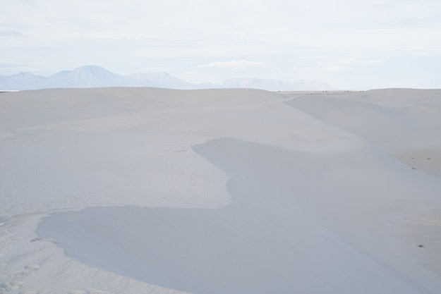
Image #1: Without any edits


Image #3: Black and white #1, using a warm light filter.
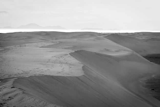
Image #4: Black and white #2, using a cool light filter.
Directing the viewer’s eye
Sometimes I like to use black and white to clarify an image. In this case, the image isn’t a disaster to edit in color, it just doesn’t need its color info. At best, the color is irrelevant, and at worst, it can be distracting.
In the first pair of images below, I liked the different linear elements, some horizontal, some vertical; some organic, some artificial. The browns and reds and greens of this image aren’t terribly impressive, and they don’t contribute to this narrative I wanted to convey. I felt that leaving the color would convey nature as the subject rather than the abstraction I wanted to convey. So I changed image #1 to image #2. I did this edit 8 months ago. Now I look at the black and white and want to push the contrast harder on the tree; perhaps if I did this edit again I would brush some contrast in.
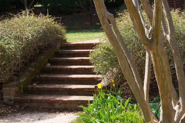
Image #1

Image #2
In this pair of images, again I was interested in an abstraction. I took this photo as part of a photography prompt: photographing light. The windows of a building across the street were reflecting light onto these windows. The window-vs-window aspect intrigued me. But other than the window reflection, the image was of a drab building wall in shadow and a slightly washed out sky. Not very exciting. By removing the color information, I thought the image more truly captured the “photographing light” prompt that I wished for it to convey.

Image #3

Image #4
Of course there are other reasons to edit to black and white. Sometimes it is to convey mood or to fit a theme. But the examples above are reasons that didn’t occur to me when I first started shooting. And they offer a lot of creative options that I didn’t realize either. Black and white can be dynamic and fun!
