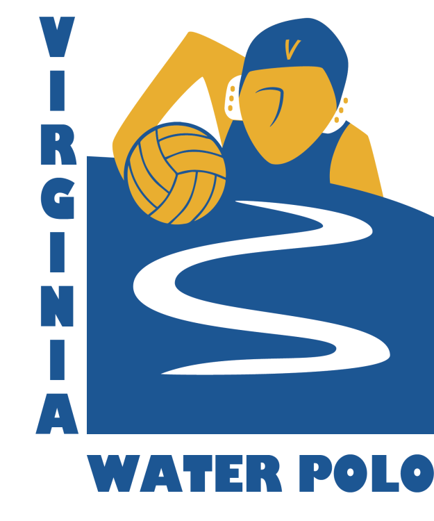
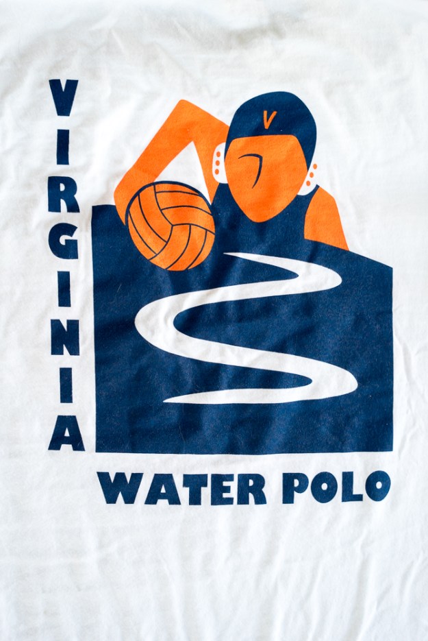
Is there any greater joy in art than seeing a project through and sharing it with others? I designed some water polo t-shirts, and finally they have arrived. They look phenomenal!
Plus, it’s a great joy to design for water polo. It’s a small sport. Maybe you’ll see a neat poster for the Olympics, but that’s about it. The women’s game is especially short on designs. This year, I took my design inspiration from art deco sports posters and the National Parks vintage poster series.
Art Deco poster style
I wanted to convey the sense of motion I like in the art deco posters. The curve of the water surface suggests energetic water. It could also suggest the curve of the ocean.
Below: An art deco poster I particularly found inspiring. Early versions of my design incorporated gradients to suggest form, as in this poster. In the interests of simplifying printing, I chose to go with two colors.
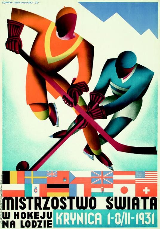
Mistrzostwo Swiata: Krynica by Stefan Osiecki and Jerzy Skolimowski, 1930. For the 1931 Ice Hockey World Championships in Krynica, Poland.
Below: an alternate idea. Like basketball, a lot of action in water polo happens at the center position. Unlike basketball, the offender and defender stay relatively fixed, facing away from the goal. The offensive center wants to turn forwards or backwards to take the shot. The defender waits to react. I hoped that the slightly disjointed postures suggested depth or motion.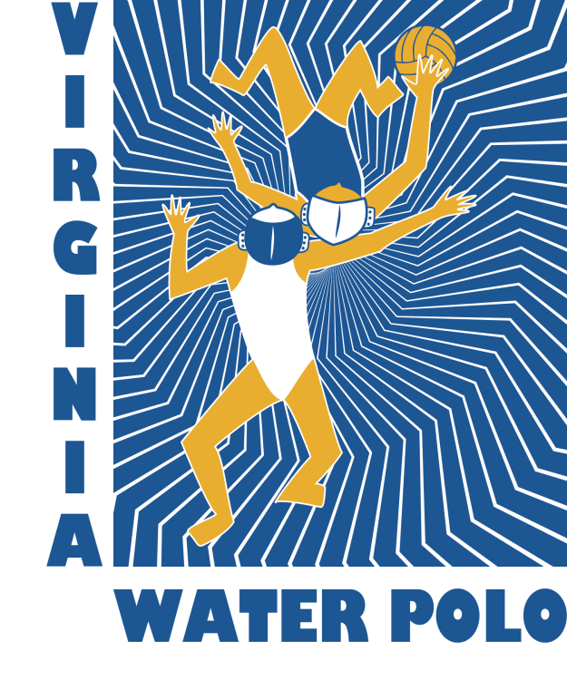
Design made into a poster. Perusing Wikipedia, I discovered that water polo has a surprising variety of names for a sport invented only about a century ago.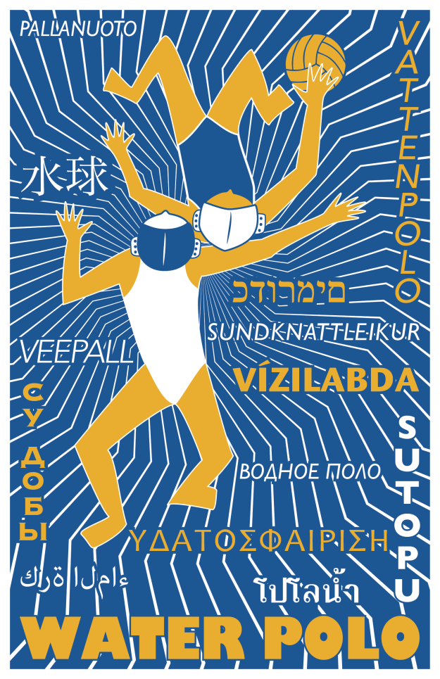
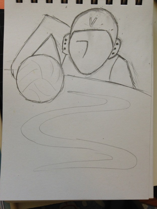
Original pencil sketch. Eventually dropped the water ripple and turned it more geometric.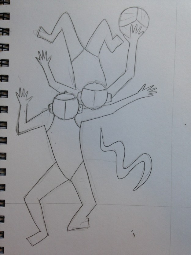
National Parks poster style
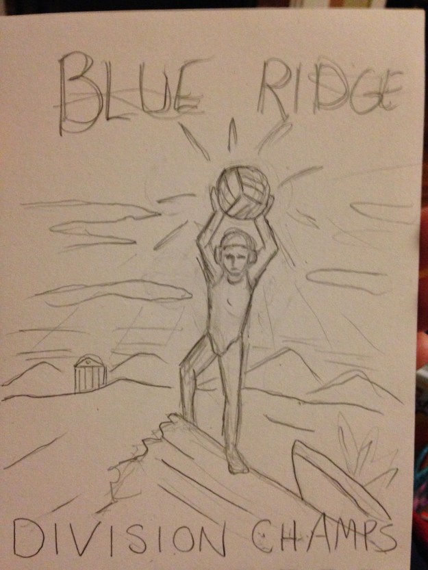
All the teams in our water polo conference, the Atlantic Conference, are in North Carolina and Virginia. Three out of the five are close to the Blue Ridge Parkway, and none are coastal. This gave me the idea that the conference could be thought of as the Blue Ridge Conference.
The championships this year were held in Charlottesville. Humpback Rocks are a popular hiking destination along the Blue Ridge near Charlottesville. People often hike Humpback rocks at sunrise to get the view of the Rockfish Valley. This fell quite naturally into a vintage style poster look.
This design was a super rush job. I drew the sketch at 10PM before the deadline the next day. The next morning I vectorized it. The shirts arrived a week later. I probably now would choose to make the figure white, for better clarity at a distance, but I still like the design.
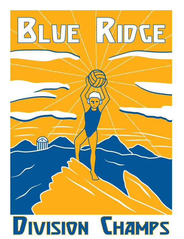
They didn’t go for my conference renaming. =P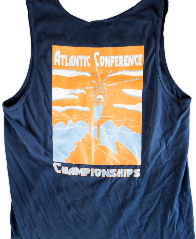
One of the national parks posters that inspired this design.

