Category Archives: Illustration

15 day draw, part 2

Drawings 6-9 of my art sprint. I’ve been developing my analog/digital mixed workflow, and developing material for my personal wiki project.

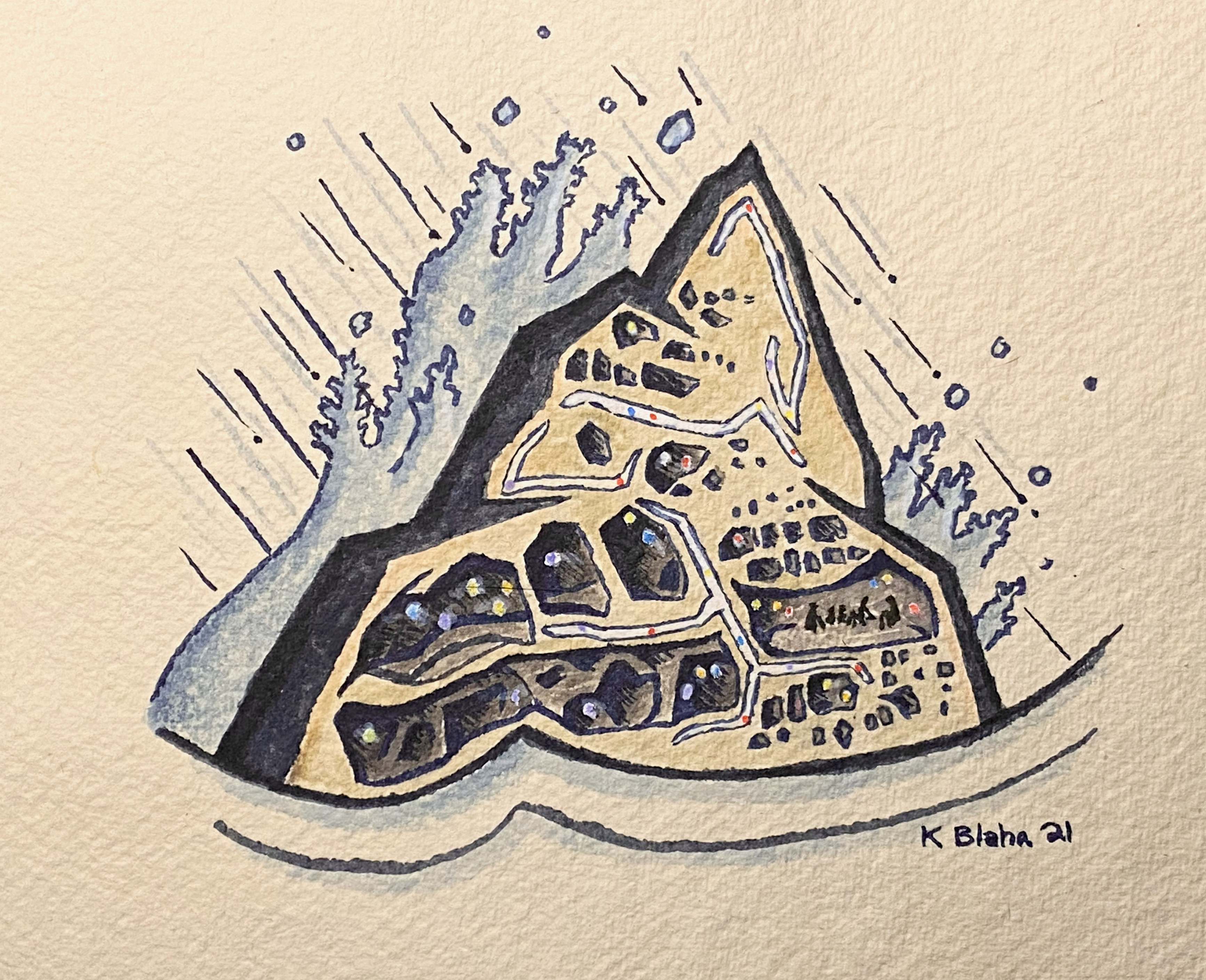
Prompt 6: “Sheltering in Mt Vit”

This is not the first time I’ve been fascinated with tafoni. Then a recent trip to Utah rekindled the passion.

Materials

  • Faber-Castell pens on water color paper (Punjab 270 gsm)

Reference materials

  • Photos of tafoni erosion

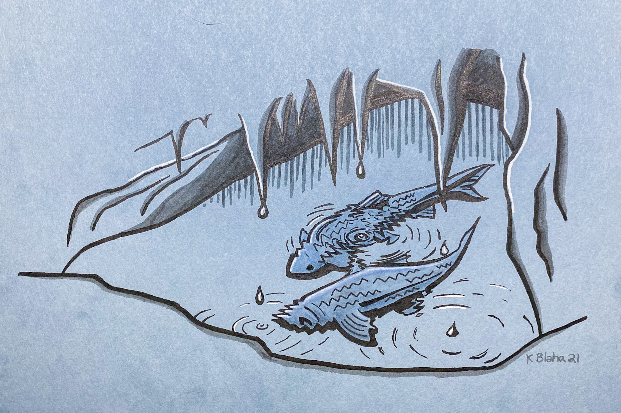
Prompt 7: “Bubbles”

This one I had hours of struggle for inspiration, and then ended up doing something a little tangential to the prompt. Pleased with this one. I used the “ripple” filter in photoshop, and I’m pleased with the effect. I’ll be using this again.

Materials

  • Faber-Castell pens on Canson Mi Teintes colored paper

Reference materials

  • “M.C. Escher: the graphic work”

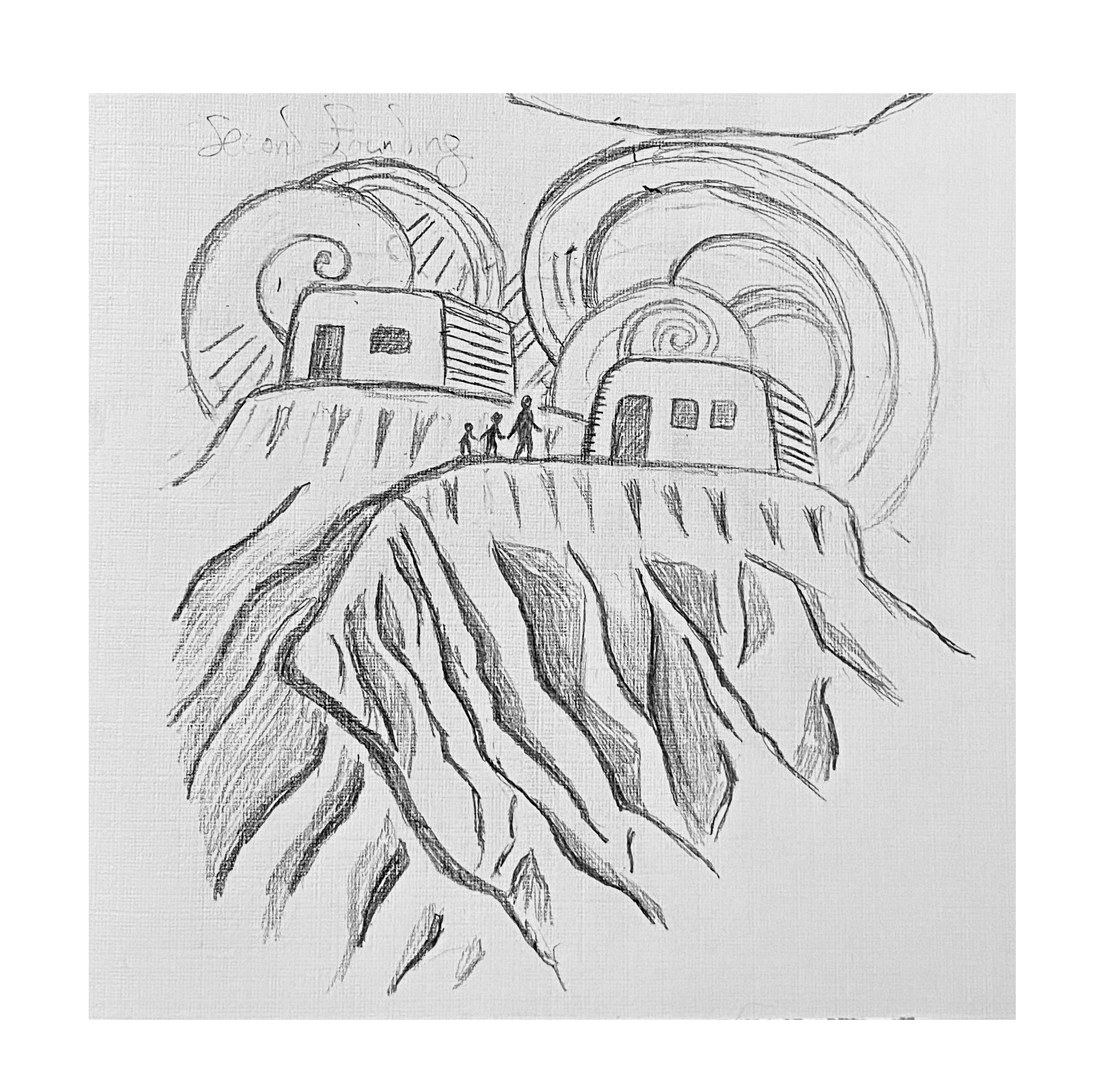
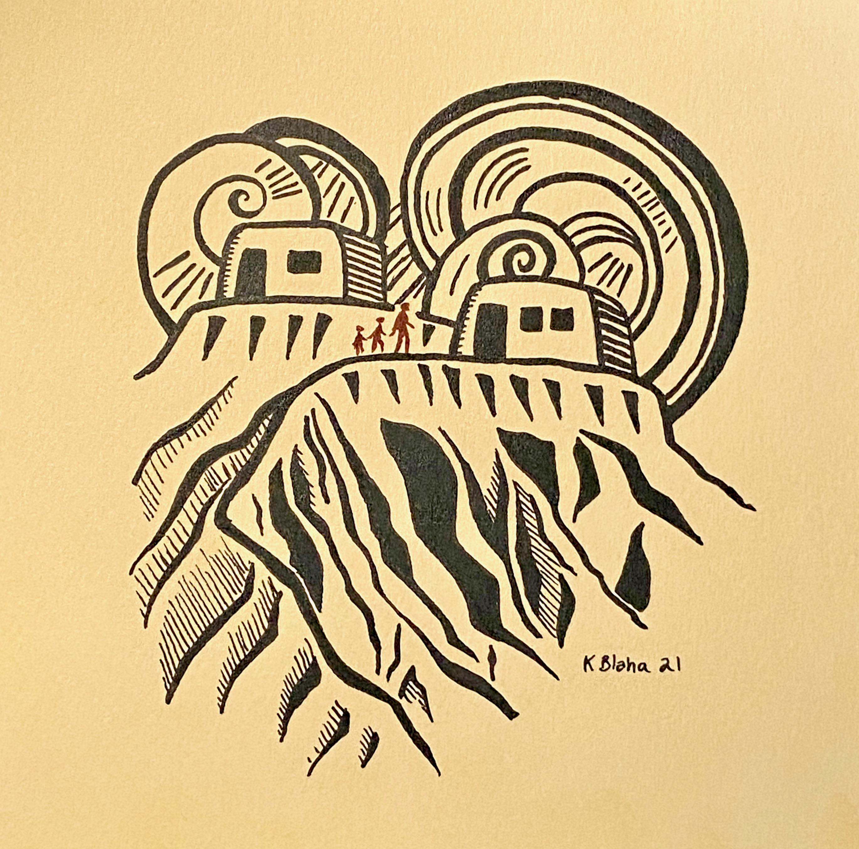
Prompt 8: “Second Founding”

A sequel to prompt 2, “First Founding”.

Materials

  • Faber-Castell pens on Canson Mi Teintes colored paper

Reference materials

  • “Walter Anderson: Birds”
  • “The Carved Line: Block Printmaking in New Mexico”

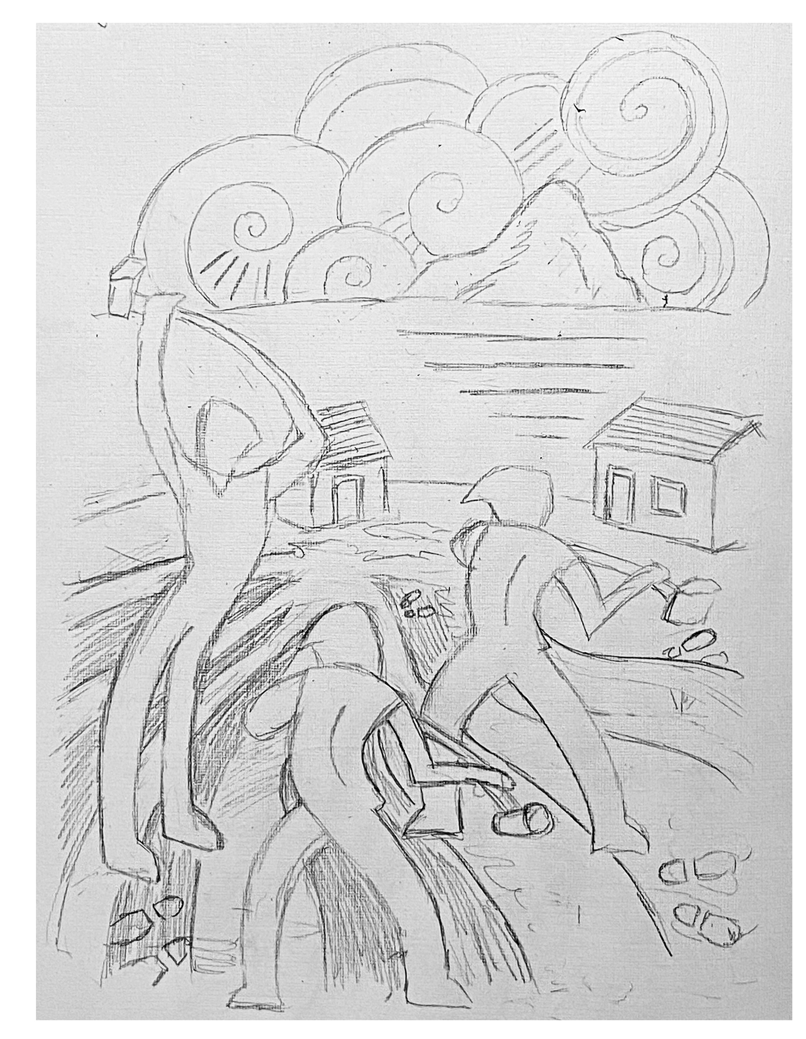
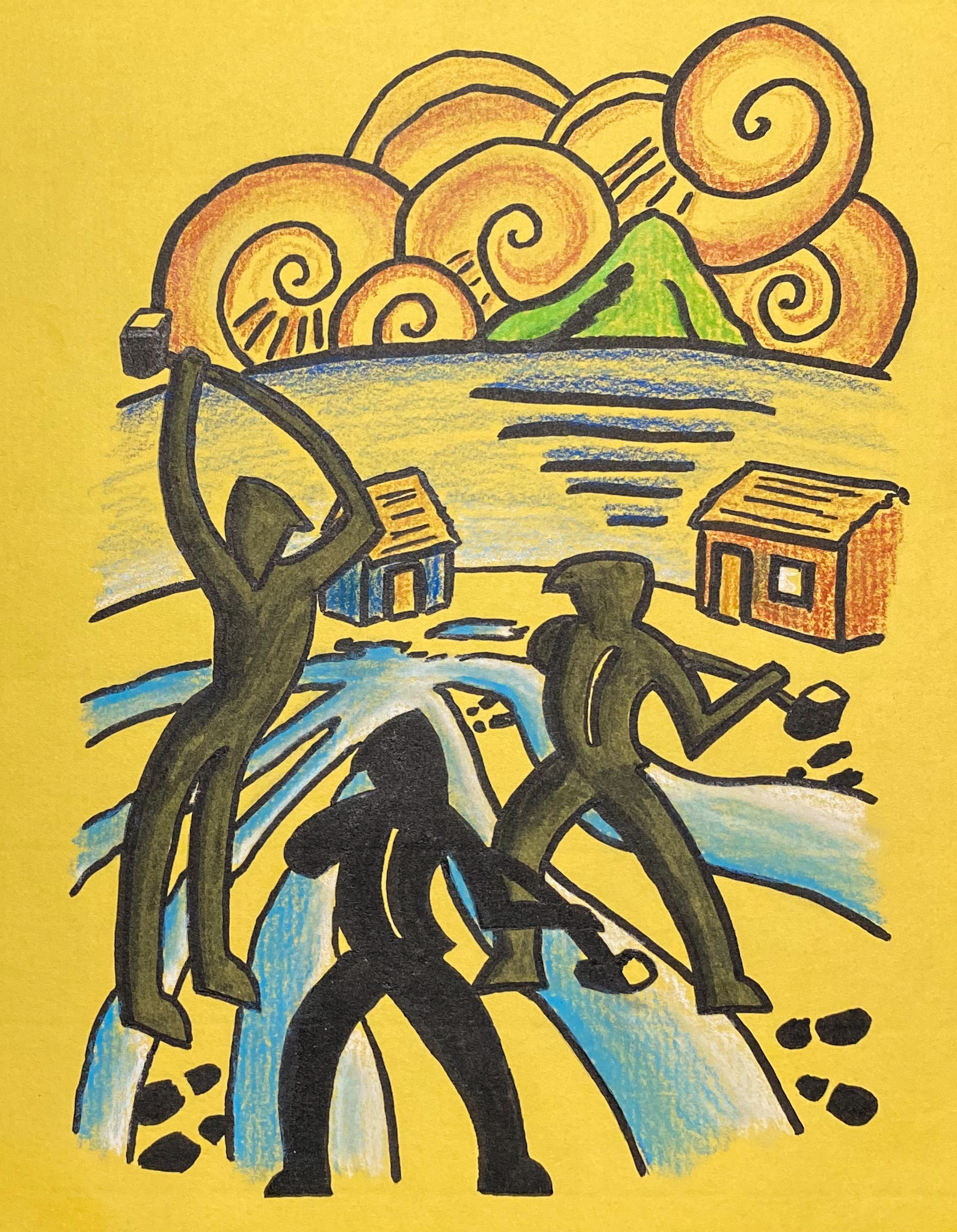
Prompt 9: Hammer

Materials

  • Prismacolor color pencils and Faber-Castell pens on Canson Mi Teintes colored paper

Reference materials

  • “Walter Anderson: Birds”
  • “Cutting Edge: Modernist British Printmaking” (a pretty direct homage to Sybil Andrews here)
  • “Vida Americana: Mexican Muralists”

Days 1-5 of the 15 day draw

I’ve made it through the first 5 days of my 15 day drawing–or as someone pointed out, a drawing development sprint. So far, so good, and using a lot of reference books to help fuel the creative flames.


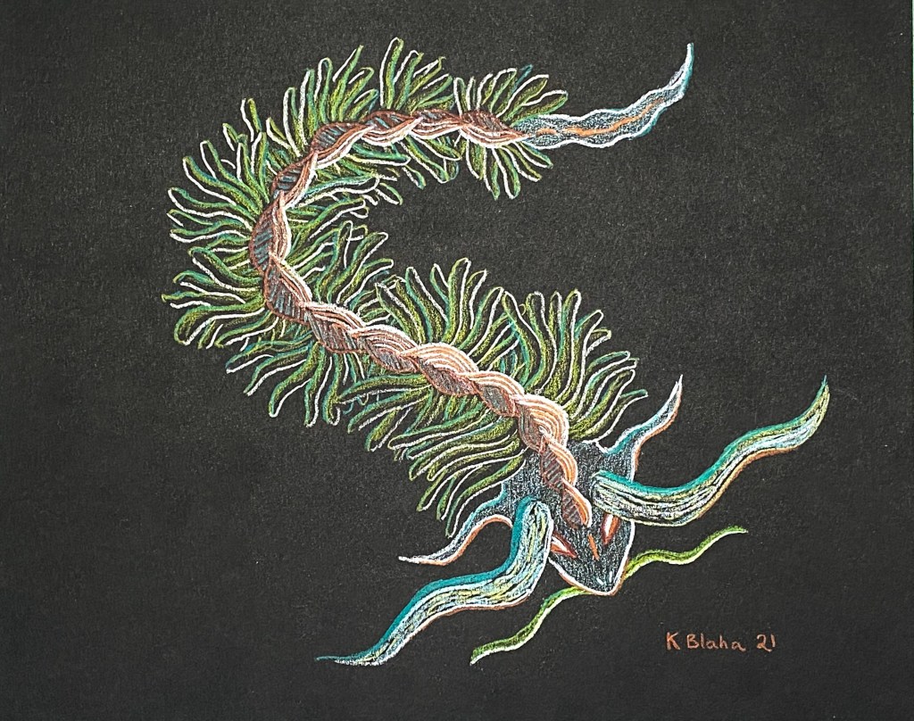
Day 1: Monster

Depicting the “World Wyrm”, a mythological monster with significance to Digurtians and humans and represented in several ways at various points of time and in various subcultures.

Materials

Prismacolor color pencils on black Canson Mi Teintes paper.

Reference Books

  • The Night Life of Trees
  • A Journey in the Phantasmagorical Garden of Apparitio Albinus
  • Ernst Haeckel Art Forms in Nature

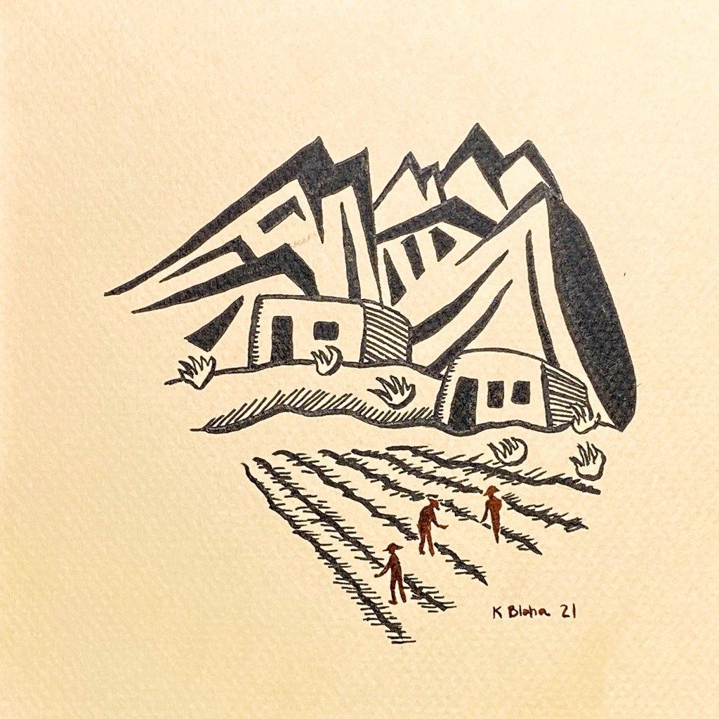
Day 2: First Founding

Trying not to belabor building materials here—trying to capture how First Founding might have been remembered by later Vironevaehns as a fleeting idyllic time between crises, a time when the community came together. Referencing an old drawing of the Vironevaehn mountains.

Materials

Faber-Castell Pitt Artist Pens on colored Canson Mi Teintes paper.

Reference Books

  • The Carved Line: Block Printmaking in New Mexico (especially the work of Willard Clark)

Day 3: Flow

Looking toward the city and a storm tower during a storm.

Materials

Faber-Castell Pitt Artist Pens and Prismacolor color pencils on Canson Mi Teintes paper.

Reference Books

  • California’s Wild Edge
  • Oscar Dröge: Landschaft Witz und Reiselust
  • The Complete Graphics of Eyvind Earle

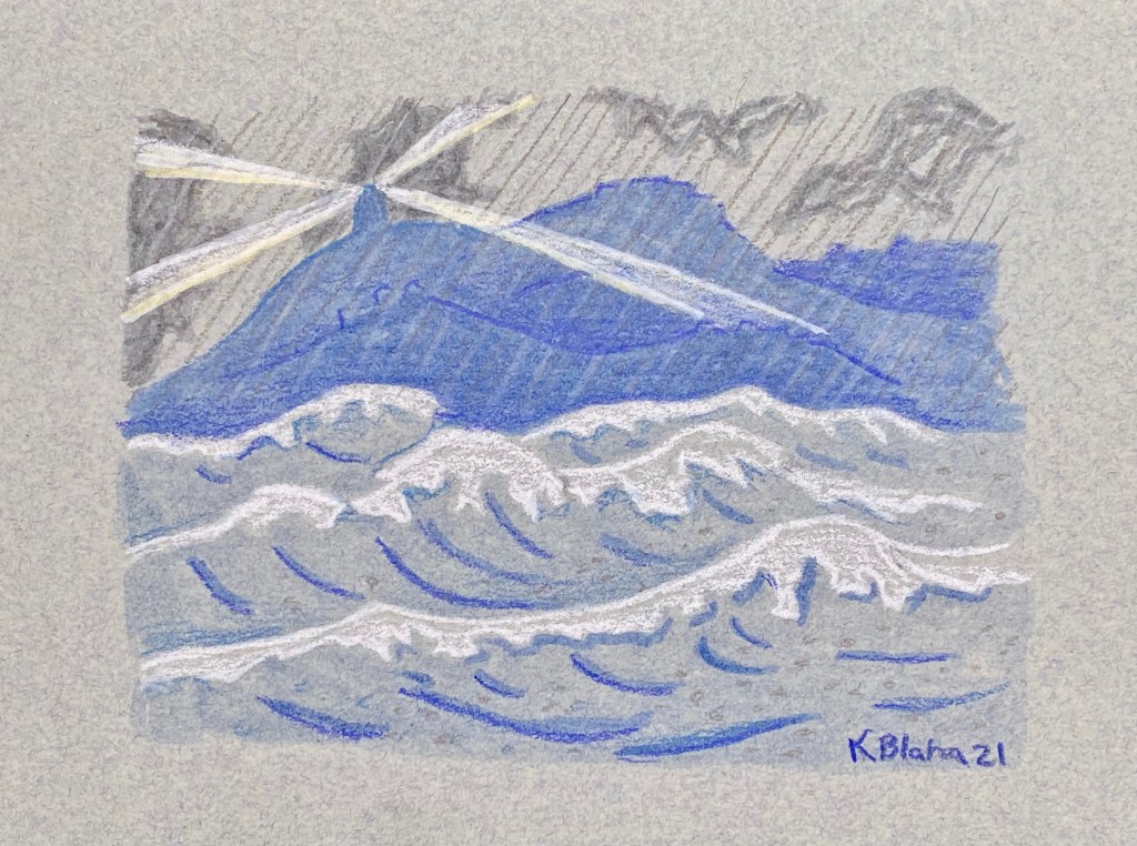
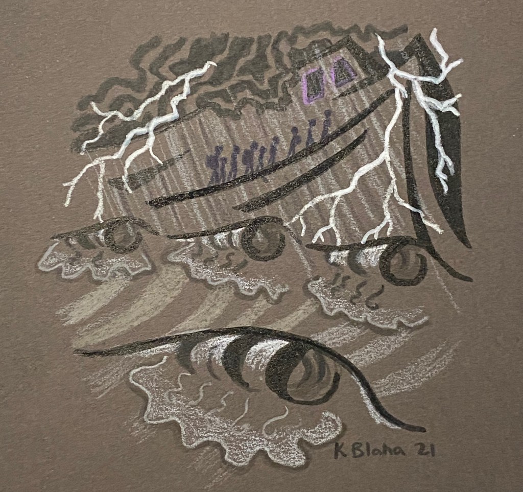
Day 4: Going to Mt. Vit

Showing the flight to the mountains after the start of the Great Rains. I wanted to show it in a storybook style, the people leaving one life forever and going to something new and a bit ominous, but nonnegotiable.

I want to re-do this one after the sprint. I want to preserve the silhouette of the mountains that is broken by the clouds in this version. Before I added the rain, it wasn’t too bad, but the rain and the clouds make the image too muddy. I think I’ll take the lightning out too. Maybe try the people in a light color too. This should be fun to redo.

Materials

Faber-Castell Pitt Artist Pens and Prismacolor color pencils on Canson Mi Teintes paper.

Reference Books

  • California’s Wild Edge
  • The Horn Island Logs of Walter Inglis Anderson

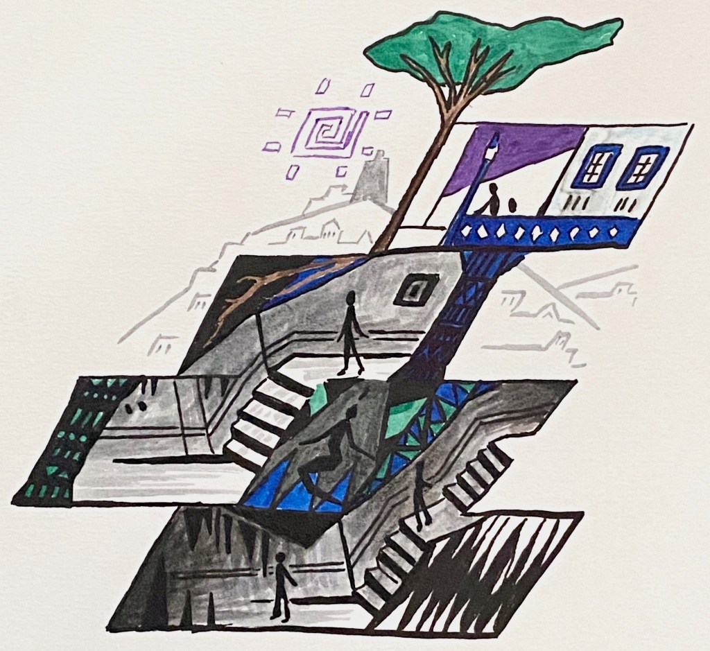
Day 5: Balance

I’ve been really obsessed with the idea of Vironevaehn identity and how it spans two humanoid cultures and their intersection. The city they build together spans above and below, and spans night and day. As night and day balance in a rhythm that defines our hormonal and cellular processes, human and Digurtian form an emergent people and culture.

Materials

Faber-Castell Pitt Artist Pens on Canson Mi Teintes paper.

Reference Materials

The city of Derinkuyu.

Reference Books

  • Sanna Annukka illustrated “Snow Queen”
  • Visions Underground: Carlsbad Caverns Through the Artist’s Eye

Inktober Days 12-17

Happy Inktober!

I’m a day behind, which is fine.

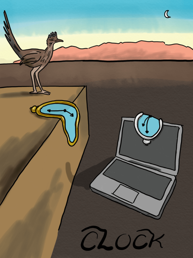
My favorite two this week are “whale” and “clock”.

I was struggling for inspiration on whale until I heard BackStory podcast’s episode last Friday about whaling. In 1880, some businessmen shipped a whale carcass around the midwest on a train as a tourist attraction. AMAZING. Here’s an article about it. I always liked the whaleziac episode of South Park, so I guess it’s whaleziac old school.

This slideshow requires JavaScript.

Inktober Days 5-11

Happy Inktober!

Here are my drawings for the week. Day 5, chicken, I started on my iPad in AutoDesk Graphic, and finished later in Adobe illustrator. The vector tools in Graphic made importing the started work a lot easier than the Adobe vector tool for iPad. The tools can be a little cumbersome, and don’t feel natively designed for a tablet, but if I want to use work from the iPad later, Graphic is better than its Adobe equivalent. This is mostly because I love Bezier curves. All the other drawings were done in Adobe Sketch.

This slideshow requires JavaScript.

And for Day 10: flow, I decided to learn one of Adobe’s animation programs, Adobe Animate. I’m still a bit clunky with it, but not bad for a first stab! I made my own Gif!

zoiderg

Inktober Days 1-4

Four days into Inktober! It’s been a great way to motivate myself to try drawing apps on my iPad. I normally work entirely on my laptop, but there are a lot of times when I don’t want to be around town with it.

So far: I’m really disappointed how Adobe’s vector-based iPad program, Adobe Illustrator Draw, has no pen tool function. This means that, although I form every object with a stroke of the pencil, I have very unwieldy blob brush paths when I import into Illustrator. My workflow on the laptop is all path based, not blob brush. Adobe’s pixel based program (Sketch) is more fun, and it’s where I’ve done all four drawings so far. But I do prefer to work in vectors.

I just downloaded Autodesk’s Graphic for iPad. It can do Bezier Curves (which I adore) and can export as a fully organized document to Illustrator. It’s not as effortless as the Adobe programs.

For both Graphic and Adobe mobile apps–the online help resources are extremely annoying. Googling puzzles about the Adobe apps will turn up threads from 2015 which are now incorrect due to rapid changes in functionality. Googling about Graphic turns up the desktop program by the same name. Trying to draw a circle took 5 minutes because I could only find the desktop recommendation–hold shift.

Happy inking! I hope to explore Graphic more this weekend!

This slideshow requires JavaScript.

Free Downloadable Science Brushes for Adobe Illustrator

I’ve used Adobe Illustrator for years, but I didn’t use brushes very much. This weekend I watch the Lynda.com course “Creating Custom Brushes”. My library gives me free access to Lynda.com through their website; yours might too so check it out.

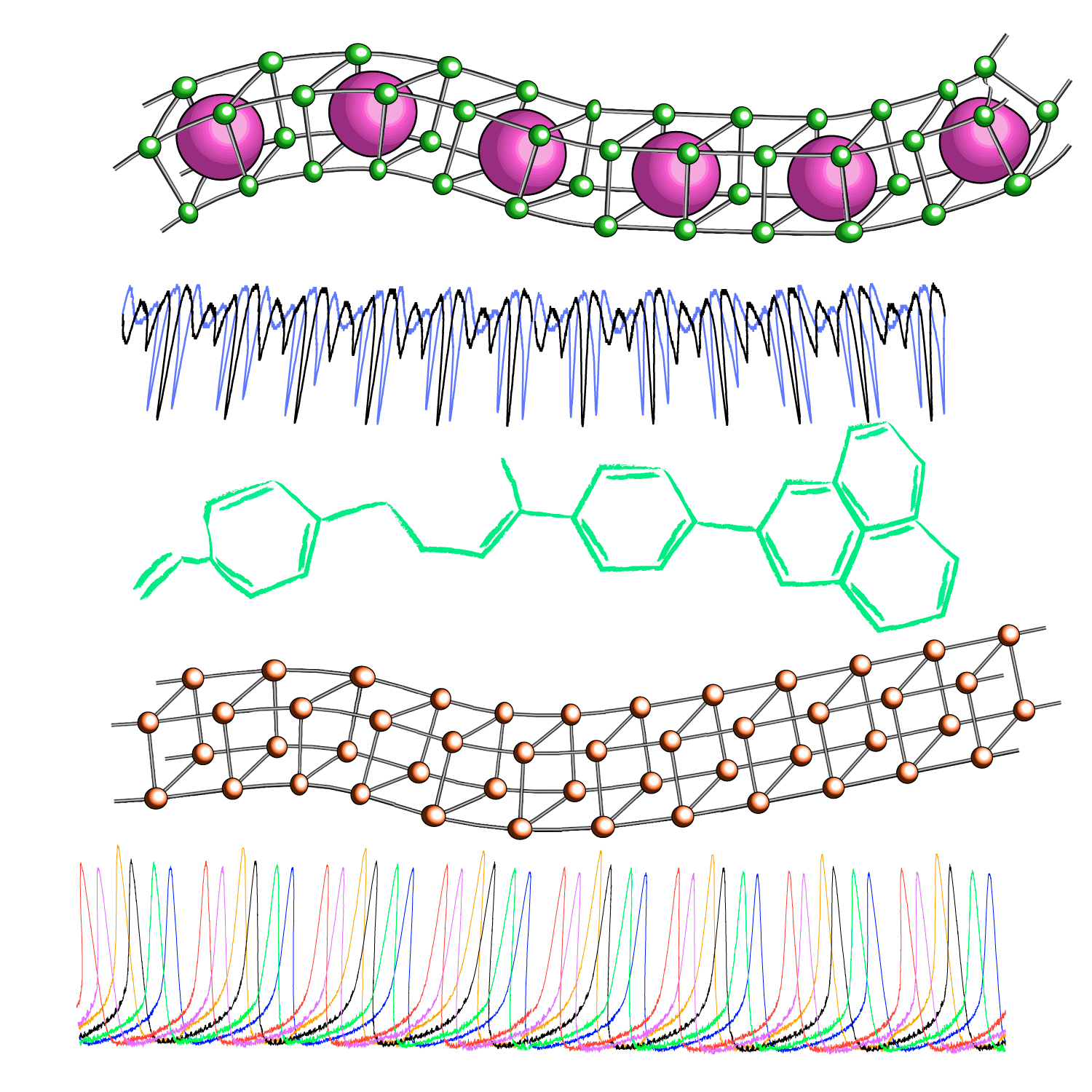
In my zeal, I created a few science-themed custom pattern brushes. Two of them are created from real experimental data. You can see them drawn onto paths below. If you like them, you can download the .ai files through my Creative Cloud presence at the following link: https://adobe.ly/2GpnK9Y.

If you use the files, please satisfy my curiosity, and either comment here or mention my twitter handle @Vironevaeh. I hope they are as fun to use as they were to make!

What are the paths? (counting from the top)

  1. The top path is loosely based on the body-centered cubic crystal (BCC) structure. A real BCC crystal has atoms in the middle of every cube, rather than every other. It also extends in all three dimensions. Iron and chromium form BCC crystals.
  2. This path is real experimental data from coupled Colpitts oscillators. A Colpitts oscillator is a simple electronic oscillator made from resistors, inductors, capacitors, and a transistor. Without coupling, the oscillations are simpler; the interactions cause them to make this interesting pattern.
  3. This path is the “skeletal formula” for a random organic molecule. Next time I will make some polymers, but this one was for play.
  4. A cubic molecule.
  5. More real experimental data, this time from an electrochemical experiment. This is the current produced from the dissolution of nickel oxide in acid. Here, six oscillators are locked in a pattern. (Note that this path has a lot of anchors so it’s a little slow. Maybe this one was more for my fun.)

BlahaScienceBrushes

Soviet Anti-Alcohol Propaganda

After visiting the Museum of Communism in Prague, I have been fascinated with propaganda posters. They share attractive design and typographical movements from their brethren in advertising, but they are grounded in darkness. Advertisements appeal to desire, ambition, family, and goodness (to a laughable extent, seriously is there anything more candy-coated than a McDonald’s or a Coca Cola ad?) ; propaganda posters appeal to fear, resentment, social-approbation, and shame. Advertisements recede into history, but they retain their emotional glow—we still enjoy old neon hotel signs and Coca Cola ads on the side of brick buildings. Propaganda maintains its darker emotions too—some of the kinder ones, like Rosie the Riveter, have crossed into pop culture, but war bonds posters from WWI and racist posters from WWII have understandably vanished.

Propaganda posters from other cultures fascinate me because they contain grim honesty. What people were meant to fear and how that fear was instilled is telling. It seems to me that propaganda varies between nations more than advertising because differences are often the source of fear.

The publishing company FUEL has a series of interesting books about Russian and Soviet culture. Their book Alcohol collects dozens of Soviet anti-drinking posters. Some of their are stylish. Some are tacky. They depict every manner of disordered drinking–children drinking, drinking during pregnancy, factory workers drinking, drivers drinking, people drinking poisonous moonshine. These are distressing ideas; they must have occurred often enough to cause anxiety.

I’ve mentioned this book to several people, and they are always surprised to hear that Russia ever suggested drinking less. They find drinking and Russia to be synonymous. Most of these posters are from the 1980s, as part of an initiative under Gorbachev. If American perception is any measure, the propaganda seems to have been ineffective.

This slideshow requires JavaScript.

Playing with patterns

In materials science class, we examined wallpaper patterns for symmetries. Atoms and molecules can pack according to a variety of crystal structures. Mathematics obviously loves patterns too. There are fractal tilings and tessellations. Who doesn’t love Escher? There are probably practical applications to tiling, but more importantly they are great fun that tickles the brain. Recently I took my first stab at pattern making depicting (what else?) water polo.

Gudrun’s Postcards: A Little Girl’s Life and Death in a Bygone Era

In 1915, my great aunt Gudrun died of type 1 diabetes at the age of ten or eleven. It was one of those family health tidbits to mention to the doctor and little more. Insulin injections weren’t developed until 1922; before that, the disease was a death sentence.

A few weeks ago, I got to see Gudrun’s postcards. They were passed down through the family, but I had never seen them before.

The oldest postcards go back to 1909 or so, when Gudrun would have been 4 or 5. They’re from her sisters, who worked in big city Minneapolis, or her school mates. Many of them are undated and probably delivered by hand, as they have no stamps or postmarks. Many of the dates on the postmarked cards aren’t legible.
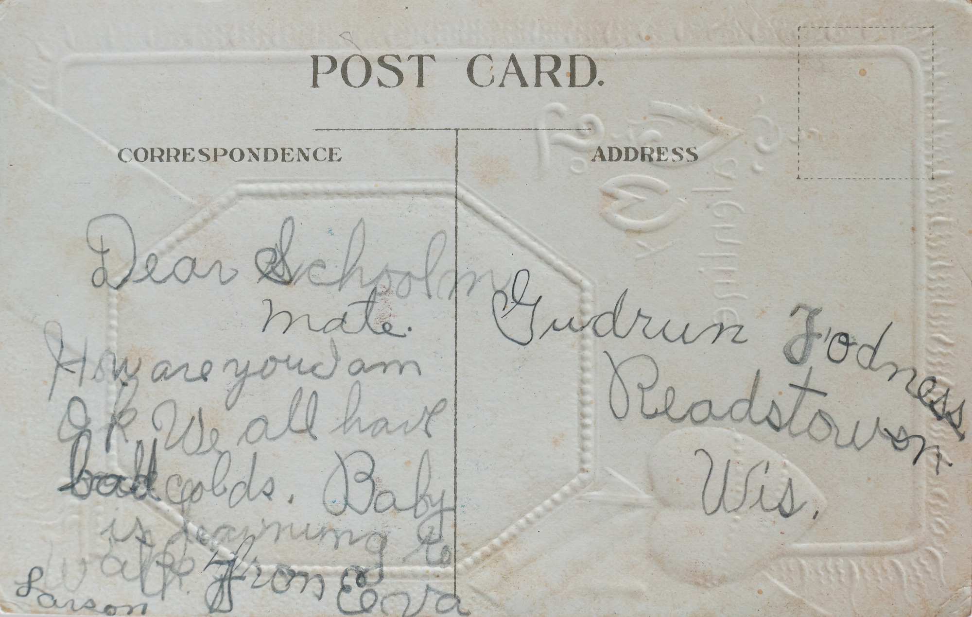
170904-postcards-7007.jpg

Dear School mate. How are you. I am ok. We all have bad colds. Baby is learning to walk. From [unreadable] Larson.
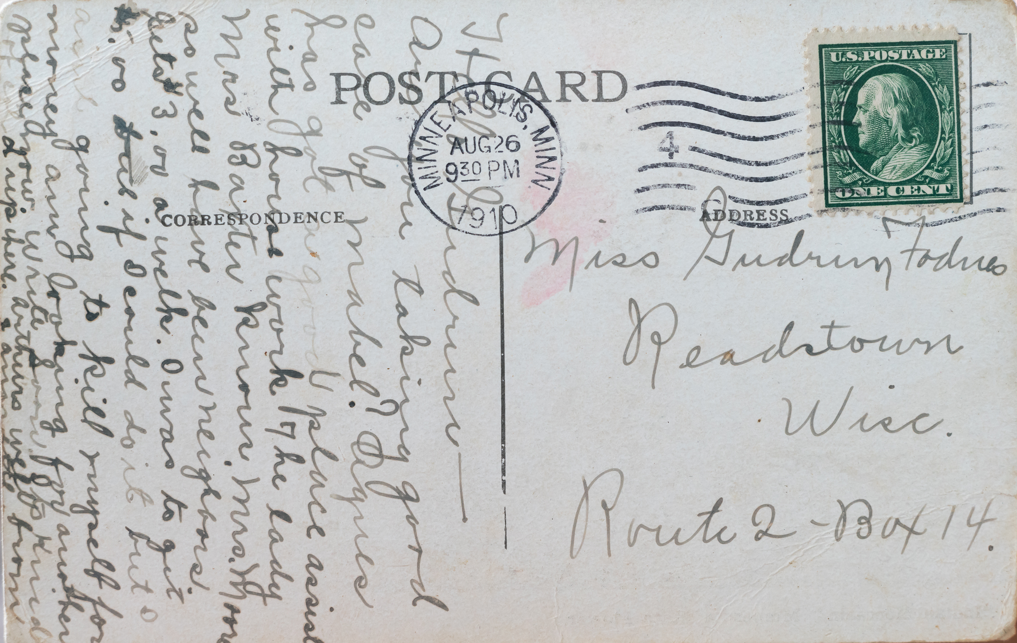
170904-postcards-7009

“Hello Gudrun–Are you taking good care of Mabel [my grandmother, who was an infant]? Agnes has got a good place assist with house work. The lady Mrs Baxter knows Mrs. Moore so well have been neighbors. Gets $3.00 a week. I was to get $5.00 but if I could do it but I ain’t going to kill myself for money am looking for another place now. Write soon. It’s kind of cold up there and [indecipherable]”-Unsigned, probably a sister in Minneapolis.

The last postcards are postmarked around Christmas 1914. I haven’t been able to find records of when Gudrun died, just that the year was 1915. Many of the postcards ask after Gudrun’s health, even well before she would have been ill. Health comes up in many of the postcards between six and seven year olds. Health was different in that era. One of Gudrun’s sisters would die from pneumonia a few years later as a high schooler. [Correction: the girl who died from pneumonia was my grandfather’s sister. One of Gudrun’s sisters died of an ear infection in the 1930s.] One of her brothers later died from an infected cut.

Postcards seem like they were routinely exchanged between young children. The spelling and handwriting on many of the cards is very young. Mail and trinkets of the greater world were probably a huge thrill in rural Readstown, Wisconsin, a town of 515 in 1910. Gudrun lived on a farm, and probably most of her classmates did too. Because many of the cards are undated, it’s hard to establish a time line. Did her classmates write more to her as she became ill? They sent cards for every holiday. There are birthday cards, Valentine’s cards, Thanksgiving cards, Easter cards, New Years cards, and Halloween cards. Many are un-themed. Sometimes a little friend sent a holiday card at an odd time, apologizing that it was the only card they could find.

We don’t know how long Gudrun was ill before she succumbed. Online resources suggest children lived from a few weeks up to a year. Around the time of Gudrun’s illness, doctors began to advocate a starvation treatment to reduce sugar levels and prolong life. In rural Wisconsin, Gudrun probably didn’t follow such a course of treatment, but maybe the general concept was present. Since ancient times, diabetes had been described for the sugary taste it gave to a victim’s urine, so the connection to sugar was well-known.

There’s a lot we don’t know about Gudrun. We don’t have any of the cards she sent. All of her correspondents and siblings are long dead. I look at her and wonder about her and what her life was like. The postcard designs are an insight into Gudrun’s era as well. Some feature Norwegian; she probably spoke some. The handwriting is exclusively in English. All but two or three feature illustrations rather than photos. Some have metallic foil and embossing. Some have half tone designs. I picked a few of my favorites.

Gudrun died over 70 years before I was born. What a wonderful record of her community and family and friendships this collection of cards is. Her life and death over a hundred years ago feels real through it.


This slideshow requires JavaScript.

Let’s make awesome women’s sports posters!

I love illustrated sports posters. Most of today’s sports posters are photographic; as a photographer, I appreciate the phenomenal sports photography that is possible with today’s equipment. But illustration can capture how a sport feels in addition to how it looks. Additionally, photos are of specific people; illustrations are often of generic athletes.

Women’s sports especially lack poster art. If we are to infer how women feel when they are playing sports from the existing posters, one would learn that (1) women are playing sports to flirt with men, (2) women are playing sports to be sexy, and (3) women are playing sports to show off clothing. There are some notable exceptions, but these categories dominated my search for distinctive women’s posters. Men’s posters (and good women’s posters) show the joy of movement and conflict and success. They show admirable members of a team effort. That’s how I feel when I play.

Fun sports poster design!

Motion, motion, motion! The people in these posters are joyful and powerful, people that the viewer looks up to or wants to be.

Bizarre women’s poster design

Many of these posters are pleasing enough in isolation, but these kinds of posters make up the majority of women’s sports posters. They model clothes, they sell bicycles, they show women doing elegant jumps that have no relation to motion that happens in the sport. They’re women as decoration, objects to admire rather than people to relate to.

This slideshow requires JavaScript.

Posters today

Many of my example posters are decades old. As I said, modern design hews toward photography, so these outdated images of women’s sport remain the few illustrated examples. As a lady athlete, I want beautiful art of my sport and other ladies sports.

Over the years, I’ve done several posters and t-shirts for my women’s water polo teams. Sometimes it’s as simple as a strap over the shoulder. It’s not a huge thing, but I like to feel like I’m included in the representation of the sport. I want to find art where people that look like me are moving with joy, rather than posing cutely. I want to see images of women in action, images that invite girls to imagine that it could be a poster of them.