Tag Archives: style

Art Deco Posters: Water Polo, the gentleman’s game

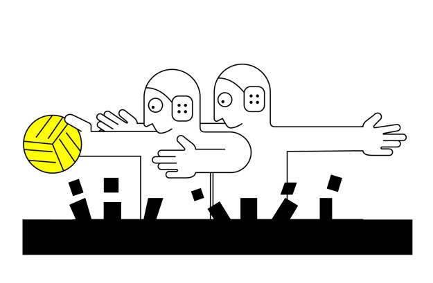
The Olympics are coming up! It’s that rare time when non-professional sports get to shine! As a lover and player of water polo, I get so inspired watching the amazing men and women of the world expressing their mutual disdain through grabbing, elbowing, and splashing in the big pool. Water polo is GREAT.

As I type this, I nurse a bruise from a deliberate kick in the back, some mystery bruises on my arm, and a sprained thumb. I can only hope I gave as good as I got. But really, one of the wonderful things about water polo is the intensity of the violence compared to the mildness of injury. You cannot fall down or run into a wall, and any underwater shenanigans are dissipated by the water. As I have often said, water polo enables to player to express all of the intent, but little of the impact. That’s perfect!

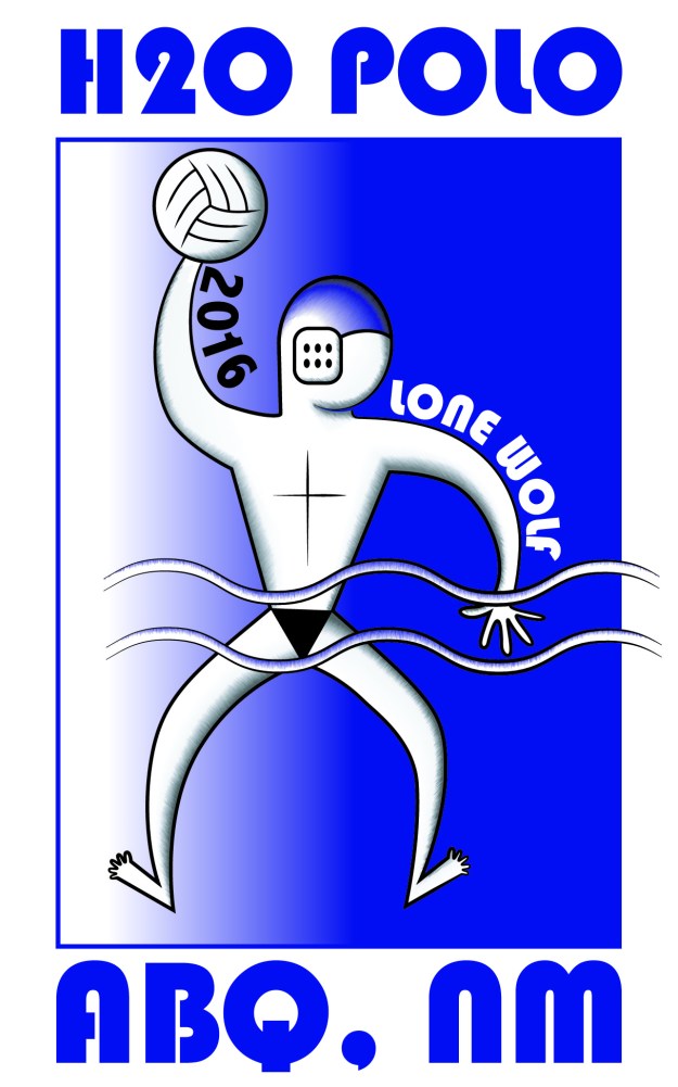
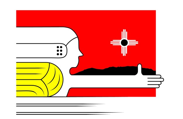
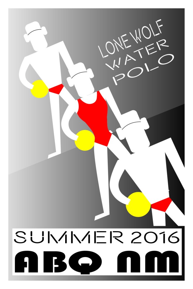
As I have demonstrated again and again, I love art deco design. I love old art deco Olympic posters; they’ve inspired my water polo art before. Water polo is a niche sport, and there isn’t a ton of art out there for it. Additionally, I enjoy contrasting the gentility of art deco design with the brutal public image of water polo. The soft civility of art deco posters in many way jives with how the game feels as a participant—it’s like a big tea party with all of my scantily-clad friends.

So, as we near these (hopefully sewage free but probably not) Olympics, I hope you’ll enjoy my water polo posters. I got inspired when the Olympic Trials were on TV a few months ago, so you can only imagine how much I’ll enjoy the Olympics.

PrintPrintPrintPrint

Nationality Rooms at the Cathedral of Learning

This weekend, I went to the Cathedral of Learning in Pittsburgh. Among other things, this gothic skyscraper contains 29 nationality rooms–each of these rooms is decorated intricately in the design of a nation. The first 19 were built between 1938 and 1957, with ten built since 1987. The Turkish and the Swiss classrooms were dedicated in 2012, and several more are planned. If you are in Pittsburgh and have any interest in craft or design, I can’t recommend visiting enough.

To visit the classrooms, you can check out a key at the desk, or take a tour with a guide. We rented a key. Visiting each room felt like a treasure hunt; each room was so different, and full of intense detail. Each room had special walls, windows, ceilings, chairs, lecterns, and chalkboards. Even the light switches and doors were in style. Many contain intricate wood or stone carvings, or genuine artifacts. Most were designed by architects of the country.

You can learn more on the University of Pittsburgh website about the nationality rooms. This page allows you to virtually tour each room.

The Chinese nationality room.

The Chinese nationality room, dedicated in 1939.

The Czechoslovak room, dedicated in 1939. This room contains a letter from the first President of Czechoslovakia, Tomáš Masaryk, to the students of the University of Pittsburgh.

The Czechoslovak room, dedicated in 1939, 8 days before the Germans invaded in World War 2. This room contains a letter from the first President of Czechoslovakia, Tomáš Masaryk, to the students of the University of Pittsburgh. His son, Jan, spoke at the dedication of the room, foreseeing trouble in the future. Page 4 of this document details the interesting connection between Czechoslovakia and Pittsburgh.

The Hungarian room was dedicated in 1939.

The Hungarian room was dedicated in 1939.

The Lithuanian room, dedicated in 1940. The walls are woven from linen in the "The Path of the Birds" design. Between the angular, abstract carvings and the painting and the walls, this was one of my favorite rooms.

The Lithuanian room, dedicated in 1940. The walls are woven from linen in the “The Path of the Birds” design. Between the angular, abstract carvings and the painting and the walls, this was one of my favorite rooms.

A detail from the Romanian room, dedicated in 1943. The style of this mural on the back wall reminded me of the opening of Beauty and the Beast.

A detail from the Romanian room, dedicated in 1943. The style of this mural on the back wall reminded me of the opening of Beauty and the Beast.

The Swedish room, dedicated in 1938.

The Swedish room, dedicated in 1938.

The Yugoslav room, dedicated in 1939. The carving in this room, called "notch carving" was simply amazing.

The Yugoslav room, dedicated in 1939. The carving in this room, called “notch carving”, was simply amazing.

The cathedral of learning, exterior.

The cathedral of learning, exterior.

The main hall of the cathedral of learning.

The main hall of the cathedral of learning.

The main hall of the cathedral of learning.

The main hall of the cathedral of learning.

Science Fiction Worldbuilding

One thing I love about science fiction is worldbuilding. When you go to a new place, you take in the architecture, the language, the food, the weather, how someone enters a house, how someone insults another person… These things exist in any culture, but they vary, sometimes radically. In science fiction, the creator tries to imagine these things in a logical and consistent manner for a time that hasn’t happened yet, for planets unknown, with the very constants of life such as gravity and oxygen subject to change. And yet the end product, when successful, is similar to travel–we visit a place that is deeply familiar in the fundamental ways and yet different in ways that provoke thought.

(Some people think that there is too much worldbuilding–I don’t agree. I think the author can tell too much of their own personal worldbuilding process and not consider the reader enough. However, I speak from a place of no authority, so take my opinion for what it is worth.)

In the last few weeks, I’ve been working on illustrations of street life in my city inspired by Hiroshige’s 100 views of Edo. Even after 17 years working on this world, I see many new things this way.

SONY DSC

On the hill in the background is the outline of an old storm tower, shaped a bit like a lighthouse. The old fortifications stood high on the hills with thick walls to withstand the storms.SONY DSC

The view west from a storm tower, to give early warning of storms. In the early days of the city, storms caused flash flooding and devastation.SONY DSCGleaming cities often have unsavory hidden parts, sometimes literally lurking around the corner.

So far I’ve done about 20 illustrations. I’d like to do at least 100. In each one I feel more comfortable with previous details. I’ve looked up references of European and Moroccan and Japanese architecture (mostly the European showing in these three samples). Now I’ve started incorporating old sketches over a decade old. The city feels all the more real to me (it’s great inspiration for story ideas and details), and the work is great fun.


Style: University of Virginia Lawn

There are three manmade UNESCO world heritage sites in the United States: The Liberty Bell, The Statue of Liberty, and The University of Virginia Lawn with Monticello. The UNESCO designation basically means there is something noteworthy of distinctive about the site. I happen to live near to the University of Virginia, so I get to take a lot of photos. (As of this post, I just discovered that all the modern photos on the lawn Wikipedia page are mine. I love to see where the creative commons take my works. Side note: check out my very large Flickr collection of mostly creative commons images.)

Many years ago, Benoit Mandelbrot, the creator of fractal geometry, visited the university to give a talk. He said it was like walking into the lion’s den of Euclidean geometry. I always liked this description; everything about the university is columns and arches and perspective points. Monticello and the University were laid out by Thomas Jefferson, who one gets the feeling never actually died living around here. He was the ambassador to France for a while, and greatly admired the architecture. He came back to the states with those architectural inspirations.

The UVA lawn, shown below, has the rotunda at one end (the second one… the first one burned down and blew up when a professor tried to save it with TNT) and is lined by ten pavilions. Between the pavilions are dorm rooms that distinguished fourth year students still live in. Each of the ten pavilions is architecturally different, and behind each is a garden in a different style which no doubt will be the topic of a future post. Pavilion 2 is pictured below. Professors still live in the pavilions. The pavilions were built in a strange order, to ensure that diminished funds would not diminish the scope of the project.

It’s very easy to find plenty of reading material on Jefferson and the University if you are interested, so I won’t try to write a tome here. However I’ll include a few of my pictures that may hopefully spark your interest.

SONY DSC DSC03036 SONY DSC SONY DSC SONY DSC SONY DSC SONY DSCpavilion 2

Monticello, i.e. the back of a nickel


Vironevaeh: Hiroshige Influence

A few weeks ago, I wrote about the paintings of Japanese artist Hiroshige. So I got inspired and tried my hand at something along those lines, something like a science fiction Hiroshige. The drawings are set in the world of Vironevaeh: Science Fiction Fairy Tales (which, btw, is free on iPad =) ).

The first, done in watercolor, shows the city of Vironevaeh on the North Bay with Mt. Viro-Vit in the background. The second is a tweaked version done in markers. The third is the linework for another, depicting a Vironevaehn holiday called Digurtian Day. The Digurtian Day celebration is labeled in Vironevaehn. Many of the Hiroshige paintings are labeled in Japanese, so it felt fun to channel that spirit.

Happy Friday! I’m off to the Virginia Festival of the Book!

viro-city-watercolor-smaller

viro-city-marker-smaller viro-digurtian day-medium

Japanese Art: Hiroshige

I have a beautifully bound book of the paintings of Edo by Hiroshige I found a few years ago. Since that acquisition, I have grown fond of the style of Hiroshige. He is an artist in the ukiyo-e style, or woodblock prints of daily life from 1800s Japan. The composition style is quite different from contemporary western works. A lot of Hiroshige’s works can be found online as part of the public domain. Wikipedia has a number of images in its gallery.

Vincent van Gogh drew stylistic inspiration from the works of Hiroshige. Below are nearly identical paintings by van Gogh (right) and Hiroshige (left). Many of van Gogh’s paintings have composition reminiscent of the ukiyo-e style.

Below are three of my favorite paintings from “one hundred famous views of Edo”.

photo photo1 photo2

Great kids books, great sources of inspiration

Whenever I go to a museum, I like to look at the kids book section. Often times, there are several really engaging and pretty books relevant to the museum’s collection. They’re often more fun and compact than the books in the adults section. I don’t need a coffee table book for every artist I like. I like to have little pieces of inspiration about my office, though. With my interest in writing children’s books, it’s even better.

The Smithsonian museums in DC have nice gift shops too. Many of the books are award-winning, and seeing them in person makes it easier to judge the book. Plus I don’t mind paying money to the Smithsonian. Below are a few of my finds:

  • Snowflake Bentley— A kid’s book biography of the guy who first photographed snowflakes (he has his own museum even). Beautifully illustrated, with a tone that appreciates science. If you like this book, there are also books of photos of snowflakes; those are great fun too. Below is one of the illustrations from the story (from childrensbookalmanac.com).

  • Oceanology— this one was in the Natural History Smithsonian. It’s a very interactive book written from the perspective of a teenager on “20,000 leagues under the sea”‘s the Nautilus. It’s written to resemble a logbook something like Darwin’s logbook from his journeys.
  • The Legend of the Lady Slipper–I found this one at the American Indian Museum (which, if you are ever in DC, has a great cafeteria). Like the cover, the illustrations have a lovely sense of movement, and nice colors. One of the artists is known for painting people dancing; this comes across in the people of the story, who are always in subtle motion.

Style: Soviet Propaganda Posters

The 20-40s really seem like it was a golden age for illustration. Color photos were not as vibrant as they are today, yet mass printing existed. Thus, beautiful and stylized portraits of life were used in advertising and propaganda (Alphonse Mucha did lovely art nouveau illustrations for advertisers since the late 1800s, I wrote about him here). Many of us have seen the posters created for the Great Depression and WW2 by artists such as Thomas Hart Benton.

When I visited the Czech Republic, Budapest and East Berlin, I was struck by their propaganda posters from the same period. There was such a contrast between the lovely illustrations and the content that we would likely find oppressive. It can be a window into history to understand how people chose (or were forced into) their path. For good collections of Czech or CSSR Propaganda, check out the Communist Musuem in Prague and Checkpoint Charlie in Berlin. The featured image for this post is the poster for the Communist Museum; one of my souvenirs from Prague are some nesting dolls with this design.

To have more we must produce more (Wikipedia)

The Czech, Hungarian, and German posters seem hard to find, and I only know the languages a little (if anyone knows good sources, let me know!) I find the role of small countries in the early 20th century especially interesting since they are underrepresented. The countries of central Europe endured many of the worst hardships during the 20th century. There are many sources for Russian propaganda posters:


10 years since the revolution


Style: Art Nouveau

My favorite style is art nouveau. I first learned about art nouveau when I was living in Prague. The works of Alphonse Mucha, a prominent Czech art nouveau artist, remain throughout the city. There is a museum of his various prints and a few paintings, that explains the motivation behind his work. The municipal house (Obecní dům) is in the art nouveau style, with stained glass windows done by Mucha. The Prague castle also has a stained glass work by Mucha, among its many others. Mucha often depicted images of slavic nationalism and women with slavic features. Mucha’s interest in the slavic and czech identity, and his works on this identity, make learning about him an interesting way to learn about Czech history.

One of Mucha’s famous posters. (pic from Wikipedia)

Thumbnails above, from left: Mucha stained glass at the Municipal House, the Municipal House and the Powder Tower, and Mucha stained glass at Prague Castle.

Besides the locations in Prague, I’ve visited several other Art Nouveau, Art Deco, and Bauhaus collections. The Bröhan museum in west Berlin and the Horta museum in Brussels are both great. You can also sometimes find museum collections online, like the Virginia Museum of Fine Arts.

Style: Aboriginal Art

I like to use different art styles for my various different stories. Lately there is nothing better than trying to find attractive illustrations of various origins. A few months ago, I found a children’s book at a library sale, very much by accident–Enora and the Black Crane. Enora is a lovely story, and the illustrations are beautiful. Before happening upon this book, I had seen little aboriginal art.

I wanted to incorporate aboriginal designs into my in-progress short story collection. Luckily, I live near the only dedicated aboriginal art museum in the United States, The Kluge-Ruhe Aboriginal Art Collection in Virginia. This was a nice resource for additional inspiration. The illustrations for the collection are black and white woodblock style (as I mentioned in my previous entry). Aboriginal design uses a lot of color. I tried to capture some of the spirit while maintaining consistency with the woodblock theme. I ended up with the featured image for this entry. I ended up knowing a bit more about aboriginal design, and my final design was richer for it.