Tag Archives: books

Great Pop-up books

Last week, I wrote about my own pop-up work. I’ve admired pop-ups since I was a kid, although I had only one pop-up book throughout my childhood. It was called Les Dinosaures and it was in French. I don’t read a word of French, but I examined the book until I shredded it. I suppose after my parents saw the wreck I made of that book, I never got another one until I started buying my own in adulthood. Below are a few of my favorites. As you can see, pop-ups cover any topic, from the literary to the historic to the nerdy. Pop-ups convey wonder and humor. I’d love to hear pop-up suggestions, too!

The White House: A Pop-Up of our Nation’s Home

Hot off the presses, a 2016 pop-up book. In my favorite page, opening a tab opens a curtain, but a photo would hardly do it justice. Little delights abound in this book. I found my copy at the LBJ presidential library in Austin, Texas.

This slideshow requires JavaScript.

Moby Dick

I found this lovely pop-up at the Kansas City Art Museum. Their gift shop had dozens of pop-ups, and in a frenzy, I had to choose one. This book has ships with riggings, pull tabs, and twisting whirlpools. It’s cartoonish and I love it.

This slideshow requires JavaScript.

Star Wars: A Pop-Up Guide to the Galaxy

I have a habit of finding my pop-up books in strange places; my Star Wars pop-up book came from the Denver Museum of Miniatures, Dolls and Toys. The museum contains numerous lovely dollhouses, historic and modern, in southwestern styles, Victorian styles, and more. It’s also full of Star War toys. This pop-up book is so jammed full it can be hard to open. The back panel features Luke and Vader facing off with lightsabers, which light when the page is opened. My favorite page shows Anakin Skywalker in the Vader mask–as you open the page, his face disappears into the mask. A true nerd’s pop-up book.

This slideshow requires JavaScript.

America’s National Parks: A Pop-Up Book

Perfect for the 100th Anniversary of the Park System, it’s the National Park pop-up book. This book alternates between pop-up pages and flat pages, which is a great way to fit a little more information into the book. The Yellowstone geyser page is lovely, but so tall it was tough to capture photographically. Appropriately, I got this book at Rocky Mountain National Park.

This slideshow requires JavaScript.

Book review: The Six-Gun Tarot (R.S. Belcher 2013

There are no spoilers in this review beyond what you’d find in the first few chapters.

Rating: 4/5

I chose to read The Six-Gun Tarot by R.S. Belcher for two reasons: one, I’ve read more western-based science fiction since I moved west, and two, I met Rod Belcher and heard him speak about the book twice. Belcher was such a pleasant and interesting person that I made note of his book, even though Six-Gun Tarot is more fantasy than I usually read (my friend Stephanie Hunter called the genre “paranormal western”). I really enjoyed Six-Gun Tarot and want to read more in this universe.

Six-Gun Tarot is set in a small 1880’s mining town in Nevada called Golgotha. The reader sees through the eyes of a dozen characters. The cast is refreshingly diverse for a western tale; we meet a teenage boy fleeing his crimes in West Virginia, an American Indian deputy, a death-defying sheriff, a housewife who’s more than she seems, a German butcher with a terrible burden, a Mormon mayor struggling to accept himself, and more. From the get go, you know that Golgotha is abnormal. The deputy is part coyote, the boy has a Chinese talisman; everybody is magic in their own way, and watching them work together was fun. I sometimes find fantasy snobbish: Harry Potter is special and muggles aren’t; Piers Anthony’s Xanthians are just plain better than the mundanes. I suppose the reader is meant to imagine themselves as one of the special ones, but so far I have not discovered magical acumen. Anyways, I felt that Six-Gun Tarot handled this aspect of fantasy well. The characters cared about action, not a sense of personal destiny or power.

Golgotha is one hell of a place; it was my favorite part of the book. The characters casually mention previous disasters; babies getting drained of blood and people going mad. And there’s something just not right up under the mountain… Golgotha feels wonderfully western and weird. It made me think of Carrizozo, one of the haunts of Billy the Kid, or of Tularosa, stuck between mountains and a desert of gypsum. For me, Golgotha was the protagonist. It draws odd people. We learn about its bars and its neighborhoods and its residents. We learn its geography. Belcher’s language really suits the setting. At one point, he describes the sunset as resembling a bruise. The only parts of the book I enjoyed less are the ones set outside of Golgotha.

Basically, Six-Gun Tarot was a fantastically fun read. If you like paranormal, you’ll probably like it. I almost exclusively don’t like paranormal. But great writing and memorable characters and setting can enliven any story. It was fun to enjoy a read outside my normal wheelhouse.


Book Review: Architects of Emortality (Brian Stableford 1999)

Note: in this review, I mostly limit comments to the intro and  first chapter (65 pages in this case).

Rating: 1.5/5 stars

Architects of Emortality by Brian Stableford is the fourth book of the Emortality series and my first Stableford book. I am still unclear on the significance of “emortal” versus “immortal”, but otherwise, the book stood alone without reading the first three books. Architects of Emortality is set in the late 2400s. Life can be extended via technology, but for most, 200 years is roughly the limit. Due to a recent technological advancements, the next generation may be immortal, but only those treated before birth can partake. The book opens with a murder and the subsequent investigation of that murder.

Architects of Emortality had interesting world-building and intriguing ideas, but it had three big flaws: 1) the characters were flat and uninteresting, 2) the language was distracting, and 3) the female roles flat-out sucked. Not every sci-fi reader cares as much about character development as I do; if you enjoy big worlds with far-reaching ideas, this may very well be a book you will enjoy. For me, it felt out-of-date though it’s only from 1999.

The book opens with investigator Charlotte Holmes at the scene of Gabriel King’s murder. His murder is unusual; murders are uncommon in this future, and King has been consumed by flowers clean down to the bone. Video shows that a beautiful young woman visited just before the murder, bearing unusual flowers. Holmes, the protagonist, is a young sergeant and assistant to Hal Watson, who investigates from afar using the resources of the web. A minor spoiler: Holmes does nothing but fret about her limits as an investigator; she travels and observes but never acts. Her uselessness fuels complaints #1 and #3, above. Stableford draws attention to the fact that she is Charlotte Holmes by having a Watson. A famously clever investigator’s name suggests that Holmes will be at the center of solving the murder mystery, and that she will be clever. Neither is true. Most of the insights come from Oscar Wilde, a flamboyant flower designer with ties to the murder who travels with Holmes during the investigation. Holmes is an appendage to whom Wilde muses.

Other than Holmes, the only significant woman in the book is the murderess. We learn little about her; she is beautiful and young and acting on the behalf of someone else. All other significant characters are men; they are mostly experts of various kinds. Where Holmes is insecure and a hard-nosed investigator and little else, Oscar Wilde enjoys 19th century literature, designs flowers, and is beautiful, vain, and eccentric. He has opinions about everything, and he likes to make people uncomfortable with those opinions. He is better characterized than Holmes, but still a bit flat. If I imagined a future botanist version based on my thin knowledge of 19th century Oscar Wilde, this Oscar Wilde is about what I’d imagine. But he is still infinitely more rich than Holmes.

That pretty well covers my first and third complaints about the book. Finally, I found the language in this book excessively self-aware, and at times plain obnoxious. Instead of engaging in the story, I was rolling my eyes at word choice. I dog-eared the worst example from about halfway through the book (not a spoiler):

 “I saw it,” Charlotte said wearily. “Was there something significant I should have taken note of?” She knew that she ought not to end sentences with prepositions, but thought that the stress of the situation made the infelicity forgivable.

This occurs immediately after the characters have had a brush with death. Not only is the preposition rule a garbage grammar rule cribbed from Latinwho cares at such a time? The quote above is just the most egregious example of pompous language undercutting the impact of events in the book. Only one line of dialogue earlier she is described as “profoundly shaken.” Also, to describe near-death as “infelicity”… I had to put the book down for a bit.

On a final positive note, the ideas in the book are rich and passionate, which is why I gave it 1.5 instead of 1 stars. These ideas include longevity technology, artistic expression, bio-engineering, what a far-reaching future might look like, and how people might find identity in a far future. It also explored how people handle death, how the media might look in a distant future, what our current tendencies toward oligarchy might lead to, what a crime might be in the future, and what nature might be in the future. Truly, it covers a lot of bases conceptually. But for me, it was on the back of lackluster characters with distracting language. I felt that the author cared far more about the concepts than his vehicles for breathing life into them. The useless female characters also damaged the sense of futurism; an avid fan of classic scifi learns to forgive empty doe-eyed ladies in 60s novels, but in a novel written in 1999 that’s just too much. I won’t be looking for Stableford in my reading future.

The delightful illustrations of George Barbier

I am two years into a project of science fiction illustration inspired by Hiroshige’s 100 View of Edo. I’m working on 100 views of Vironevaeh. I’ve completed 75 line art drawings, and am satisfied with 44 of them. It’s a project that ebbs and flows, and I constantly seek new sources of inspiration. The floor of my office is littered with books tabbed with post-it notes—a photo essay of the Koreas, French war illustrations from World War I, a Western photo essay, amongst others. This weekend I found art deco master George Barbier.

I’ve written about my interest in art deco and art nouveau before. (see: Victor Horta’s architecture, Alphonse Mucha’s posters and Walter Crane’s childrens books.) When I found a book of George Barbier illustrations on my shelf, purchased over a year ago, but forgotten in a cross-country move, I found inspiration.

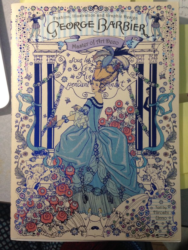
The book is the top Barbier hit on Amazon, though it is mostly in Japanese with some original French. Barbier was one of the top artists in France after World War I, but disappeared largely after his death in 1932, a fate that seems to happen to many of the commercial artists of this period. Blissfully, he is in ascendance, even if the most accessible manifestation at the moment is an unreadable rendition in metallic blue. The illustrations are good enough that that doesn’t matter.

IMG_2681

The book has hundreds of illustrations from what seem like a variety of sources. The impenetrable Japanese let my imagination run wild. Below are just three.

This slideshow requires JavaScript.

One inspired me rather directly. Can you tell? Time to take my scattered brain back into the world of inspiration.


Bookbinding once more!

There’s nothing like a cross-country move to raise one’s creative spirits. New words, new faces, and new ideas. But a big move also challenges order. Everything goes into boxes, and even when you bring it back out, it goes into a different room and belongs in a new place. Then everything in every other room is similarly displaced. And there are new restaurants and new people and new sights, and pretty soon, you’re hopelessly in disarray.

So last week, I finally fought back against entropy. For me, a good workspace has my favorite tools in arm’s reach, but never in the way. I set forth to accomplish that goal.

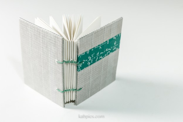
The ultimate test of a working space is simple—does it inspire work? Over the weekend, I tested my space. It does inspire. I made my first three books in New Mexico. They are relatively humble, but they are setting the tone for the work ahead.

I am inspired. =)

FullSizeRender 3.jpg

This slideshow requires JavaScript.

Painting with dark: books of night-themed art to inspire the high ISO photographer

Photography means “painting with light.” But how much light? Today, cameras are more light sensitive than ever, with ISOs up to 400,000 or even 4,000,000. Some have described cameras that can take video by the light of a candle as “painting with dark.” After discussing these advancements at a photo event yesterday, I found myself thinking about how that affects an image. If light is the exception rather than the rule, what kind of images could I create?

So I visited my bookshelf! And I found two art books themed around darkness and nighttime. In a future post, I’ll have to see how these inspiring books guided me. After all, it’s a great time of year to find guidance in darkness.

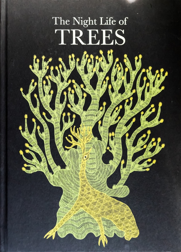
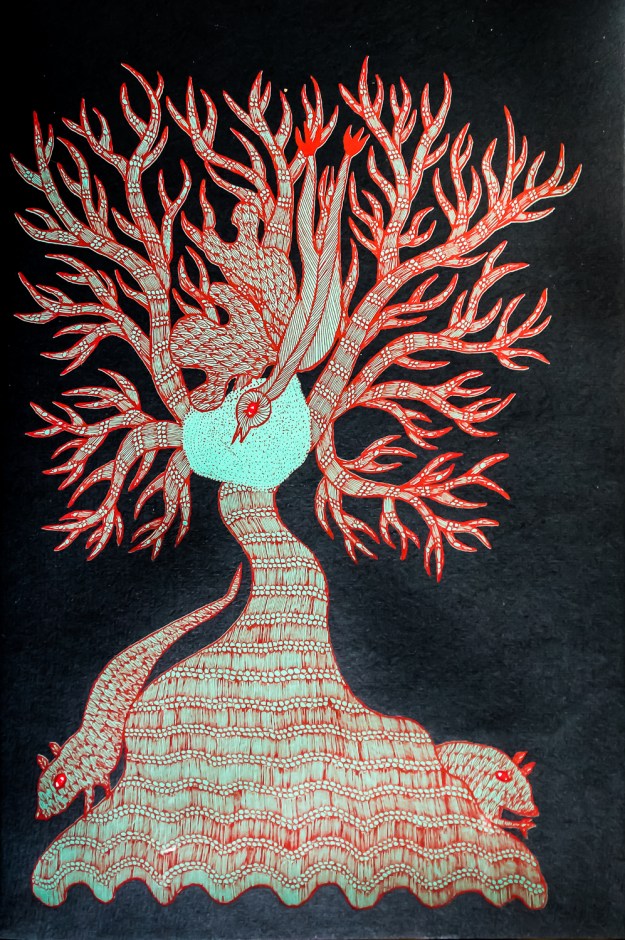
The Night Life of Trees by Bhajju Shyam, Durga Bai, and Ram Singh Urveti

This book is from Tara Books, a company that does beautiful and imaginative books. I also recommend Waterlife by Rambharos Jha, which I wrote about in a previous post. Both Night Life and Waterlife are silk-screen print books, which gives the colors and ink a life that other printing methods don’t match. Both books also smell amazing. (This sounds weird, but they just do. I don’t know whether it’s the ink, the paper, or both.)

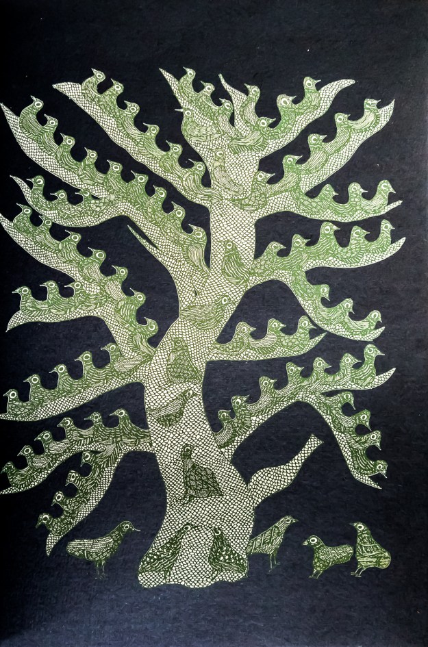
The Night Life of Trees is full of illustrations depicting just that—trees at night and what goes on in them. The images are screen prints on black paper, allowing the book to “paint with darkness” in a way that other books just can’t. Check out the beautiful images below.

160118-books-9437160118-books-9439160118-books-9438


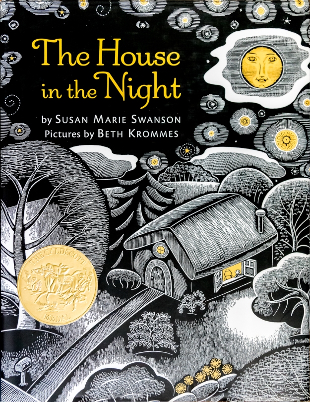
The House in the Night
by Susan Marie Swanson

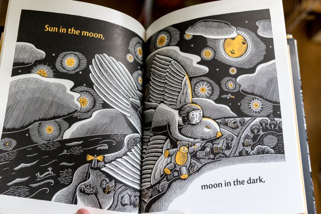
A children’s book with awesome art. Sometimes kids books have the best art because they keep it simple. This book is literally about light at night. I don’t think that needs too much explanation. Just check out the art, which incidentally mimics the woodcut style that I discussed last week.

160118-books-9440160118-books-9441

More bookbinding

Winter is a great time to look outside at the cold rain and bare trees and stay in and bind books instead. Below are three projects from last week.

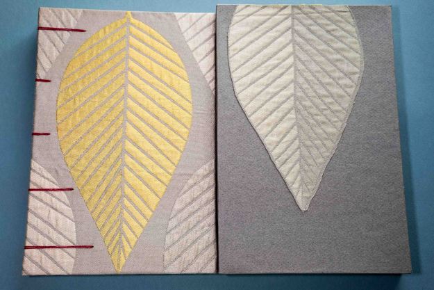
Book 1

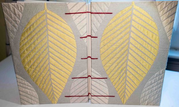
Upholstery fabric makes great book cloth. It’s thick enough that it doesn’t need backing paper to keep the glue from coming through. It’s substantial enough that it doesn’t tend to bubble or warp. And it often has interesting textures that work well for a book cover. I love the fabric for book 1, the way it fits on the cover, the feel, and the sheen. Upholstery fabric can be pricy, but the retail price is similar to prepared book cloth. The fabric for book 1 was an $8 remnant; this project took at most 1/5 of that fabric. That’s not bad at all.

I did a coptic stitch with red waxed linen thread. At $16 a spool, it’s pricey, but it is a lot of thread. I’d estimate one spool could sew very roughly about 50 books of this size.

bookbind-04005

I did my very first box for this project, following this set of videos for guidance. Sage Reynolds YouTube channel seems like an excellent source for book binding expertise. I’m sure I’ll be back there.bookbind-04049 bookbind-04048

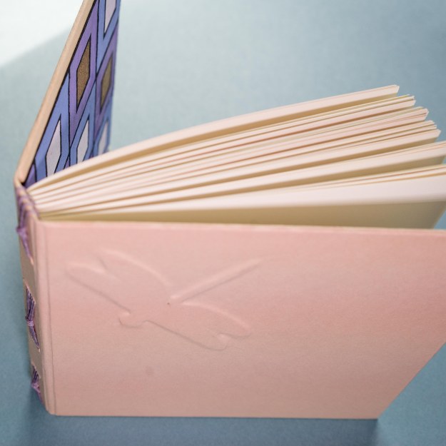
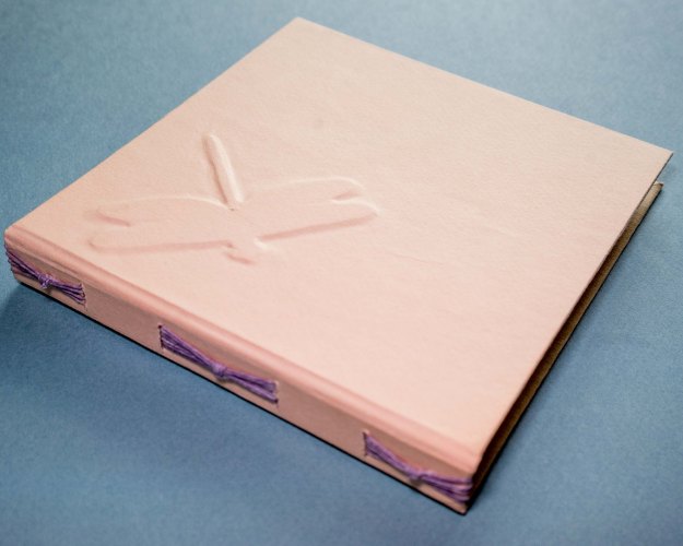
Book 2- Dragonfly journal

For Book 2, I did my first long stitch book. For this binding, you simply sew through the spine. It was quick and pretty painless. I added a dragonfly embellishment to the cover, which I designed in illustrator, and had my Silhouette Cameo cut out. Another use for a favored toy. (Read more on the Cameo.)bookbind-04040 bookbind-04037

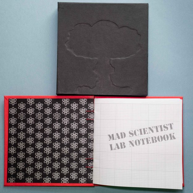
Book 3- Mad Scientist Lab Notebook

Book 3 features more raised details. Again, I did a coptic stitch. The endpaper I printed using the Silhouette Cameo’s art pen. It took a long time to draw all those paths, but I am in love with the result. The black slipcase (my second box!) features a mushroom cloud, cut with the Silhouette Cameo.

bookbind-04036

The cover features a radioactivity symbol. I’m really excited about the mad scientist theme, so I’ll probably do more of these.bookbind-04034

Diversity in Science Fiction: Some Diverse Reads

Science fiction often touts itself as the genre of the future. But science fiction is a reflection of today as much as it is a dream about the future. Science fiction has been too white and too male, both in authors and in protagonists. This is a reflection of the biases in our society.

My own top 20 sci-fi novels list features 18 books by white men, and two books by Ursula Le Guin. The Guardian’s list of top 500 scifi novels featured the names of 18 women. Any scifi reader starting out will hear about Asimov, Heinlein, and Clarke. Too many people get defensive when someone points this out. (See: the Great SFWA Shitstorm.)

The answer is to read widely, and to continue to read widely. So in that spirit, I list below some diverse science fiction*, some of which I have read, and some of which I ought to. For further reading, here is a great article listing a lot of great authors from the LA Times.

  • Lilith’s Brood by Octavia Butler: we destroy ourselves with war and aliens come in and save the survivors, mostly people from South American cultures who avoided the bombs. Oh, and the aliens want weird weird sex. A fun and weird read.
  • Windup Girl by Paolo Bacigalupi: A western man goes to future Bangkok. The native Thais and the genetically-engineered windup girl are the stars of the show, though.
  • The Three-Body Problem by Cixin Liu: One for me to read! A best seller in China, recently translated into English.
  • Downbelow Station and Cyteen by C. J. Cherryh: Distant future novels where women kick ass in militaristic and scientific settings, if you can get past the info-dumping at the front.
  • Who Fears Death by Nnedi Orakafor: Another for me to read! Far future, post-apocalyptic Africa.
  • The Miles Vorkosigan series by Lois McMaster Bujold: I have looked for these for years in used bookstores. I guess they fall into that awkward old-enough-to-be-out-of-print-, not-so-old-as-to-be-reprinted phase. They won a buttload of Hugos. And they feature a disabled protagonist.

*Note: I think it’s currently easier to find diverse fantasy. Maybe this is because it’s straightforward to use alternate mythology to Western mythology. I personally vastly prefer sci-fi. I think diversity in far future sci-fi is a challenge, because our whole concept of diversity is rooted in today’s culture. Just giving everything Chinese-ish names isn’t very satisfying. In LeGuin’s Left Hand of Darkness, Genly is black, but this isn’t relevant to the story at all. But I would like to see more female protagonists!


Three beautiful books that inspire

I’m always looking for design inspirations. Whenever I find myself in an art museum or an interesting shop, I always look to see what kinds of design books they have. Today I included three very different commercially available favorites in my little collection.

Waterlife by Rambharos Jha

A stunningly beautiful book by Indian folk painter Rambharos Jha. The critters come alive with the wiggling and colorful lines. Each page is silk-screened by hand onto hand-made paper. You can see the difference from ordinary printing methods immediately. Striking. This is also one of the best smelling books. Every time I open the book, the smell of ink and paper hits me, I’m looking at this book. My only criticism is that the binding method prevents the book from opening as flat as I would like. I love to look at this book when I’m trying to feel energy in my work.


beauty-books-02737beauty-books-02739

Carl Larsson’s A Farm: Paintings from a Bygone Era

A collection of 19th century Swedish painter Carl Larsson‘s farm paintings. His calendars are a staple with the Scandinavian branch of my family. His work makes me think a bit of Norman Rockwell– beautiful and flowing, but with crisp lines that give a feel of illustration. I love to look at his work for inspirations in depictions of the ordinary, the pastoral, the family.

beauty-books-02733beauty-books-02743

Radioactive: Marie & Pierre Curie, A Tale of Love and Fallout by Lauren Redniss

I previously reviewed this book here. I’m not in love with the writing in this book (see the review), but I am in love with the art. I love the way it connects to the science and is elevated by it. The typography for this book is also divine. Redniss even created a special typeface called Eusapia LR for this book, and it works beautifully. This book is an inspiration in marrying art and science.

beauty-books-02736beauty-books-02741

Some More Fun with Pop-Ups

I’ve written a few times about my interest in pop-ups on this blog. I’ve played around with making them and I’ve found some toys with which to make them better. But pop-ups can be hard, and after a lot of play, I found myself a little discouraged. I would try and try, but I wouldn’t seem to approach a working solution. I put my pop-ups aside for a bit.

Then, last weekend, I took a pop-up book class through a local club. The class was instructed by Carol Barton, who has written several pop-up instructional books, as well as produced several artistic pop-up books. We made dozens of pop-ups in the class, ranging from very simple to more complex. We talked about different kinds of folds and cuts. Some of my pop-ups worked, some didn’t. My classmates experimented too. Carol was an excellent teacher, helping us to think intuitively about the pop-up rather than strictly mathematically. I came out of the weekend feeling much more confident. I might still make mistakes, but I work toward a better product eventually.

Below are some of my pop-ups. The two most complex pop-ups are ones I’ve worked on this last week. The last three ones I made in a few minutes in the class with scissors cutting by hand.

If you are interested in learning to make pop-ups, I recommend Carol’s books in the “Pocket Paper Engineer” series. They have excellent illustrations and explanations. Even better, they have pages for you to cut out and work on pre-designed pop-ups. These pages show you all the techniques of pop-up books, starting at the most simple and becoming more complex.

popups-00500

My big project this week: the Old Courthouse and the Arch in St. Louis. I programmed this in Illustrator and used my Silhouette Cameo to do the cuts.

popups-00499

Preliminary work on a pop-up of UVA’s Rotunda.

popups-00491

A simple saddle pop-up, cut by hand in class.

popups-00489

A pop-up made of a series of box pop-ups. It looks fancier than it is– it took no planning and only a few moments of snipping and folding to make.

popups-00487

A series of box folds to make a very simple yet in my opinion really interesting pop-up.