Category Archives: Illustration

M.C. Escher: revisiting a familiar name

M.C. Escher and Salvador Dalí are two of the greatest reality-bending artists. So, fittingly, the Salvador Dalí Museum in St. Petersburg, Florida recently hosted a special Escher exhibit. I’ve visited the Dalí collection many times, but I’d never seen Escher in person.

I had many Escher calendars as a kid. When I took crystallography, we studied the symmetries in Escher’s tessellations. I’ve always been interested in design and mathematics, and Escher is the purest intersection of the two. I was ecstatic to see the exhibit.

Before the exhibit, I was most familiar with Escher’s lithographs. Without too much elaboration, lithography is a high-fidelity technique which allows the artist to produce an image that is not directed by the mechanics of printing (I’m sure the method does direct some artistic choices, but as a non-expert, that’s my rough take on it).

The exhibit contained many of Escher’s woodcuts, which were new to me. Woodcuts are make by carving a plate of wood, coating the plate with ink, and pressing the plate to a page. The page will be white where the wood has been cut away and the page will be colored where the wood remained. Woodcuts have a distinctive style–they cannot render colors in between white and ink color. Multiple colors can be achieved with additional pressings, but the technique is inherently color-limited.Additionally, the resolution of the print is limited to the fidelity of the wood. These two aspects give woodcuts a distinctive artistic feeling. If you can’t tell, I’m currently a little in love with woodcuts.

Escher died in 1972, but thanks to Disney, his works remain out of the Creative Commons. However, I am allowed to use low-resolution works for discussion purposes. You’ll have to buy books if you want anything with much detail, though. Below are a few of my favorite Escher images that are available through Wikipedia, as I have linked them under the image.

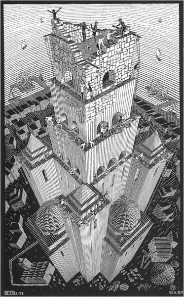
Some of Escher’s early works were illustrations. There was a beautiful cathedral, half underwater. There were evil-looking creatures in forests. It was such a romantic side to an artist most think of as a master of geometry. Below is an example of one of his illustrations. Even though it’s of a conventional subject, the Tower of Babel, the perspective is beautiful. I love the lines; this work just wouldn’t be whole using a method besides woodcut.

Below was Escher’s first impossible reality. And look, it’s a woodcut! Hooray!
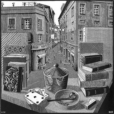
escher2c_still_life_and_street

Still Life and Street: Escher’s first impossible reality

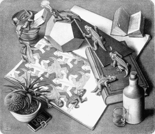
Below is one of Escher’s more famous images. It is a lithograph printing. See how various tones of gray are possible with this technique, as well as high-fidelity. It lends this images a very different tone than the one above. The lizard design is called a tessellation. Tessellations are plane-filling patterns. They occur in nature and area subject of mathematical study. Escher was inspired by the tiling work at the Alhambra in Spain, another example of tessellation.

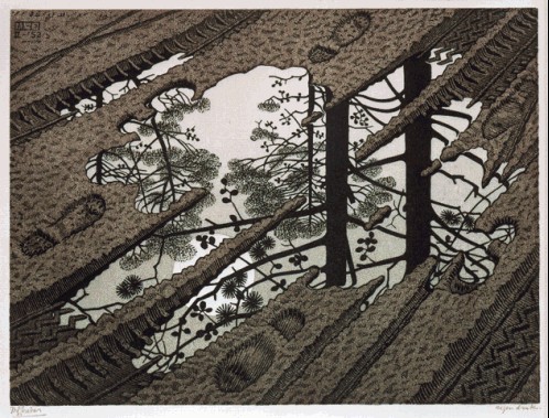
Below is another Escher woodcut, done with several plates to achieve multiple colors. Even when Escher wasn’t exploring impossible realities of geometry puzzles, he chose interesting perspectives.

Book now with the Exoplanet Travel Bureau

(You may have a wait while the technology for your flight is developed.)

A lot of my first reading as a child was astronomy books and magazines. When I was little, my brother told me there was a black hole under his bed (to keep me from snooping—nerd children fight dirty), and after that, I had to know more about the enigmatic and alarming properties of the universe.
One of the things I remember was the hunt for the first exoplanet, that is, the first confirmed planet outside of the solar system. Scientists were quite sure they should exist (why wouldn’t they?), but the equipment and techniques thus far hadn’t shown them. I remember reading about some of the first exoplanets in the hazy early 90s. They were massive, close to their stars, and had outrageous properties that inspired wild imaginings.
Now confirmed exoplanets number in the thousands. And poking around the internet on an unrelated chore the other night, I found this gem: the Exoplanet Travel Bureau. NASA’s Jet Propulsion Laboratory (the extremely prestigious and awesome JPL) made travel posters for four exoplanets in the style of retro travel posters. Each of them features characteristics of their planet. I promptly printed out three and hung them in my guest room. I’m still ecstatic about them; these are the kinds of visions and dreams I had so long ago as a kid, and that I love to chase in my own art. These are awesome, and I love them, and you can download them at full size. Tell all your friends, and print your own! Here they are!

Click on the image for more image sizes. Images by the NASA Jet Propulsion Laboratory.

Click on the image for more image sizes. Images by the NASA Jet Propulsion Laboratory.

Click on the image for more image sizes. Images by the NASA Jet Propulsion Laboratory.

Click on the image for more image sizes. Images by the NASA Jet Propulsion Laboratory.

Water Polo Designs & T-shirts

Is there any greater joy in art than seeing a project through and sharing it with others? I designed some water polo t-shirts, and finally they have arrived. They look phenomenal!

Plus, it’s a great joy to design for water polo. It’s a small sport. Maybe you’ll see a neat poster for the Olympics, but that’s about it. The women’s game is especially short on designs. This year, I took my design inspiration from art deco sports posters and the National Parks vintage poster series.

Art Deco poster style

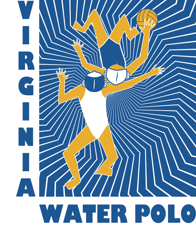
I wanted to convey the sense of motion I like in the art deco posters. The curve of the water surface suggests energetic water. It could also suggest the curve of the ocean.

Vector artwork for t-shirt

Vector artwork for t-shirt

tshirts-04810

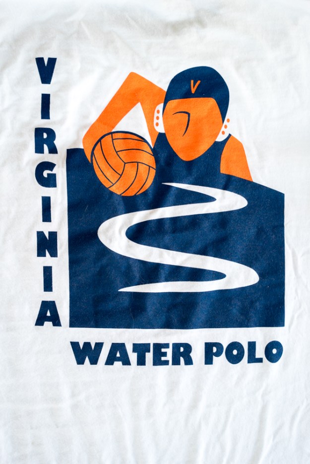
Final t-shirt result

design1

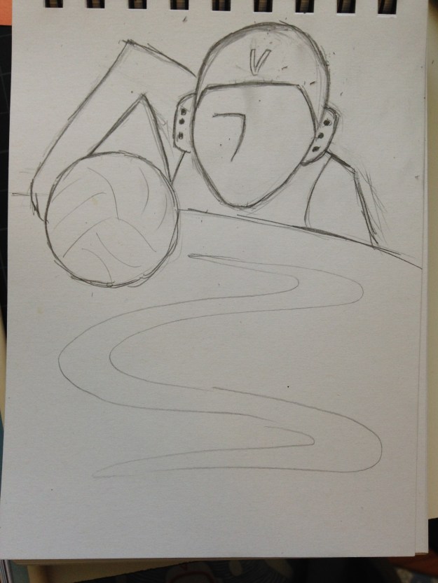
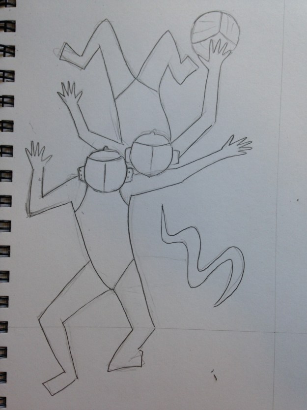
Source pencil drawing

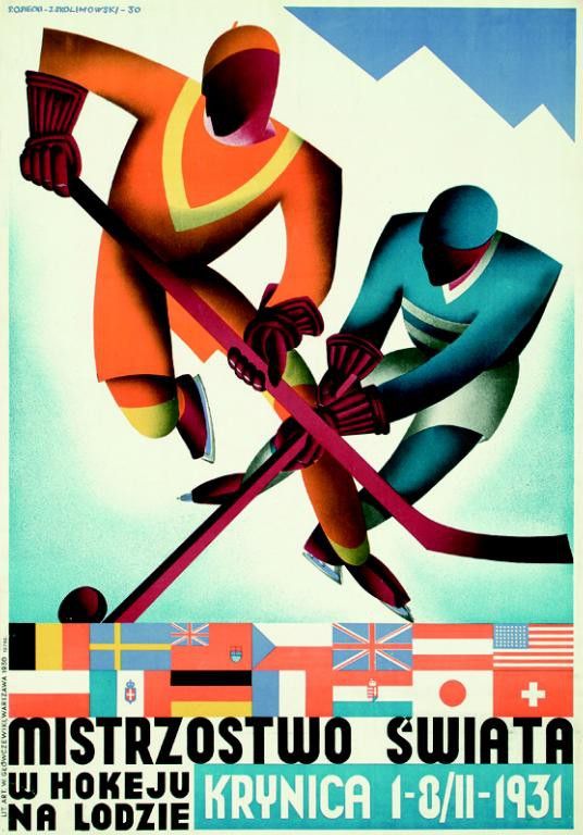
Below: An art deco poster I particularly found inspiring. Early versions of my design incorporated gradients to suggest form, as in this poster. In the interests of simplifying printing, I chose to go with two colors.

Mistrzostwo Swiata: Krynica by Stefan Osiecki and Jerzy Skolimowski, 1930.  For the 1931 Ice Hockey World Championships in  Krynica, Poland.

Mistrzostwo Swiata: Krynica by Stefan Osiecki and Jerzy Skolimowski, 1930. For the 1931 Ice Hockey World Championships in Krynica, Poland.

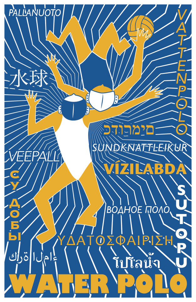
Below: an alternate idea. Like basketball, a lot of action in water polo happens at the center position. Unlike basketball, the offender and defender stay relatively fixed, facing away from the goal. The offensive center wants to turn forwards or backwards to take the shot. The defender waits to react. I hoped that the slightly disjointed postures suggested depth or motion.design2 text-01

Design made into a poster. Perusing Wikipedia, I discovered that water polo has a surprising variety of names for a sport invented only about a century ago.design2-poster-01

Original pencil sketch. Eventually dropped the water ripple and turned it more geometric.design2

National Parks poster style

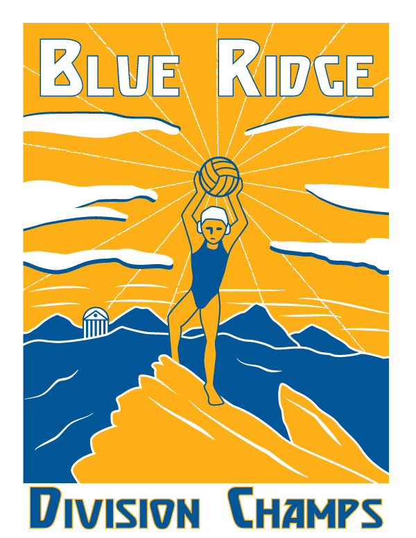
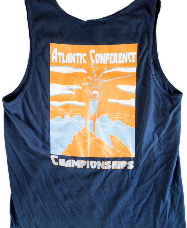
All the teams in our water polo conference, the Atlantic Conference, are in North Carolina and Virginia. Three out of the five are close to the Blue Ridge Parkway, and none are coastal. This gave me the idea that the conference could be thought of as the Blue Ridge Conference.

The championships this year were held in Charlottesville. Humpback Rocks are a popular hiking destination along the Blue Ridge near Charlottesville. People often hike Humpback rocks at sunrise to get the view of the Rockfish Valley. This fell quite naturally into a vintage style poster look.

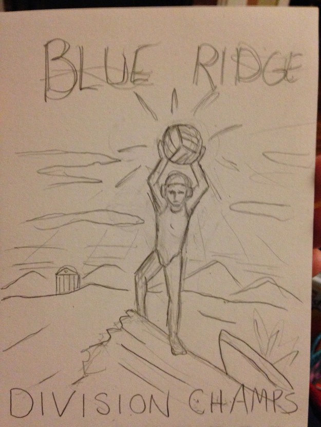
This design was a super rush job. I drew the sketch at 10PM before the deadline the next day. The next morning I vectorized it. The shirts arrived a week later. I probably now would choose to make the figure white, for better clarity at a distance, but I still like the design.

Blue-ridge-tee

They didn’t go for my conference renaming. =Ptshirts-1774

Original sketch.IMG_0769

One of the national parks posters that inspired this design.

Three beautiful books that inspire

I’m always looking for design inspirations. Whenever I find myself in an art museum or an interesting shop, I always look to see what kinds of design books they have. Today I included three very different commercially available favorites in my little collection.

Waterlife by Rambharos Jha

A stunningly beautiful book by Indian folk painter Rambharos Jha. The critters come alive with the wiggling and colorful lines. Each page is silk-screened by hand onto hand-made paper. You can see the difference from ordinary printing methods immediately. Striking. This is also one of the best smelling books. Every time I open the book, the smell of ink and paper hits me, I’m looking at this book. My only criticism is that the binding method prevents the book from opening as flat as I would like. I love to look at this book when I’m trying to feel energy in my work.


beauty-books-02737beauty-books-02739

Carl Larsson’s A Farm: Paintings from a Bygone Era

A collection of 19th century Swedish painter Carl Larsson‘s farm paintings. His calendars are a staple with the Scandinavian branch of my family. His work makes me think a bit of Norman Rockwell– beautiful and flowing, but with crisp lines that give a feel of illustration. I love to look at his work for inspirations in depictions of the ordinary, the pastoral, the family.

beauty-books-02733beauty-books-02743

Radioactive: Marie & Pierre Curie, A Tale of Love and Fallout by Lauren Redniss

I previously reviewed this book here. I’m not in love with the writing in this book (see the review), but I am in love with the art. I love the way it connects to the science and is elevated by it. The typography for this book is also divine. Redniss even created a special typeface called Eusapia LR for this book, and it works beautifully. This book is an inspiration in marrying art and science.

beauty-books-02736beauty-books-02741

Fun and inspiring: The Library of Congress online archives

My trip to the Library of Congress building later led me online to explore their equally amazing catalog of images. They have thousands of high-resolution images, from baseball cards to Japanese prints to Spanish civil war posters. And that’s just the prints and photographs section.

I preferred the collection of WPA posters. They combine beautiful design with period topics that can seem wacky today. Ride the El! Get tested for syphilis! Beat the Germans! Children’s piano competition! Over 900 governmental exhortations paint a vivid picture of 1930s life. I was amazed by the number of posters for illness: tuberculosis, syphilis (31 posters alone!), diphtheria, scarlet fever.

The posters are also great sources of design inspiration. Most have playful typography and engaging graphics. Many of them are available as high-resolution TIFFs, so you can print them out and have instant decor. My bathroom now has posters about syphilis and pneumonia. I’m sure my guests will feel safer.

And without further ado, some favorites:

As old as creation, Syphilis is now curable.

pneumonia strikes like a man eating shark led by its pilot fish the common cold.

The Art Institute of Chicago international exhibition of water colors

An orderly line is a safe line!

Stop and get your free fag bag– careless matches aid the Axis.

14th Illinois Cattle feeders meeting.

The slow and steady

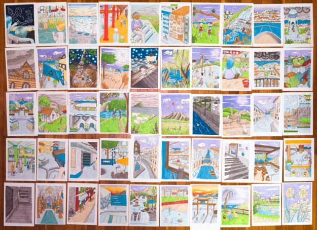
Over six months ago, I challenged myself to do 100 illustrations of my city of Vironevaeh, the fictitious city that is the unspellable namesake of this website. I would build my world in myriad ways, practice art, and create some beautiful scenes. On Thursday, I finished the fiftieth color image. I have images of city streets, markets, pets, agriculture, constellations, architecture, pastimes, clothing, family, and weather.

50-74


Eventually, I will have descriptions for each of them, and a place on the map. Eventually there will be at least 50 more. It’s a lot of work to do for something that probably won’t mean much to anyone besides me. But Vironevaeh is a city at my side for over 17 years, and it will mean a lot to me. I am so pleased with my progress. Here are a couple of my favorites:

006-small

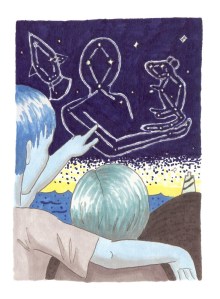
A man showing a child constellations in the sky. These constellations are of Abenn the hermit and Peep the mouse, who hid away on Neva the spaceship. These legendary figures are the subject of my recent and free fairy tale The Lonely Man on the Ship. Sharp eyes may note that the people here are blue and green.

008-small


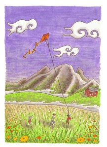
Children running with a kite in the countryside. A pretty typical scene even here on Earth, except for the lovely purple Vironevaehn sky. Also the fact the fog in the valleys behind them could be brain-eating. All in normal day!

Soon I’ll bind up a little fun book of my favorite ten illustrations, but for now, I’m basking. Onto the next milestone!

Another Fairy Tale at last


When I released my collection of science fiction fairy tales, it was the start of a push to creatively engage with the world. I finally finished a project and put it out there, doubtless non-perfect like everything. Since then, I’ve submitted my short works nearly 90 times (with 3 acceptances). I’ve joined a writing group and participated in critiquing groups to work on my writing. I’ve studied Adobe’s Photoshop and illustrator, and recently painting, to improve my artistic skills. I’ve studied Indesign and book layout. I started posting regularly on this site, as I have for nearly two years now. The first set of fairy tales started all of this self-improvement.

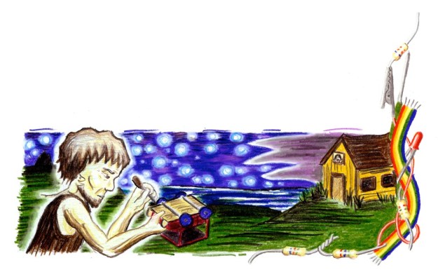
I always intended to do another collection of fairy tales. I recently finished the first story, “The Lonely Man on the Ship”, about a man trapped alone for years on a spaceship during  terrible storms. I did the art with Prismacolor color pencils (which I intend to use for the rest of the eventual collection).

Now I’m coding the fairy tale for the kindle. Once I do, “The Lonely Man on the Ship” will be available free on the kindle and on the iPad. Much of the last two years’ studies has gone into this work. I used Indesign and illustrator for layout work. I used Photoshop to make sure my scanned art work was as attractive as possible. I think the writing is stronger than in the first fairy tales. As the first fairy tales inspired new studies, to release this work properly I’m learning CSS and HTML coding.

So until I finish this last step, enjoy a couple of illustrations!

abenn_ghost-small letterhead-small

Playing with paint and color

For years, I’ve played with paint and markers and colored pencils. After taking tutorials this summer for Photoshop and illustrator, I was astonished at how much I learned in a short time, and how much I hadn’t known from years of aimless experimentation. I realized– I must have similar gaps and oversights in other self-taught areas.

So I am taking a watercolor painting class. I’ve learned a ton, had fun, and been inspired in other artistic endeavors as well. The excitement of this class has re-energized my work on a second set of fairy tales. And I just signed up for a pop-up book class in August!

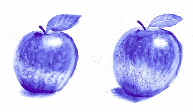
Week 2: Painting with one color from a photograph. Focusing on value and texture and mark-making. Sometimes I’m afraid to take risks painting, where there isn’t an undo button and sometimes your choices just don’t look good. In these, I tried techniques involving gouging the paper, spattering the paint from the brush, and painting wet-in-wet.

apples-small

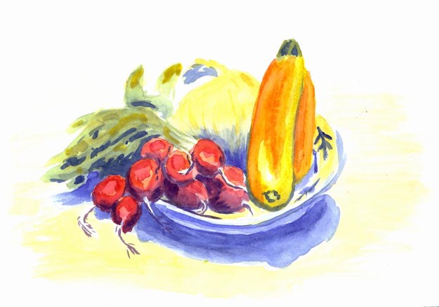
Week 3: Still life. To start this painting, we painted the bright parts of the composition with a warm color (I chose the yellow on the tabletop though orange and red can be appropriate choices too) and the shadows with a cool color (a less intense version of the shadow under the bowl). Sunlight is warm compared to the cool shadows it casts, so painting these casts evoke such settings. Then the brighter colors go over these washes, with more illuminated regions taking warmer casts and more shadowed regions taking cooler casts.

fruit plate-small

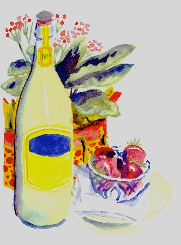
Week 4: Still life (still in progress). In this painting, we chose another painting to emulate, and tried to style our still life after this painting. (I would post this image, but I really have no idea as to the copyright implications.) To emulate my choice, I 1) tried to keep objects as more simplified shapes rather than intricately detailed and 2) planned for certain regions to be brightly painted, and others to pull most of the paint off after I applied it. All the red in this image is bright as are the labels of the bottle and the box. The bottle glass and the bowl glass I washed out. To finish this piece, I still need to add a bit to the napkins and plate under the bowl. I want to do this with comparatively little paint, and to allow to the eye to fill in the negative space.

still life-small

Playing with Paper Cutting on a Silhouette Cameo

On Friday, my Silhouette Cameo came in the mail. This device cuts paper according to an image file; analogously, a printer lays down ink according to an image file. Until a couple of months ago, I had no idea that such a device existed, but now I am full of ideas for it.

When I researched the Cameo online, repeated complaints spoke of how useless the software was. The software that ships with it is woefully inadequate, and, from what I could see, only much good for making circles and rectangles. Silhouette has a wide variety of templates available for purchase, but I don’t want to pay for everything I print, and I want to design my own things.

Fortunately, there is a plug-in available for Adobe Illustrator that allows you to build vector graphics in Illustrator and then export them to the Silhouette Connect program. Unfortunately, this plug-in costs $40. However, to use the machine properly, this plug-in is basically a must, so I treated it as part of the purchasing cost. This plug-in only came out in December, and the previous plug-in was apparently quite out of date.

With this plug-in, I found the Cameo really easy to use. For comparison, it is much easier to work with than a basic desktop printer. You just set the blade to a height appropriate for the paper (thick card stock will obviously require a taller blade than thin printer paper), export the vector graphic to Silhouette Connect, and select the layer you want to cut based upon. You can cut around printed designs; you simply have to include some marks on the print out to help the Cameo optically align.

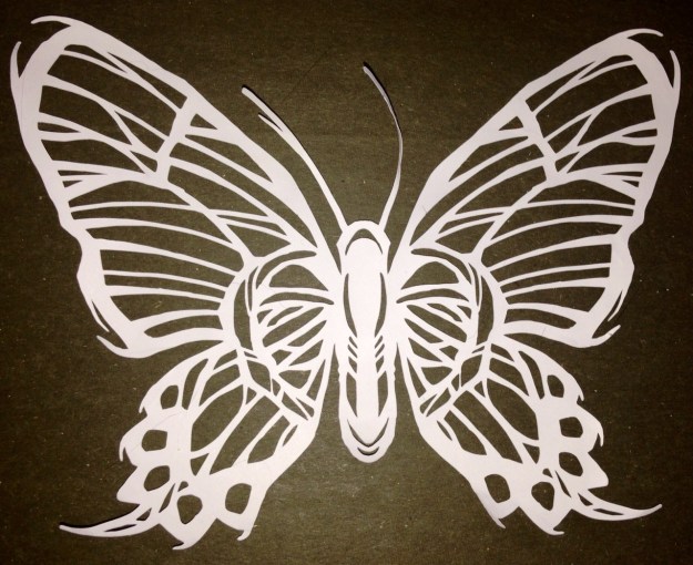
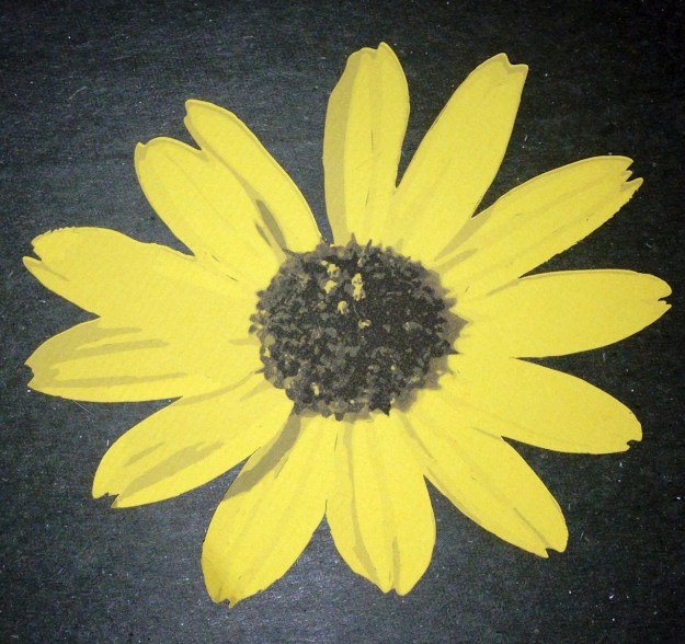
So, below are some of my first works. The butterfly is not my own design work, but came from a Lynda.com tutorial video; it seemed like a robust test of the Cameo’s accuracy. The second has a design printed onto a yellow background which was then cut out by the Cameo.

photo 1-1 photo 2-1


There are tons of exciting options for the future. I mentioned my enthusiasm for pop-up books many months ago, but it was too hard to reproduce the work. Now the process of making copies is easy. Additionally, I have always loved paper dolls, which seems right up the Cameo’s alley. I admire bookbinding techniques that allow interactions between the pages through cut-outs; this device is perfect to obtain the reproducible results I would want.

Final conclusion… this thing really makes me want to get a CNC machine.

Or at least a 3D printer.

Nationality Rooms at the Cathedral of Learning

This weekend, I went to the Cathedral of Learning in Pittsburgh. Among other things, this gothic skyscraper contains 29 nationality rooms–each of these rooms is decorated intricately in the design of a nation. The first 19 were built between 1938 and 1957, with ten built since 1987. The Turkish and the Swiss classrooms were dedicated in 2012, and several more are planned. If you are in Pittsburgh and have any interest in craft or design, I can’t recommend visiting enough.

To visit the classrooms, you can check out a key at the desk, or take a tour with a guide. We rented a key. Visiting each room felt like a treasure hunt; each room was so different, and full of intense detail. Each room had special walls, windows, ceilings, chairs, lecterns, and chalkboards. Even the light switches and doors were in style. Many contain intricate wood or stone carvings, or genuine artifacts. Most were designed by architects of the country.

You can learn more on the University of Pittsburgh website about the nationality rooms. This page allows you to virtually tour each room.

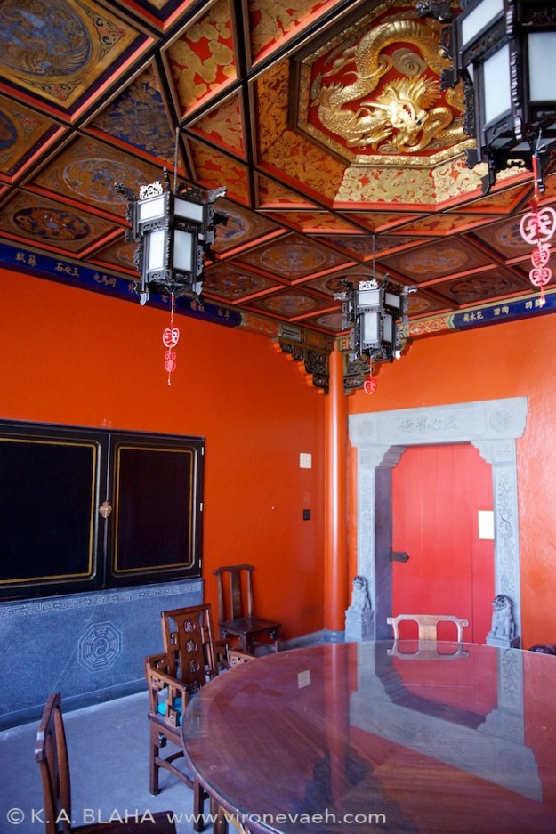
The Chinese nationality room.

The Chinese nationality room, dedicated in 1939.

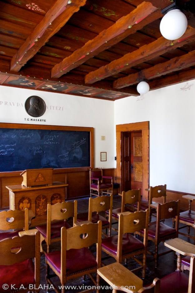
The Czechoslovak room, dedicated in 1939. This room contains a letter from the first President of Czechoslovakia, Tomáš Masaryk, to the students of the University of Pittsburgh.

The Czechoslovak room, dedicated in 1939, 8 days before the Germans invaded in World War 2. This room contains a letter from the first President of Czechoslovakia, Tomáš Masaryk, to the students of the University of Pittsburgh. His son, Jan, spoke at the dedication of the room, foreseeing trouble in the future. Page 4 of this document details the interesting connection between Czechoslovakia and Pittsburgh.

The Hungarian room was dedicated in 1939.

The Hungarian room was dedicated in 1939.

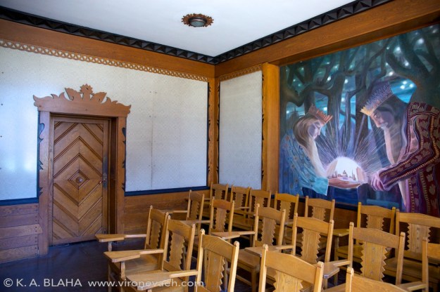
The Lithuanian room, dedicated in 1940. The walls are woven from linen in the "The Path of the Birds" design. Between the angular, abstract carvings and the painting and the walls, this was one of my favorite rooms.

The Lithuanian room, dedicated in 1940. The walls are woven from linen in the “The Path of the Birds” design. Between the angular, abstract carvings and the painting and the walls, this was one of my favorite rooms.

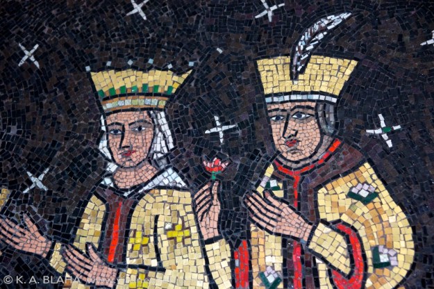
A detail from the Romanian room, dedicated in 1943. The style of this mural on the back wall reminded me of the opening of Beauty and the Beast.

A detail from the Romanian room, dedicated in 1943. The style of this mural on the back wall reminded me of the opening of Beauty and the Beast.

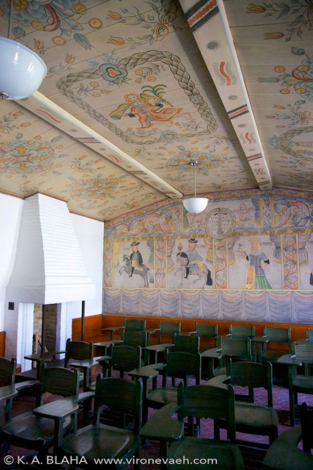
The Swedish room, dedicated in 1938.

The Swedish room, dedicated in 1938.

The Yugoslav room, dedicated in 1939. The carving in this room, called "notch carving" was simply amazing.

The Yugoslav room, dedicated in 1939. The carving in this room, called “notch carving”, was simply amazing.

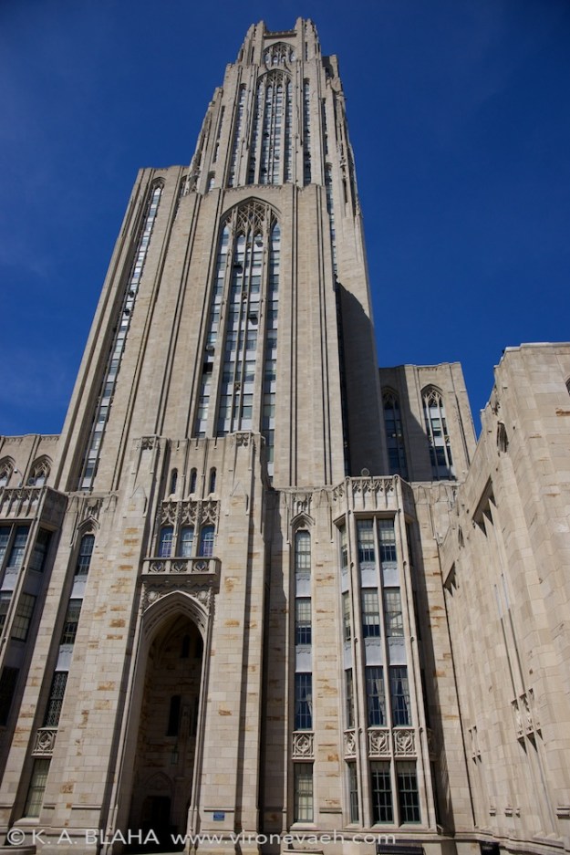
The cathedral of learning, exterior.

The cathedral of learning, exterior.

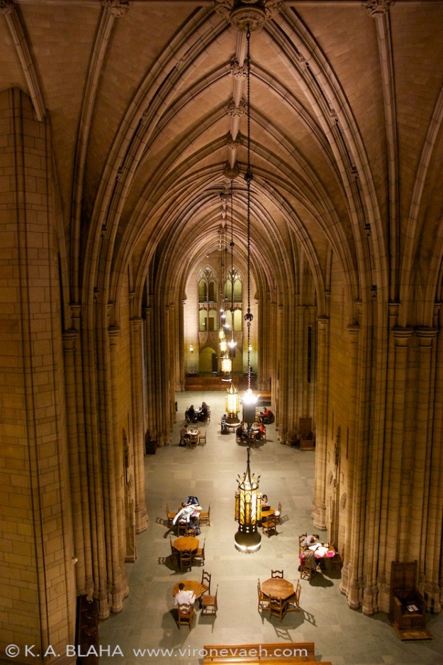
The main hall of the cathedral of learning.

The main hall of the cathedral of learning.

The main hall of the cathedral of learning.

The main hall of the cathedral of learning.