Tag Archives: art

Zish and Argo Artwork

My biggest goal over the holidays was to complete painting for the Zish and Argo book. Last night I finished the last painting! Hooray! Champagne! Zish and Argo has 13+ full size color illustrations, painted in water colors. The picture below shows the ones I finished during the holidays. For reference, they are about 8 inches tall. In the next couple of weeks, I will pull together the art and put up book details. The featured image shows the tentative cover that I just finished as well.

Tomorrow I head back north to new projects and adventures.

SONY DSC


Artists: Walter Crane

I love to go to art museums to new style ideas. On a recent trip to the Virginia Museum of Fine Arts (VMFA), I visited the art nouveau section and saw a piece by English artist Walter Crane:

Walter Crane plate at VMFA.

The plate mentioned that Walter Crane did children’s books.

So I went home and ordered a couple of his books. A Floral Fantasy in an Old English Garden anthropomorphizes the flowers of the gardens in beautiful art nouveau fashion. Below is a photo of one of the pages. This page depicts bachelor’s buttons. All the little details, down to their boots, are done to match the characteristics of the plant. Another panel shows a battle between a thistle knight and a snapdragon. Walter Crane has several children’s books besides this one. Since Walter Crane died in 1915, his works have entered the creative commons, and they can be had very cheap, especially digitally.

photo

Walter Crane also did more adult works. Neptune’s Horses reminds me of the scene in Lord of the Rings where the elf summons up the waters to fend off the nazgul, but it was painted over a century before.

Soviet Holiday Cards

Boingboing had a cool post yesterday about Soviet “Christmas” cards. Actually most of the cards say “s novum godom”– “to the new year”. I love all the science and rocketry themes. I also find it interesting how many things we associate with Christmas have been co-opted for a holiday the soviets found safer: New Year’s. You can find the original website for the cards here. Below are a few of my favorites, which can all be found at www.mazaika.com/postcard01.htm.


A little on watercoloring

This week I am spending most of my time painting the line-art from The Galactic Adventures of Zish and Argo. One of the things I really like about watercolors is that they travel well. I’m on the road for the next couple of weeks, but it is just as easy to paint here as it is at home. A major reason for the portability is the type of materials I use. I bought a Windsor-Newton field box set several years ago, pictured below. At $50, you might experience a bit of sticker shock. I’ve only recently had to start replacing pans; it lasts and lasts.

I have used the liquid watercolors as well. I find I enjoy the quick set up of the solid colors. There is no need to dole out paint as you go, and you only use what you need. Plus it’s easier to travel with. The solid paints can still deliver good intensity and brightness. I roll all my brushes up in a bamboo case like this one, and then I’m ready to go anywhere and paint anything. If you have a pigment-ink printer, you can economize on your watercolor paper by selectively choosing what you print. I discuss that more in an old entry, here.

I read a watercolor book a few years ago that I found helpful as well: Watercolor Tricks and Techniques, by Johnson. If you are curious, it is worth a look.

So there are 13 paintings for the core of the Zish and Argo book. I have 7.5 paintings done, so I’m over halfway! The Robotoids say hello!!robot

Paper engineering (AKA: pop ups!)

Everybody love a pop-up book. The well-executed ones are a thing of joy. I got a pop-up book as a kid about dinosaurs, which I didn’t care that much about, in French, which I didn’t read. I read that thing to its grave.

Recently, I see more pop-up books in stores, aimed at more than just children. These books are made by not artists, but paper engineers. As an engineer, I approve of this shift in language. Perhaps I should strive to be a word and paint engineer, rather than writer and illustrator. A few years ago, I bought Moby Dick, as done by paper engineer Sam Ita. Amazon lists a few of his books here. He even has a pop-up Xmas tree, if you’re still looking. His Moby Dick is wonderful, with whirling whirlpools and ships complete with rigging and a looking-glass.

I have started my own attempts at pop-up (shown below). A fun project, but one on hold for now because I’m not sure how to put them together with any kind of efficiency. If you’re interested in learning about pop-ups, I have used a few books to guide my exploration:

popupHappy paper engineering!


Artists: Thomas Hart Benton

Previously I have talked about depression era posters and Soviet propaganda posters. Thomas Hart Benton was a depression era painter and muralist from southwest Missouri. Growing up in St. Louis, I was exposed to his art from a young age. His shading brings the people in his paintings to life. He often depicts scenes of work, as suits the depression. (Both of the images in this entry can be found on Wikipedia.)

Cut the Line (Wikipedia)

If you for some reason find yourself in Jefferson City, Missouri (unlikely), the capitol building has many of his murals. Then stop by Central Dairy, where you can get a pile of amazing ice cream for very little $. Then you have seen all there is to see in the illustrious capitol.

Summer is gone, waiting for spring

Tomorrow is the first day of December. In the last week, the last of our colorful leaves have fallen. Even the confused daisy shrub in my yard is no longer in bloom. The daylight is short, and the foliage is bleak. This time of year, I love to review photos from more colorful times. The colors will be back before very long. Starting in February, the Lenten roses and the crocuses will return. Until then, photos can be our flowers. Every year when spring breaks, I walk through the gardens at least once a week and see what new flower has opened.

Check out my Flickr feed for thousands of other photos. 95% of my Flickr photos are fair use for non-commercial purposes, so feel free to use them, but please attribute and link to my flickr.  Most of all I love seeing where my photos get used. (Side note: the first picture on the Wikipedia swimming article is mine. That’s neat!)

Here’s some color for your Friday.


SONY DSCSONY DSCSONY DSCSONY DSCSONY DSC

Style: Soviet Propaganda Posters

The 20-40s really seem like it was a golden age for illustration. Color photos were not as vibrant as they are today, yet mass printing existed. Thus, beautiful and stylized portraits of life were used in advertising and propaganda (Alphonse Mucha did lovely art nouveau illustrations for advertisers since the late 1800s, I wrote about him here). Many of us have seen the posters created for the Great Depression and WW2 by artists such as Thomas Hart Benton.

When I visited the Czech Republic, Budapest and East Berlin, I was struck by their propaganda posters from the same period. There was such a contrast between the lovely illustrations and the content that we would likely find oppressive. It can be a window into history to understand how people chose (or were forced into) their path. For good collections of Czech or CSSR Propaganda, check out the Communist Musuem in Prague and Checkpoint Charlie in Berlin. The featured image for this post is the poster for the Communist Museum; one of my souvenirs from Prague are some nesting dolls with this design.

To have more we must produce more (Wikipedia)

The Czech, Hungarian, and German posters seem hard to find, and I only know the languages a little (if anyone knows good sources, let me know!) I find the role of small countries in the early 20th century especially interesting since they are underrepresented. The countries of central Europe endured many of the worst hardships during the 20th century. There are many sources for Russian propaganda posters:


10 years since the revolution


Getting creative with a printer

Last year I got a medium format pigment printer (epson r2000). With research, you can get a decent deal on these kinds of printers. I purchased mine for $300 (with rebate) while it now lists for $550 (but remember, the ink is always a swindle). If you know how to use color profiles and tune your screen’s color, these printers can be a ton of fun. Printing photos was the main motivation for my purchase, but the other less expected uses have been equally exciting.

Watercolor painting and pigment printing

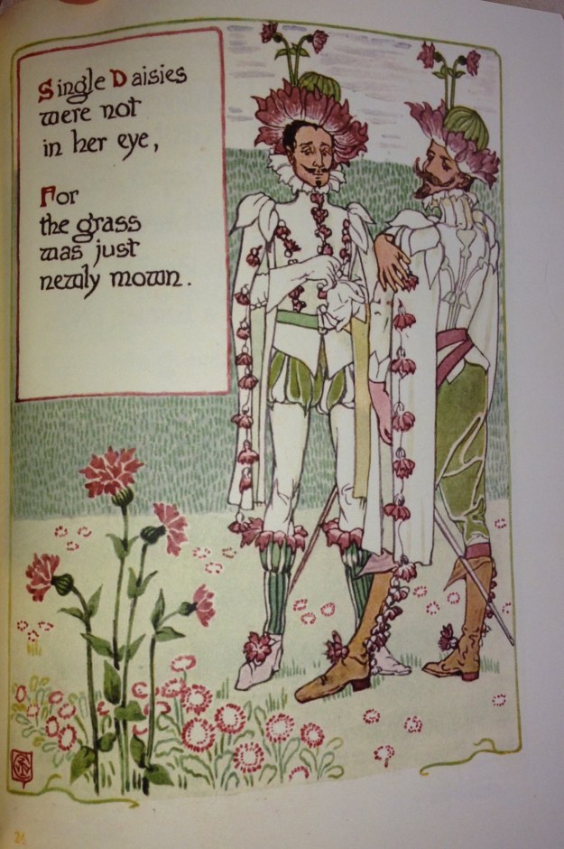
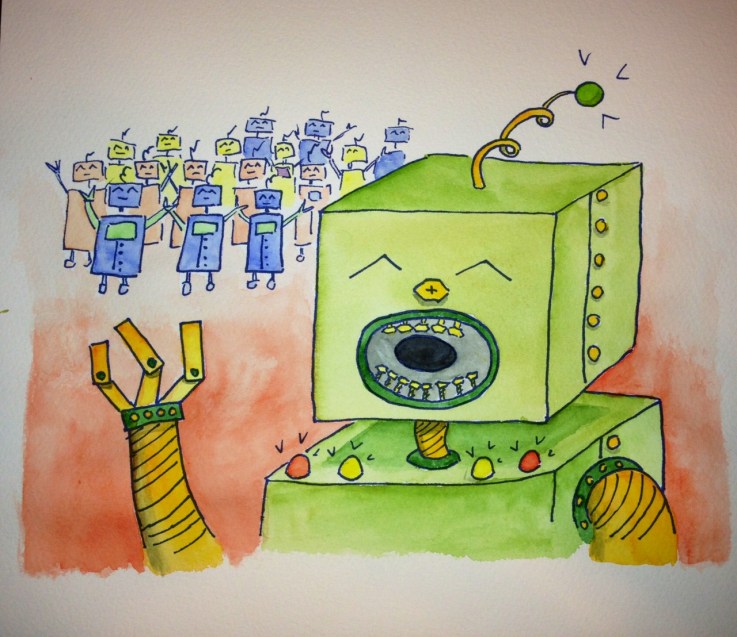
Pigment inks are waterproof after they dry. Long ago I learned the hard way that normal ink jets are not waterproof. This feature of pigment inks has helped my watercolor process immensely. Now I can do line art on low quality paper. Then I scan the line art in and I can digitally fix it. This can mean a number of things: I can remove a badly placed stroke, or I can rearranged items in space. For the Zish and Argo stories, I did preliminary line art, and moved things to satisfy the needs of the page layout.

Once the line art is optimized, then I can print to the expensive watercolor paper. I probably only use half of my preliminary line art, which is an awful waste of premium watercolor paper. But now I can be efficient. Printing line art is additionally attractive because it uses little ink. Additionally, I can print several copies, and have several chances to get my work just right. I did the featured image art using this procedure.

Printing on fun materials

The printer can also print to some fun surfaces. It can print to basically anything you feed through it, like poster board, wood, foam board, canvas, or other sufficiently heavy fabric. Obviously, it can also print to any sturdy paper as well (I print frequently to drawing and watercolor paper).

I recently did my first project printing to canvas. I then used this canvas to cover a book, shown below. This canvas is also designed to stretch over a frame like any canvas.

Any additional ideas on creative printing? There’s nothing better than using a tool on hand in a different way.

Style: Art Nouveau

My favorite style is art nouveau. I first learned about art nouveau when I was living in Prague. The works of Alphonse Mucha, a prominent Czech art nouveau artist, remain throughout the city. There is a museum of his various prints and a few paintings, that explains the motivation behind his work. The municipal house (Obecní dům) is in the art nouveau style, with stained glass windows done by Mucha. The Prague castle also has a stained glass work by Mucha, among its many others. Mucha often depicted images of slavic nationalism and women with slavic features. Mucha’s interest in the slavic and czech identity, and his works on this identity, make learning about him an interesting way to learn about Czech history.

One of Mucha’s famous posters. (pic from Wikipedia)

Thumbnails above, from left: Mucha stained glass at the Municipal House, the Municipal House and the Powder Tower, and Mucha stained glass at Prague Castle.

Besides the locations in Prague, I’ve visited several other Art Nouveau, Art Deco, and Bauhaus collections. The Bröhan museum in west Berlin and the Horta museum in Brussels are both great. You can also sometimes find museum collections online, like the Virginia Museum of Fine Arts.