Tag Archives: arts

A little on watercoloring

This week I am spending most of my time painting the line-art from The Galactic Adventures of Zish and Argo. One of the things I really like about watercolors is that they travel well. I’m on the road for the next couple of weeks, but it is just as easy to paint here as it is at home. A major reason for the portability is the type of materials I use. I bought a Windsor-Newton field box set several years ago, pictured below. At $50, you might experience a bit of sticker shock. I’ve only recently had to start replacing pans; it lasts and lasts.

I have used the liquid watercolors as well. I find I enjoy the quick set up of the solid colors. There is no need to dole out paint as you go, and you only use what you need. Plus it’s easier to travel with. The solid paints can still deliver good intensity and brightness. I roll all my brushes up in a bamboo case like this one, and then I’m ready to go anywhere and paint anything. If you have a pigment-ink printer, you can economize on your watercolor paper by selectively choosing what you print. I discuss that more in an old entry, here.

I read a watercolor book a few years ago that I found helpful as well: Watercolor Tricks and Techniques, by Johnson. If you are curious, it is worth a look.

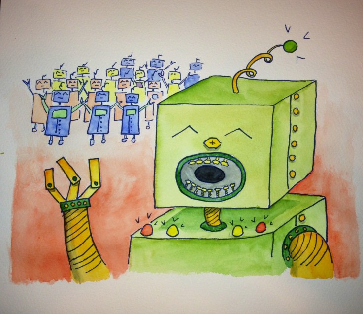
So there are 13 paintings for the core of the Zish and Argo book. I have 7.5 paintings done, so I’m over halfway! The Robotoids say hello!!robot

Paper engineering (AKA: pop ups!)

Everybody love a pop-up book. The well-executed ones are a thing of joy. I got a pop-up book as a kid about dinosaurs, which I didn’t care that much about, in French, which I didn’t read. I read that thing to its grave.

Recently, I see more pop-up books in stores, aimed at more than just children. These books are made by not artists, but paper engineers. As an engineer, I approve of this shift in language. Perhaps I should strive to be a word and paint engineer, rather than writer and illustrator. A few years ago, I bought Moby Dick, as done by paper engineer Sam Ita. Amazon lists a few of his books here. He even has a pop-up Xmas tree, if you’re still looking. His Moby Dick is wonderful, with whirling whirlpools and ships complete with rigging and a looking-glass.

I have started my own attempts at pop-up (shown below). A fun project, but one on hold for now because I’m not sure how to put them together with any kind of efficiency. If you’re interested in learning about pop-ups, I have used a few books to guide my exploration:

popupHappy paper engineering!


Summer is gone, waiting for spring

Tomorrow is the first day of December. In the last week, the last of our colorful leaves have fallen. Even the confused daisy shrub in my yard is no longer in bloom. The daylight is short, and the foliage is bleak. This time of year, I love to review photos from more colorful times. The colors will be back before very long. Starting in February, the Lenten roses and the crocuses will return. Until then, photos can be our flowers. Every year when spring breaks, I walk through the gardens at least once a week and see what new flower has opened.

Check out my Flickr feed for thousands of other photos. 95% of my Flickr photos are fair use for non-commercial purposes, so feel free to use them, but please attribute and link to my flickr.  Most of all I love seeing where my photos get used. (Side note: the first picture on the Wikipedia swimming article is mine. That’s neat!)

Here’s some color for your Friday.


SONY DSCSONY DSCSONY DSCSONY DSCSONY DSC

Getting creative with a printer

Last year I got a medium format pigment printer (epson r2000). With research, you can get a decent deal on these kinds of printers. I purchased mine for $300 (with rebate) while it now lists for $550 (but remember, the ink is always a swindle). If you know how to use color profiles and tune your screen’s color, these printers can be a ton of fun. Printing photos was the main motivation for my purchase, but the other less expected uses have been equally exciting.

Watercolor painting and pigment printing

Pigment inks are waterproof after they dry. Long ago I learned the hard way that normal ink jets are not waterproof. This feature of pigment inks has helped my watercolor process immensely. Now I can do line art on low quality paper. Then I scan the line art in and I can digitally fix it. This can mean a number of things: I can remove a badly placed stroke, or I can rearranged items in space. For the Zish and Argo stories, I did preliminary line art, and moved things to satisfy the needs of the page layout.

Once the line art is optimized, then I can print to the expensive watercolor paper. I probably only use half of my preliminary line art, which is an awful waste of premium watercolor paper. But now I can be efficient. Printing line art is additionally attractive because it uses little ink. Additionally, I can print several copies, and have several chances to get my work just right. I did the featured image art using this procedure.

Printing on fun materials

The printer can also print to some fun surfaces. It can print to basically anything you feed through it, like poster board, wood, foam board, canvas, or other sufficiently heavy fabric. Obviously, it can also print to any sturdy paper as well (I print frequently to drawing and watercolor paper).

I recently did my first project printing to canvas. I then used this canvas to cover a book, shown below. This canvas is also designed to stretch over a frame like any canvas.

Any additional ideas on creative printing? There’s nothing better than using a tool on hand in a different way.

Beautiful Books

I love a well-made book. There is something awesome about a book with golden edges and an embossed cover. I like pages with heft and texture, and books with color illustration. However I am also a great fan of classic science fiction, and 1960s scifi seems rarely to intersect with fine binding techniques. I often go to the used book stores and find paperbacks with yellow cracked pages and broken spines. The cover art is often wonderful, but these books are dying and falling apart. Many of these books have not been reprinted recently, or are offered only for outrageous prices as ebooks.

Lovely books were always a source of inspiration as a kid. This Tasha Tudor fairy tale book was my favorite (and was a big source of inspiration for my own collection of fairy tales). I hope with the rise in ebooks, we will see a rise in beautiful books. When you need not spend space on books, perhaps that space will be spent on books that are also art objects. Lately, I feel like I’ve been seeing more attention towards the appearance of books. Right now it’s more limited to literary classics, but I hope it will grow towards science fiction, which seems like it could benefit from such visualizations. Here are a few pretty books I’ve noticed:

  • Hiroshige, by Taschen (pictured above). This book is gorgeous. Bone clasps hold together the cover, and the book is bound in the traditional Japanese stab-binding style. The paper feel like it is cotton, and it really suits the art it bears. Also at $40, it isn’t insane, and it’s even cheaper on amazon.
  • Barnes and Noble Leatherbound Classics Series. There are a ton of books in this series, from Hitchhiker’s Guide to Arabian Nights to Foundation and Grimm’s Fairy Tales. One complaint: it’s very hard to judge the contents from the web. I found in person that the older out of copyright works had many more illustrations inside. I especially like their Arabian Nights. Most of these are around $20, so they are affordable.
  • Basically anything by Folio Society. I am particularly intrigued by their Foundation Trilogy, which has some fun-looking illustrations. Folio Society is a bit pricier, so I haven’t gotten anything from them yet.

I would love to hear about any other finds as well. Good hunting! (And here’s some lovely bookcases as well.)

Style: Art Nouveau

My favorite style is art nouveau. I first learned about art nouveau when I was living in Prague. The works of Alphonse Mucha, a prominent Czech art nouveau artist, remain throughout the city. There is a museum of his various prints and a few paintings, that explains the motivation behind his work. The municipal house (Obecní dům) is in the art nouveau style, with stained glass windows done by Mucha. The Prague castle also has a stained glass work by Mucha, among its many others. Mucha often depicted images of slavic nationalism and women with slavic features. Mucha’s interest in the slavic and czech identity, and his works on this identity, make learning about him an interesting way to learn about Czech history.

One of Mucha’s famous posters. (pic from Wikipedia)

Thumbnails above, from left: Mucha stained glass at the Municipal House, the Municipal House and the Powder Tower, and Mucha stained glass at Prague Castle.

Besides the locations in Prague, I’ve visited several other Art Nouveau, Art Deco, and Bauhaus collections. The Bröhan museum in west Berlin and the Horta museum in Brussels are both great. You can also sometimes find museum collections online, like the Virginia Museum of Fine Arts.

Fun Science: Art Resembling Science

Can you tell the two below pictures apart? Which of the following two images is a modern aboriginal painting, and which is a picture of an oscillatory chemical reaction?


The left image is of the Belousov-Zhabotinsky (BZ) chemical reaction. The right image is a painting from Western Australia using aboriginal techniques. They are strikingly similar. Could it just be a coincidence? I believe some models with bacteria growing competitively yield similar patterns; perhaps such patterns existed in nature. (EDIT: traveling wavefronts like above have been shown in slime molds. A search on “cAMP spiral waves” reveals many examples.)

Art: Aboriginal designs from Western Australia

The image on the right above came from a book about Aboriginal art called Balgo-4-04 that I found at the Kluge-Ruhe Aboriginal collection in Charlottesville, VA. Unfortunately, I did not think to write down the title of the exact work, or its info (hopefully I will go back soon and retrieve it).

The collection was put together by Warlayirti artists from Western Australia. I don’t know the year of this painting, but I think it is modern and based upon older sand painting techniques. Unfortunately I am not enough of an expert on this topic to provide any deep insights. If anyone else is, I’d love to learn more.

Science: Belousov-Zhabotinsky reaction

The image on the left is an image of the Belousov-Zhabotinsky (BZ) reaction (photo credit: Brandeis U Chemistry). For a more technical overview, check out the Scholarpedia page. Transition metals at different oxidation states lead to these colors; the particular metal can be varied to give different properties. Cerium and manganese, as well as many others, can be used in the reaction. The curling waves in the dish are traveling oscillations. The video below shows the patterns in time.

Another good youtube video showing how the BZ reaction is set up is here. The behaviors observed in the BZ reaction occur in other oscillatory systems. The spiral waves are 2D analogies to the 3D scroll waves that occur in the heart during ventricular fibrillation (VF). VF causes the heart to quiver and is deadly. In this link, wave-propagation in the heart is shown under several conditions (using a java plug-in). If you click “java applets” on the left, under the “introduction” header, you can choose VF, VT (ventricular tachycardia), and normal heart rhythm. You can then apply defibrillation to these rhythms and see what happens. The website is maintained by a scientist, Flavio Fenton, who researches nonlinear dynamics in hearts and biological systems.

For more discussion on oscillatory dynamics, check out my post on synchrony.

Style: Aboriginal Art

I like to use different art styles for my various different stories. Lately there is nothing better than trying to find attractive illustrations of various origins. A few months ago, I found a children’s book at a library sale, very much by accident–Enora and the Black Crane. Enora is a lovely story, and the illustrations are beautiful. Before happening upon this book, I had seen little aboriginal art.

I wanted to incorporate aboriginal designs into my in-progress short story collection. Luckily, I live near the only dedicated aboriginal art museum in the United States, The Kluge-Ruhe Aboriginal Art Collection in Virginia. This was a nice resource for additional inspiration. The illustrations for the collection are black and white woodblock style (as I mentioned in my previous entry). Aboriginal design uses a lot of color. I tried to capture some of the spirit while maintaining consistency with the woodblock theme. I ended up with the featured image for this entry. I ended up knowing a bit more about aboriginal design, and my final design was richer for it.

Maintaining my creative momentum

This blog is now a little over a month old, and soon the Etsy store will be a month old too. I’ve made 8 journals and 4 copies of the Fairy Tales in the last month, not to mention sourcing materials, testing color profiles, etc. Bookbinding, blogging, and website maintenance takes time, time that normally would go to my creative process. Last night this blog crossed 250 views total which of course many blogs get per day, but it felt like a big achievement. It promotes the feeling that these endeavors, so different than my normal choices, are worthy ones.

My most ambitious current writing project is a collection of short stories from different planets in a planetary alliance, the Quaiin League. Some of the stories are over 7,000 words, some are quite short. All of these stories will have at least one woodblock style black-and-white illustration, like the one featured for this entry. It will be many months before this collection is complete, probably over a year. As I share my projects with people, there are more and more tasks to keep track of. But it helps to remind myself here of my goals.

It may not be easy to begin as a writer, but I feel that momentum will continue to gather. As long as I keep pushing and caring, I will accomplish these things.

Upon Book Binding- Getting started and some useful things

Book binding is pretty simple. I do not mean it is necessarily easy or fast, but that you do not need much equipment or knowledge to get started. I think when I first started binding (not much more than a year ago) that this knowledge was a big surprise to me. So, if you are interested in trying your hand at binding, take heart!

Most of what I have learned came from three sources: observation, YouTube videos (such as this one on the coptic stitch style), and this nice book on book craft. With the help of the library, this info is all free.

I once imagined that bookbinding required extensive tools. It is true that the books themselves take certain special materials (you can’t fake nice paper, for example), but the tools required for putting them together is dead simple. I use four g-clamps and a couple well-bound oversize books, shown below. Every book I have ever made was with these four clamps and these two books. Very soon I will be making myself some new presses according to this tutorial, except that I intend to use cutting boards instead of fiberboard.

The only truly essential materials are strong thread (beading thread or linen thread works well), paper, an awl, a cutting board, a cutting implement, book board, and copious quantities of elmer’s glue. I like to order my decorative papers and cloths from Hollanders, and most other supplies like book board, elmer’s glue, and linen thread from Amazon.

The first few times I made books, they were not great looking. There were two primary reasons for this: 1) I did not let the glue dry sufficiently before moving to the next step. Then when I did the next step, the unset material would wrinkle, bubble or tear, and 2) Some papers are really unforgiving and will bubble and wrinkle very easily. Copy paper for example is not designed to be absorptive, and thus takes some skill to handle. I recommend starting with drawing papers or high cotton content papers. These papers will not buckle with too much glue or bubble with too little.

Below are four books I did in the first six months of learning. You can’t see here, but all of them have some little wrinkle or foible here or there. Each was still really exciting; I still had made books! I hope this little discussion is helpful to anyone who is interested, or getting started. I find joy in every book I put together, sometimes to an extent that seems strange. For more pics (of more recent efforts), or if you are interested in my books, check out my Etsy store.