Tag Archives: art

The impermanence of color: the treachery of entropy

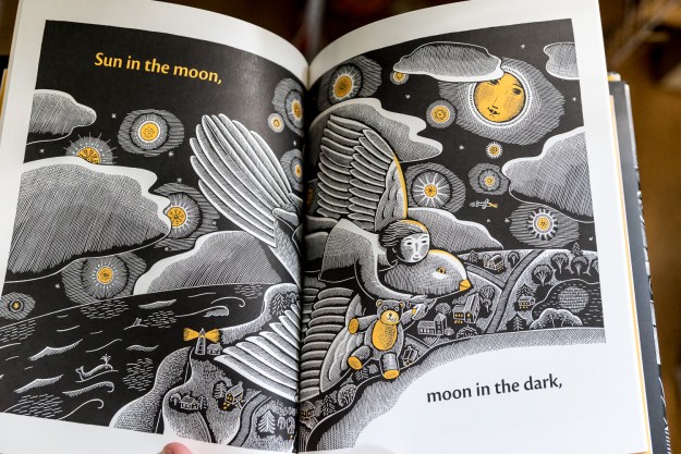
Color seems like an easy, marvelous thing when you get that 64 color box of Crayolas as a kid. 64 sticks of pure color. But, of course, color is complicated. It can be impermanent, difficult to obtain, and toxic. To understand the life and chemistry of colors is to peek under the hood. It’s not what catches your eye, but it’s the heart of the drama.

Many paintings are known to be fading; it’s the newer paintings that draw the most concern. To some extent, the older paintings had probably already faded, but the older paintings also used old tried-and-true methods. The works of Jan van Eyck (1390-1441) are considered to be about as colorful today as when they were painted. Van Gogh’s daisies are fading. Renoir’s red has been digitally re-envisioned to show its pre-faded look.

The 1800s were a boom time of chemistry and industrialization, and the art world participated in this expansion too. 12 elements, including sodium and potassium, were discovered between 1800 and 1810. As Chemistry exploded, and new colors exploded. Mauve, the first synthetic dye, was produced in 1856 from coal tar. Renaissance painters (or their apprentices) prepared their own dyes and pigments (think of those scenes from “The Girl with the Pearl Earring” where Scarlett Johansson is grinding various things); 19th century painters bought paint from chemists. Like the disintegrating trade paperbacks of the early 1900s, when industrialization took over an old process, it was faster and cheaper, but took a while to match other characteristics. Books from the early 1800s are often far more intact than the wood-pulp books that followed them.

Artists like Van Gogh knew the strengths and limitations of their new tools. Van Gogh wrote to his brother, noting that the Impressionist paints “fade like flowers,” so he used the brightest colors he could, doing what he could to counteract impermanence. Even now, not all paints are equally durable; here’s a table for watercolors including such measures.

Today, scientists are studying the precise chemistry that causes fading using X-rays. So far, nothing can be done to stop or reverse the fading; they can only be kept away from light. At least we have the tools to imagine their former glory.

Further reading: Victoria Finlay’s Color is a great read on the chemistry of color without diving too deep technically. I reviewed it on this blog a couple of years ago. This article about the history of oil colors is also really fascinating. And finally, if you’re a chemistry buff, the scientific article about Van Gogh’s fading yellow is open source, and available to the public here.


Advertisement

Bookbinding once more!

There’s nothing like a cross-country move to raise one’s creative spirits. New words, new faces, and new ideas. But a big move also challenges order. Everything goes into boxes, and even when you bring it back out, it goes into a different room and belongs in a new place. Then everything in every other room is similarly displaced. And there are new restaurants and new people and new sights, and pretty soon, you’re hopelessly in disarray.

So last week, I finally fought back against entropy. For me, a good workspace has my favorite tools in arm’s reach, but never in the way. I set forth to accomplish that goal.

The ultimate test of a working space is simple—does it inspire work? Over the weekend, I tested my space. It does inspire. I made my first three books in New Mexico. They are relatively humble, but they are setting the tone for the work ahead.

I am inspired. =)

FullSizeRender 3.jpg

This slideshow requires JavaScript.

More Awesome NASA Space Travel Posters

Thinking about a trip to Mars or Ceres? Book today! Don’t forget to ask about your Pi Day discount.

NASA is in the travel agent business again! JPL released travel posters for Mars, Venus, Jupiter, and several moons. They explore some different styles from the first set, and are cool as hell. Below are some of the preview sizes. They are available to download free at high res, suitable for printing up to 20″ x 30″.

And if you’re a vintage poster enthusiast like me, also check out the Library of Congress site. Tons of WPA posters are available free at high res, among other historical documents. (Beware, though, their site requires patience. It’s not organized for quick browsing, but there are some real gems in their collection. I linked to some of my favorites in this old post. I decorated my bathroom with them. Yes, I have a poster about syphilis in my bathroom.)  And finally, the National Parks posters are amazing vintage posters, though they aren’t free. I just made a few of my own last week.

This slideshow requires JavaScript.

IMG_2499.JPG

Proof! I did indeed print and hang the travel posters. Also in this room: a tea towel with a graphic of the Very Large Array (VLA). Nerd factor infinity!

Painting with dark: books of night-themed art to inspire the high ISO photographer

Photography means “painting with light.” But how much light? Today, cameras are more light sensitive than ever, with ISOs up to 400,000 or even 4,000,000. Some have described cameras that can take video by the light of a candle as “painting with dark.” After discussing these advancements at a photo event yesterday, I found myself thinking about how that affects an image. If light is the exception rather than the rule, what kind of images could I create?

So I visited my bookshelf! And I found two art books themed around darkness and nighttime. In a future post, I’ll have to see how these inspiring books guided me. After all, it’s a great time of year to find guidance in darkness.

The Night Life of Trees by Bhajju Shyam, Durga Bai, and Ram Singh Urveti

This book is from Tara Books, a company that does beautiful and imaginative books. I also recommend Waterlife by Rambharos Jha, which I wrote about in a previous post. Both Night Life and Waterlife are silk-screen print books, which gives the colors and ink a life that other printing methods don’t match. Both books also smell amazing. (This sounds weird, but they just do. I don’t know whether it’s the ink, the paper, or both.)

The Night Life of Trees is full of illustrations depicting just that—trees at night and what goes on in them. The images are screen prints on black paper, allowing the book to “paint with darkness” in a way that other books just can’t. Check out the beautiful images below.

160118-books-9437160118-books-9439160118-books-9438


The House in the Night
by Susan Marie Swanson

A children’s book with awesome art. Sometimes kids books have the best art because they keep it simple. This book is literally about light at night. I don’t think that needs too much explanation. Just check out the art, which incidentally mimics the woodcut style that I discussed last week.

160118-books-9440160118-books-9441

M.C. Escher: revisiting a familiar name

M.C. Escher and Salvador Dalí are two of the greatest reality-bending artists. So, fittingly, the Salvador Dalí Museum in St. Petersburg, Florida recently hosted a special Escher exhibit. I’ve visited the Dalí collection many times, but I’d never seen Escher in person.

I had many Escher calendars as a kid. When I took crystallography, we studied the symmetries in Escher’s tessellations. I’ve always been interested in design and mathematics, and Escher is the purest intersection of the two. I was ecstatic to see the exhibit.

Before the exhibit, I was most familiar with Escher’s lithographs. Without too much elaboration, lithography is a high-fidelity technique which allows the artist to produce an image that is not directed by the mechanics of printing (I’m sure the method does direct some artistic choices, but as a non-expert, that’s my rough take on it).

The exhibit contained many of Escher’s woodcuts, which were new to me. Woodcuts are make by carving a plate of wood, coating the plate with ink, and pressing the plate to a page. The page will be white where the wood has been cut away and the page will be colored where the wood remained. Woodcuts have a distinctive style–they cannot render colors in between white and ink color. Multiple colors can be achieved with additional pressings, but the technique is inherently color-limited.Additionally, the resolution of the print is limited to the fidelity of the wood. These two aspects give woodcuts a distinctive artistic feeling. If you can’t tell, I’m currently a little in love with woodcuts.

Escher died in 1972, but thanks to Disney, his works remain out of the Creative Commons. However, I am allowed to use low-resolution works for discussion purposes. You’ll have to buy books if you want anything with much detail, though. Below are a few of my favorite Escher images that are available through Wikipedia, as I have linked them under the image.

Some of Escher’s early works were illustrations. There was a beautiful cathedral, half underwater. There were evil-looking creatures in forests. It was such a romantic side to an artist most think of as a master of geometry. Below is an example of one of his illustrations. Even though it’s of a conventional subject, the Tower of Babel, the perspective is beautiful. I love the lines; this work just wouldn’t be whole using a method besides woodcut.

Below was Escher’s first impossible reality. And look, it’s a woodcut! Hooray!

escher2c_still_life_and_street

Still Life and Street: Escher’s first impossible reality

Below is one of Escher’s more famous images. It is a lithograph printing. See how various tones of gray are possible with this technique, as well as high-fidelity. It lends this images a very different tone than the one above. The lizard design is called a tessellation. Tessellations are plane-filling patterns. They occur in nature and area subject of mathematical study. Escher was inspired by the tiling work at the Alhambra in Spain, another example of tessellation.

Below is another Escher woodcut, done with several plates to achieve multiple colors. Even when Escher wasn’t exploring impossible realities of geometry puzzles, he chose interesting perspectives.

World Pinhole Photography Day

Did you know that a pinhole can focus and project light? A pinhole in an opaque material is the world’s simplest camera! Yesterday was World Pinhole Photography Day.

History

The discovery of pinhole optics massively predates photography (the act of chemically recording a projected image). During the Renaissance, painters traced scenes projected onto a canvas by a pinhole on the opposite wall. The use of a pinhole to project images goes back to 5th century BC China.

A camera obscura uses a pinhole to project an image. Renaissance painters could then trace these images. (image source: Wikipedia)

Why Pinholes?

In an age of digital cameras and high-end optics, the pinhole endures, charming and simple.  In honor of World Pinhole Photography Day, I went on a pinhole outing.

You might ask, what is the point of pinhole photography in this day and age? There are aesthetic and practical reasons. I like knowing exactly how my lens works, for once. Even a prime lens can have upwards of a dozen pieces of glass in it. I have a good science background, and I can’t even touch that level of optics. A hole in black plastic. I get that. Pinholes have interesting properties. True, they don’t focus nearly as sharply as lenses. But because pinholes have such small apertures, they have nearly infinite focal depth.

Brief photography lesson: larger openings (apertures) allow more light and create shallow ranges of focus. This can be desirable in a portrait. Small openings permit less light and increase range of focus. This might be preferable for a landscape. Sufficiently small openings cause softening due to diffraction (physics of light stuff). If you shoot on an SLR, you may have noticed diffraction-caused softening on shots at f/22. The pinhole I use is f/177. This diffraction is what gives pinhole photos their texture.

The upshot: pinhole photos flatten a scene. Something a yard away will look similar to something 100 yards away. This allows a photographer to create interactions between different depths that wouldn’t be possible with a conventional lens. And finally, pinholes can create a really fun old-timey effect.

My setup

My setup is a bit like sticking a horse-drawn carriage on a rocket ship. I use a Lensbaby composer with the pinhole optics kit. My camera is a Sony Alpha 7s. Pinhole photography, due to the tiny amount of light transmitted, has slow exposure time. Exposures are often measured in multiple seconds. The Sony Alpha 7s is one of the fastest consumer cameras in the industry, with a maximum ISO of 409600. Thus, I was able to take decent handheld pinhole images even in low light by using high ISO.

Lenbaby pinhole on Sony Alpha 7s.

Lensbaby pinhole on Sony Alpha 7s.

The Images!

ISO 409,600, 1/6 second exposure. No tripod. Indoor shot on a rainy day.

ISO 409,600, 1/6 second exposure. No tripod. Indoor shot on a rainy day.

ISO 20,000; 1/60 sec.

ISO 20,000; 1/60 sec.

ISO 80,000; 1/60 sec.

ISO 80,000; 1/60 sec.

ISO 12,800; 1/60 sec.

ISO 12,800; 1/60 sec.

ISO 16,000, 1/60 second exposure.

ISO 16,000, 1/60 second exposure.

ISO 160,000, 1/10 second exposure. Indoor shot on a rainy day.

ISO 160,000, 1/10 second exposure. Indoor shot on a rainy day. I love how it looks like a 40s cheesecake shot.

Water Polo Designs & T-shirts

Is there any greater joy in art than seeing a project through and sharing it with others? I designed some water polo t-shirts, and finally they have arrived. They look phenomenal!

Plus, it’s a great joy to design for water polo. It’s a small sport. Maybe you’ll see a neat poster for the Olympics, but that’s about it. The women’s game is especially short on designs. This year, I took my design inspiration from art deco sports posters and the National Parks vintage poster series.

Art Deco poster style

I wanted to convey the sense of motion I like in the art deco posters. The curve of the water surface suggests energetic water. It could also suggest the curve of the ocean.

Vector artwork for t-shirt

Vector artwork for t-shirt

tshirts-04810

Final t-shirt result

design1

Source pencil drawing

Below: An art deco poster I particularly found inspiring. Early versions of my design incorporated gradients to suggest form, as in this poster. In the interests of simplifying printing, I chose to go with two colors.

Mistrzostwo Swiata: Krynica by Stefan Osiecki and Jerzy Skolimowski, 1930.  For the 1931 Ice Hockey World Championships in  Krynica, Poland.

Mistrzostwo Swiata: Krynica by Stefan Osiecki and Jerzy Skolimowski, 1930. For the 1931 Ice Hockey World Championships in Krynica, Poland.

Below: an alternate idea. Like basketball, a lot of action in water polo happens at the center position. Unlike basketball, the offender and defender stay relatively fixed, facing away from the goal. The offensive center wants to turn forwards or backwards to take the shot. The defender waits to react. I hoped that the slightly disjointed postures suggested depth or motion.design2 text-01

Design made into a poster. Perusing Wikipedia, I discovered that water polo has a surprising variety of names for a sport invented only about a century ago.design2-poster-01

Original pencil sketch. Eventually dropped the water ripple and turned it more geometric.design2

National Parks poster style

All the teams in our water polo conference, the Atlantic Conference, are in North Carolina and Virginia. Three out of the five are close to the Blue Ridge Parkway, and none are coastal. This gave me the idea that the conference could be thought of as the Blue Ridge Conference.

The championships this year were held in Charlottesville. Humpback Rocks are a popular hiking destination along the Blue Ridge near Charlottesville. People often hike Humpback rocks at sunrise to get the view of the Rockfish Valley. This fell quite naturally into a vintage style poster look.

This design was a super rush job. I drew the sketch at 10PM before the deadline the next day. The next morning I vectorized it. The shirts arrived a week later. I probably now would choose to make the figure white, for better clarity at a distance, but I still like the design.

Blue-ridge-tee

They didn’t go for my conference renaming. =Ptshirts-1774

Original sketch.IMG_0769

One of the national parks posters that inspired this design.

Pittsburgh’s transcendent Cathedral of Learning

There is a gothic skyscraper on the University of Pittsburgh campus called the Cathedral of Learning. It’s a beautiful building that does indeed resemble a vertically stretched cathedral. But inside are 29 nationality rooms that are even more astounding. Each one is themed around a different nationality (or culture, in the case of some like the African Heritage Classroom or the Israel Heritage Classroom). The oldest were dedicated in 1938, and the newest was dedicated in 2012. Each room is a highly detailed presentation of the culture of its country, down to the light switch panels, lights, and chair backs. Most are designed by architects of the country and decorated by artists of the country. And they’re all incredibly beautiful.

I visited the cathedral about a year ago now, but I’m still enthralled by it. I wrote about it then too. But recently I was editing my pictures from my visit, which gave me an excuse to post about it again. Check out the photos below, or the hundred full-res images I posted as creative commons works on Flickr.

The Ukrainian Classroom, dedicated in 1990.

The Ukrainian Classroom, dedicated in 1990.

The Turkish Classroom, dedicated in 2012.

The Turkish Classroom, dedicated in 2012.

The Israel Heritage Classroom, dedicated in 1987.

The Israel Heritage Classroom, dedicated in 1987.

The Greek Classroom, dedicated in 1941.

The Greek Classroom, dedicated in 1941.

The Chinese Classroom, dedicated in 1939.

The Chinese Classroom, dedicated in 1939.

The Swedish Classroom, dedicated in 1938.

The Swedish Classroom, dedicated in 1938.

The Lithuanian Classroom, dedicated in 1940.

The Lithuanian Classroom, dedicated in 1940.

A detail from the Irish Classroom, dedicated in 1957.

A detail from the Irish Classroom, dedicated in 1957.

A detail from the Polish classroom, dedicated in 1940.

The tempura painted ceiling in the Polish classroom, dedicated in 1940. 

The Hungarian Classroom, dedicated in 1939.

The Hungarian Classroom door, dedicated in 1939.

The Czechoslovak Classroom, dedicated in 1939.

The Czechoslovak Classroom, dedicated in 1939.

A detail from the Yugoslav Classroom, dedicated in 1939.

The ceiling in the Yugoslav Classroom, dedicated in 1939.

More bookbinding

Winter is a great time to look outside at the cold rain and bare trees and stay in and bind books instead. Below are three projects from last week.

Book 1

Upholstery fabric makes great book cloth. It’s thick enough that it doesn’t need backing paper to keep the glue from coming through. It’s substantial enough that it doesn’t tend to bubble or warp. And it often has interesting textures that work well for a book cover. I love the fabric for book 1, the way it fits on the cover, the feel, and the sheen. Upholstery fabric can be pricy, but the retail price is similar to prepared book cloth. The fabric for book 1 was an $8 remnant; this project took at most 1/5 of that fabric. That’s not bad at all.

I did a coptic stitch with red waxed linen thread. At $16 a spool, it’s pricey, but it is a lot of thread. I’d estimate one spool could sew very roughly about 50 books of this size.

bookbind-04005

I did my very first box for this project, following this set of videos for guidance. Sage Reynolds YouTube channel seems like an excellent source for book binding expertise. I’m sure I’ll be back there.bookbind-04049 bookbind-04048

Book 2- Dragonfly journal

For Book 2, I did my first long stitch book. For this binding, you simply sew through the spine. It was quick and pretty painless. I added a dragonfly embellishment to the cover, which I designed in illustrator, and had my Silhouette Cameo cut out. Another use for a favored toy. (Read more on the Cameo.)bookbind-04040 bookbind-04037

Book 3- Mad Scientist Lab Notebook

Book 3 features more raised details. Again, I did a coptic stitch. The endpaper I printed using the Silhouette Cameo’s art pen. It took a long time to draw all those paths, but I am in love with the result. The black slipcase (my second box!) features a mushroom cloud, cut with the Silhouette Cameo.

bookbind-04036

The cover features a radioactivity symbol. I’m really excited about the mad scientist theme, so I’ll probably do more of these.bookbind-04034

Three beautiful books that inspire

I’m always looking for design inspirations. Whenever I find myself in an art museum or an interesting shop, I always look to see what kinds of design books they have. Today I included three very different commercially available favorites in my little collection.

Waterlife by Rambharos Jha

A stunningly beautiful book by Indian folk painter Rambharos Jha. The critters come alive with the wiggling and colorful lines. Each page is silk-screened by hand onto hand-made paper. You can see the difference from ordinary printing methods immediately. Striking. This is also one of the best smelling books. Every time I open the book, the smell of ink and paper hits me, I’m looking at this book. My only criticism is that the binding method prevents the book from opening as flat as I would like. I love to look at this book when I’m trying to feel energy in my work.


beauty-books-02737beauty-books-02739

Carl Larsson’s A Farm: Paintings from a Bygone Era

A collection of 19th century Swedish painter Carl Larsson‘s farm paintings. His calendars are a staple with the Scandinavian branch of my family. His work makes me think a bit of Norman Rockwell– beautiful and flowing, but with crisp lines that give a feel of illustration. I love to look at his work for inspirations in depictions of the ordinary, the pastoral, the family.

beauty-books-02733beauty-books-02743

Radioactive: Marie & Pierre Curie, A Tale of Love and Fallout by Lauren Redniss

I previously reviewed this book here. I’m not in love with the writing in this book (see the review), but I am in love with the art. I love the way it connects to the science and is elevated by it. The typography for this book is also divine. Redniss even created a special typeface called Eusapia LR for this book, and it works beautifully. This book is an inspiration in marrying art and science.

beauty-books-02736beauty-books-02741