Tag Archives: design

Three beautiful books that inspire

I’m always looking for design inspirations. Whenever I find myself in an art museum or an interesting shop, I always look to see what kinds of design books they have. Today I included three very different commercially available favorites in my little collection.

Waterlife by Rambharos Jha

A stunningly beautiful book by Indian folk painter Rambharos Jha. The critters come alive with the wiggling and colorful lines. Each page is silk-screened by hand onto hand-made paper. You can see the difference from ordinary printing methods immediately. Striking. This is also one of the best smelling books. Every time I open the book, the smell of ink and paper hits me, I’m looking at this book. My only criticism is that the binding method prevents the book from opening as flat as I would like. I love to look at this book when I’m trying to feel energy in my work.


beauty-books-02737beauty-books-02739

Carl Larsson’s A Farm: Paintings from a Bygone Era

A collection of 19th century Swedish painter Carl Larsson‘s farm paintings. His calendars are a staple with the Scandinavian branch of my family. His work makes me think a bit of Norman Rockwell– beautiful and flowing, but with crisp lines that give a feel of illustration. I love to look at his work for inspirations in depictions of the ordinary, the pastoral, the family.

beauty-books-02733beauty-books-02743

Radioactive: Marie & Pierre Curie, A Tale of Love and Fallout by Lauren Redniss

I previously reviewed this book here. I’m not in love with the writing in this book (see the review), but I am in love with the art. I love the way it connects to the science and is elevated by it. The typography for this book is also divine. Redniss even created a special typeface called Eusapia LR for this book, and it works beautifully. This book is an inspiration in marrying art and science.

beauty-books-02736beauty-books-02741

Fun and inspiring: The Library of Congress online archives

My trip to the Library of Congress building later led me online to explore their equally amazing catalog of images. They have thousands of high-resolution images, from baseball cards to Japanese prints to Spanish civil war posters. And that’s just the prints and photographs section.

I preferred the collection of WPA posters. They combine beautiful design with period topics that can seem wacky today. Ride the El! Get tested for syphilis! Beat the Germans! Children’s piano competition! Over 900 governmental exhortations paint a vivid picture of 1930s life. I was amazed by the number of posters for illness: tuberculosis, syphilis (31 posters alone!), diphtheria, scarlet fever.
The posters are also great sources of design inspiration. Most have playful typography and engaging graphics. Many of them are available as high-resolution TIFFs, so you can print them out and have instant decor. My bathroom now has posters about syphilis and pneumonia. I’m sure my guests will feel safer.

And without further ado, some favorites:

As old as creation, Syphilis is now curable.

pneumonia strikes like a man eating shark led by its pilot fish the common cold.

The Art Institute of Chicago international exhibition of water colors

An orderly line is a safe line!

Stop and get your free fag bag– careless matches aid the Axis.

14th Illinois Cattle feeders meeting.

Nationality Rooms at the Cathedral of Learning

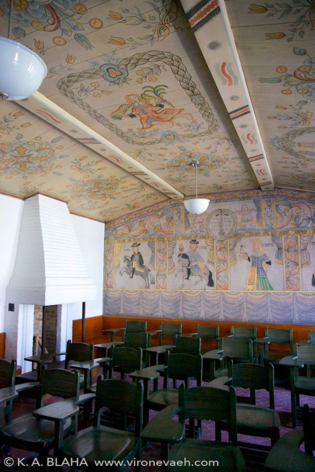
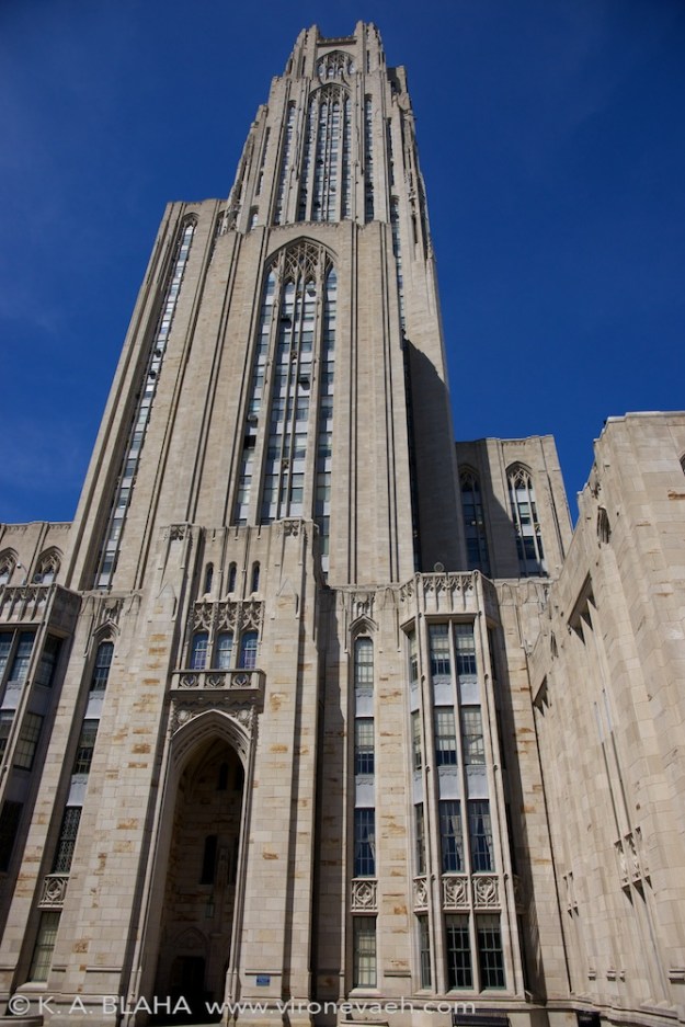
This weekend, I went to the Cathedral of Learning in Pittsburgh. Among other things, this gothic skyscraper contains 29 nationality rooms–each of these rooms is decorated intricately in the design of a nation. The first 19 were built between 1938 and 1957, with ten built since 1987. The Turkish and the Swiss classrooms were dedicated in 2012, and several more are planned. If you are in Pittsburgh and have any interest in craft or design, I can’t recommend visiting enough.

To visit the classrooms, you can check out a key at the desk, or take a tour with a guide. We rented a key. Visiting each room felt like a treasure hunt; each room was so different, and full of intense detail. Each room had special walls, windows, ceilings, chairs, lecterns, and chalkboards. Even the light switches and doors were in style. Many contain intricate wood or stone carvings, or genuine artifacts. Most were designed by architects of the country.

You can learn more on the University of Pittsburgh website about the nationality rooms. This page allows you to virtually tour each room.

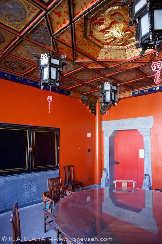
The Chinese nationality room.

The Chinese nationality room, dedicated in 1939.

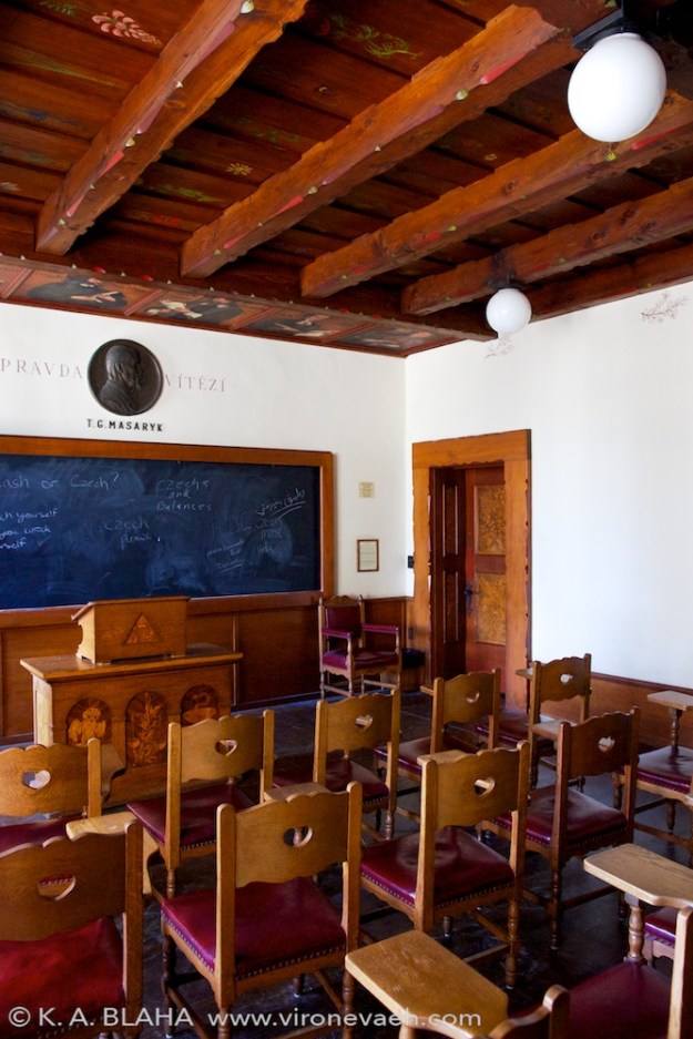
The Czechoslovak room, dedicated in 1939. This room contains a letter from the first President of Czechoslovakia, Tomáš Masaryk, to the students of the University of Pittsburgh.

The Czechoslovak room, dedicated in 1939, 8 days before the Germans invaded in World War 2. This room contains a letter from the first President of Czechoslovakia, Tomáš Masaryk, to the students of the University of Pittsburgh. His son, Jan, spoke at the dedication of the room, foreseeing trouble in the future. Page 4 of this document details the interesting connection between Czechoslovakia and Pittsburgh.

The Hungarian room was dedicated in 1939.

The Hungarian room was dedicated in 1939.

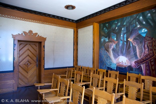
The Lithuanian room, dedicated in 1940. The walls are woven from linen in the "The Path of the Birds" design. Between the angular, abstract carvings and the painting and the walls, this was one of my favorite rooms.

The Lithuanian room, dedicated in 1940. The walls are woven from linen in the “The Path of the Birds” design. Between the angular, abstract carvings and the painting and the walls, this was one of my favorite rooms.

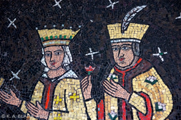
A detail from the Romanian room, dedicated in 1943. The style of this mural on the back wall reminded me of the opening of Beauty and the Beast.

A detail from the Romanian room, dedicated in 1943. The style of this mural on the back wall reminded me of the opening of Beauty and the Beast.

The Swedish room, dedicated in 1938.

The Swedish room, dedicated in 1938.

The Yugoslav room, dedicated in 1939. The carving in this room, called "notch carving" was simply amazing.

The Yugoslav room, dedicated in 1939. The carving in this room, called “notch carving”, was simply amazing.

The cathedral of learning, exterior.

The cathedral of learning, exterior.

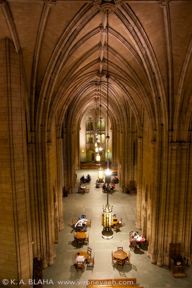
The main hall of the cathedral of learning.

The main hall of the cathedral of learning.

The main hall of the cathedral of learning.

The main hall of the cathedral of learning.

Science Fiction Worldbuilding

One thing I love about science fiction is worldbuilding. When you go to a new place, you take in the architecture, the language, the food, the weather, how someone enters a house, how someone insults another person… These things exist in any culture, but they vary, sometimes radically. In science fiction, the creator tries to imagine these things in a logical and consistent manner for a time that hasn’t happened yet, for planets unknown, with the very constants of life such as gravity and oxygen subject to change. And yet the end product, when successful, is similar to travel–we visit a place that is deeply familiar in the fundamental ways and yet different in ways that provoke thought.

(Some people think that there is too much worldbuilding–I don’t agree. I think the author can tell too much of their own personal worldbuilding process and not consider the reader enough. However, I speak from a place of no authority, so take my opinion for what it is worth.)

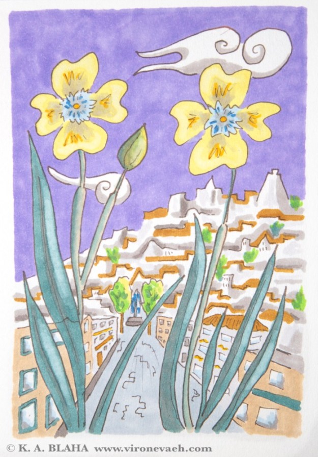
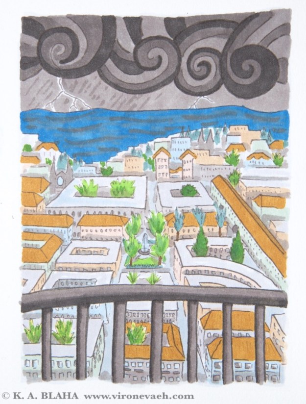
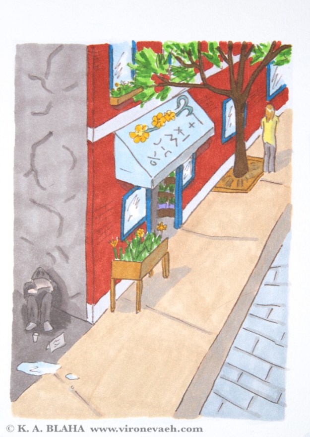
In the last few weeks, I’ve been working on illustrations of street life in my city inspired by Hiroshige’s 100 views of Edo. Even after 17 years working on this world, I see many new things this way.

SONY DSC

On the hill in the background is the outline of an old storm tower, shaped a bit like a lighthouse. The old fortifications stood high on the hills with thick walls to withstand the storms.SONY DSC

The view west from a storm tower, to give early warning of storms. In the early days of the city, storms caused flash flooding and devastation.SONY DSCGleaming cities often have unsavory hidden parts, sometimes literally lurking around the corner.

So far I’ve done about 20 illustrations. I’d like to do at least 100. In each one I feel more comfortable with previous details. I’ve looked up references of European and Moroccan and Japanese architecture (mostly the European showing in these three samples). Now I’ve started incorporating old sketches over a decade old. The city feels all the more real to me (it’s great inspiration for story ideas and details), and the work is great fun.


Style: University of Virginia Lawn

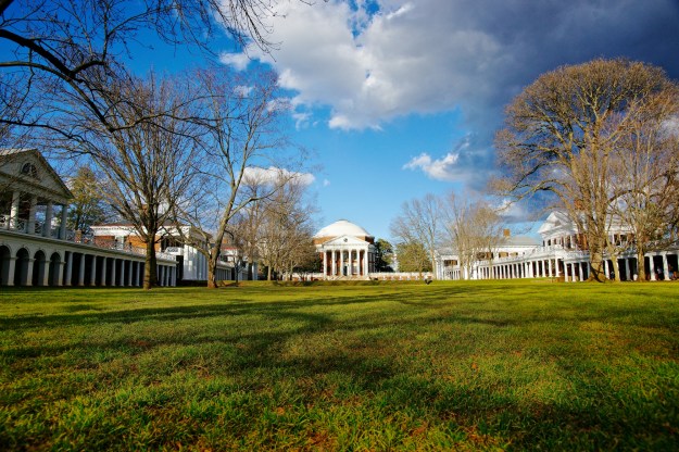
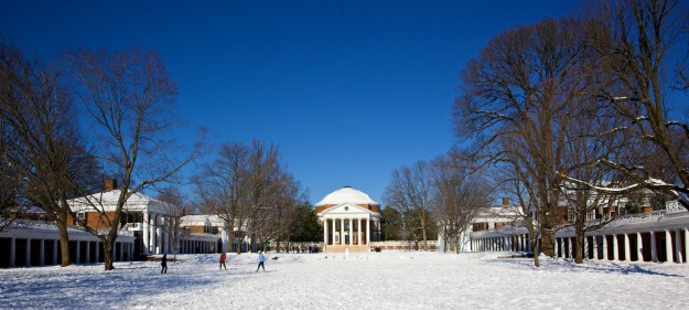
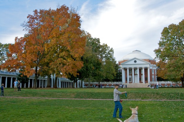
There are three manmade UNESCO world heritage sites in the United States: The Liberty Bell, The Statue of Liberty, and The University of Virginia Lawn with Monticello. The UNESCO designation basically means there is something noteworthy of distinctive about the site. I happen to live near to the University of Virginia, so I get to take a lot of photos. (As of this post, I just discovered that all the modern photos on the lawn Wikipedia page are mine. I love to see where the creative commons take my works. Side note: check out my very large Flickr collection of mostly creative commons images.)

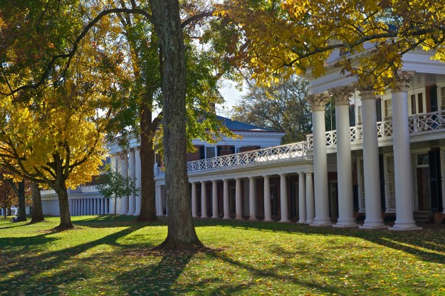
Many years ago, Benoit Mandelbrot, the creator of fractal geometry, visited the university to give a talk. He said it was like walking into the lion’s den of Euclidean geometry. I always liked this description; everything about the university is columns and arches and perspective points. Monticello and the University were laid out by Thomas Jefferson, who one gets the feeling never actually died living around here. He was the ambassador to France for a while, and greatly admired the architecture. He came back to the states with those architectural inspirations.

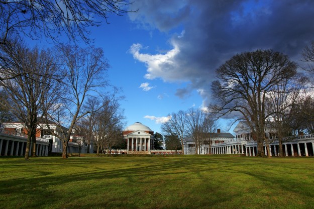
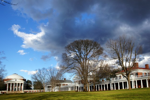
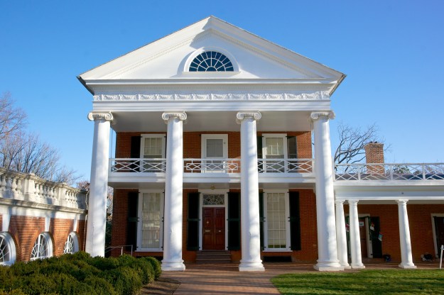
The UVA lawn, shown below, has the rotunda at one end (the second one… the first one burned down and blew up when a professor tried to save it with TNT) and is lined by ten pavilions. Between the pavilions are dorm rooms that distinguished fourth year students still live in. Each of the ten pavilions is architecturally different, and behind each is a garden in a different style which no doubt will be the topic of a future post. Pavilion 2 is pictured below. Professors still live in the pavilions. The pavilions were built in a strange order, to ensure that diminished funds would not diminish the scope of the project.

It’s very easy to find plenty of reading material on Jefferson and the University if you are interested, so I won’t try to write a tome here. However I’ll include a few of my pictures that may hopefully spark your interest.

SONY DSC DSC03036 SONY DSC SONY DSC SONY DSC SONY DSC SONY DSCpavilion 2

Monticello, i.e. the back of a nickel


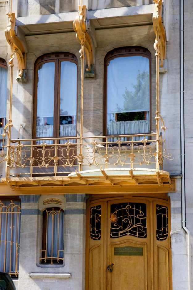
Victor Horta: Art Nouveau Architect

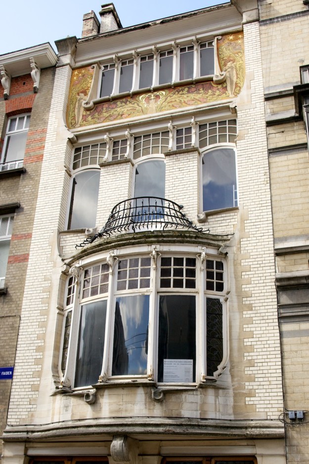
I pretty much love anything art nouveau. So whenever I go to European cities, I look to see if they have any art nouveau icons. In Prague there is Mucha, in Berlin there is the Bröhan museum, and in Brussels there is Victor Horta. There is a Horta Museum, as well as a number of buildings he and others designed nearby. A bunch of walking tours (like this one with a nice video) can help you cover the various buildings or get a peek from wherever you currently are via the pictures.

Like many architects of the period, he also designed the furniture, wallpaper, and interior structures like staircases. The museum has great examples of these. Alas no pictures were allowed and there aren’t any fair use pics. But if you’re curious you can google for yourself. Here are some pictures of his lovely buildings:

SONY DSC

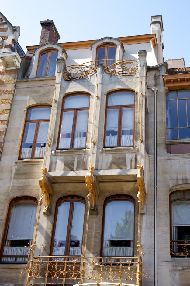
Hôtel Tassel in Brussels

SONY DSC

Hôtel Solvay

SONY DSC

Horta museum building

SONY DSC

Horta museum building

IMG_0287

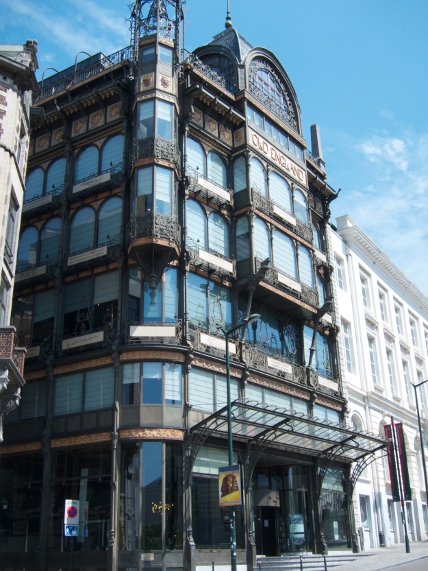
Old England building, designed by Barnabé Guimard, closer to the Grand Place in Brussels. (not Horta, but still very cool. This hosts the instrument museum so you can go inside and enjoy that too.

Staircase from Horta museum


Miniature Books!

This weekend at the festival of the book, I saw an exhibition about miniature books. The exhibition is a traveling show from the University of Akron including about 80 small or odd books. At the exhibition, Molly Schwartzburg, the curator of the miniature books collection at the University of Virginia, gave a talk about the exhibition and about mini books in general. The university has a collection of several thousand miniature books, which by their definition means no bigger than 3″ in any dimension when closed. Some of the mini books are made for artistic purposes, and others for practical purposes. The Knights of Columbus used to send miniature books containing short stories to soldiers during WW1, packing the tiny books with cigarettes. The Akron exhibit didn’t adhere to the 3″ limit, but all of the books were eccentric.

Below are a few pics from the collection.

photo copy 2

This does fold flat- “Solar Terms” by Ling Luo

photo copy 3

“Altar of Transformation” by Cathie Bleck

photo

A bunch of accordion style mini books.

photo copy

“Pig, hog, bacon” by S. V. Medaris, showing the life cycle of a pig on one side and bacon on the other.

photo copy 4

“I went to the mountains, but they were not there” by Rachel Mausier- a really cool combo of book arts and something more like origami.


Board game in progress

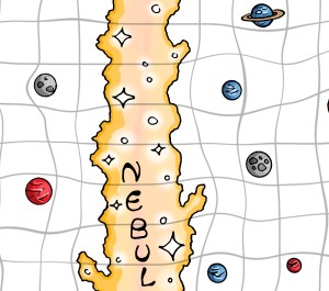
I am designing a board game. This is kind of new territory for me, so we’ll see how it goes. Right now I have a beta edition of the board (a little piece below) and a portion of the rules written. I have a vague idea of the rest, but I will need to get it onto paper. Yesterday, I printed the first copy of the board onto 13″ x 19″ paper. After I finish the rules and the cards, I will test it. It is a space-based game, but in the image below you can see the background is still white. I assume some of the details will need to move, so no need to fill in the background just yet. I’ve been throwing this idea around for a little bit, so it’s exciting to share the progress. It still has no name, but it is a game about space travel, perhaps loosely related to my Zish and Argo stories.

boardgame zoom

Beautiful Books

I love a well-made book. There is something awesome about a book with golden edges and an embossed cover. I like pages with heft and texture, and books with color illustration. However I am also a great fan of classic science fiction, and 1960s scifi seems rarely to intersect with fine binding techniques. I often go to the used book stores and find paperbacks with yellow cracked pages and broken spines. The cover art is often wonderful, but these books are dying and falling apart. Many of these books have not been reprinted recently, or are offered only for outrageous prices as ebooks.

Lovely books were always a source of inspiration as a kid. This Tasha Tudor fairy tale book was my favorite (and was a big source of inspiration for my own collection of fairy tales). I hope with the rise in ebooks, we will see a rise in beautiful books. When you need not spend space on books, perhaps that space will be spent on books that are also art objects. Lately, I feel like I’ve been seeing more attention towards the appearance of books. Right now it’s more limited to literary classics, but I hope it will grow towards science fiction, which seems like it could benefit from such visualizations. Here are a few pretty books I’ve noticed:

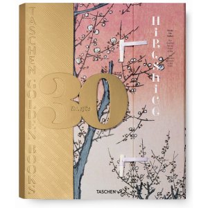
  • Hiroshige, by Taschen (pictured above). This book is gorgeous. Bone clasps hold together the cover, and the book is bound in the traditional Japanese stab-binding style. The paper feel like it is cotton, and it really suits the art it bears. Also at $40, it isn’t insane, and it’s even cheaper on amazon.
  • Barnes and Noble Leatherbound Classics Series. There are a ton of books in this series, from Hitchhiker’s Guide to Arabian Nights to Foundation and Grimm’s Fairy Tales. One complaint: it’s very hard to judge the contents from the web. I found in person that the older out of copyright works had many more illustrations inside. I especially like their Arabian Nights. Most of these are around $20, so they are affordable.
  • Basically anything by Folio Society. I am particularly intrigued by their Foundation Trilogy, which has some fun-looking illustrations. Folio Society is a bit pricier, so I haven’t gotten anything from them yet.

I would love to hear about any other finds as well. Good hunting! (And here’s some lovely bookcases as well.)

Style: Art Nouveau

My favorite style is art nouveau. I first learned about art nouveau when I was living in Prague. The works of Alphonse Mucha, a prominent Czech art nouveau artist, remain throughout the city. There is a museum of his various prints and a few paintings, that explains the motivation behind his work. The municipal house (Obecní dům) is in the art nouveau style, with stained glass windows done by Mucha. The Prague castle also has a stained glass work by Mucha, among its many others. Mucha often depicted images of slavic nationalism and women with slavic features. Mucha’s interest in the slavic and czech identity, and his works on this identity, make learning about him an interesting way to learn about Czech history.

One of Mucha’s famous posters. (pic from Wikipedia)

Thumbnails above, from left: Mucha stained glass at the Municipal House, the Municipal House and the Powder Tower, and Mucha stained glass at Prague Castle.

Besides the locations in Prague, I’ve visited several other Art Nouveau, Art Deco, and Bauhaus collections. The Bröhan museum in west Berlin and the Horta museum in Brussels are both great. You can also sometimes find museum collections online, like the Virginia Museum of Fine Arts.