Tag Archives: Illustration

Art Deco Posters: Water Polo, the gentleman’s game

The Olympics are coming up! It’s that rare time when non-professional sports get to shine! As a lover and player of water polo, I get so inspired watching the amazing men and women of the world expressing their mutual disdain through grabbing, elbowing, and splashing in the big pool. Water polo is GREAT.

As I type this, I nurse a bruise from a deliberate kick in the back, some mystery bruises on my arm, and a sprained thumb. I can only hope I gave as good as I got. But really, one of the wonderful things about water polo is the intensity of the violence compared to the mildness of injury. You cannot fall down or run into a wall, and any underwater shenanigans are dissipated by the water. As I have often said, water polo enables to player to express all of the intent, but little of the impact. That’s perfect!

As I have demonstrated again and again, I love art deco design. I love old art deco Olympic posters; they’ve inspired my water polo art before. Water polo is a niche sport, and there isn’t a ton of art out there for it. Additionally, I enjoy contrasting the gentility of art deco design with the brutal public image of water polo. The soft civility of art deco posters in many way jives with how the game feels as a participant—it’s like a big tea party with all of my scantily-clad friends.

So, as we near these (hopefully sewage free but probably not) Olympics, I hope you’ll enjoy my water polo posters. I got inspired when the Olympic Trials were on TV a few months ago, so you can only imagine how much I’ll enjoy the Olympics.

PrintPrintPrintPrint

Advertisement

The delightful illustrations of George Barbier

I am two years into a project of science fiction illustration inspired by Hiroshige’s 100 View of Edo. I’m working on 100 views of Vironevaeh. I’ve completed 75 line art drawings, and am satisfied with 44 of them. It’s a project that ebbs and flows, and I constantly seek new sources of inspiration. The floor of my office is littered with books tabbed with post-it notes—a photo essay of the Koreas, French war illustrations from World War I, a Western photo essay, amongst others. This weekend I found art deco master George Barbier.

I’ve written about my interest in art deco and art nouveau before. (see: Victor Horta’s architecture, Alphonse Mucha’s posters and Walter Crane’s childrens books.) When I found a book of George Barbier illustrations on my shelf, purchased over a year ago, but forgotten in a cross-country move, I found inspiration.

The book is the top Barbier hit on Amazon, though it is mostly in Japanese with some original French. Barbier was one of the top artists in France after World War I, but disappeared largely after his death in 1932, a fate that seems to happen to many of the commercial artists of this period. Blissfully, he is in ascendance, even if the most accessible manifestation at the moment is an unreadable rendition in metallic blue. The illustrations are good enough that that doesn’t matter.

IMG_2681

The book has hundreds of illustrations from what seem like a variety of sources. The impenetrable Japanese let my imagination run wild. Below are just three.

This slideshow requires JavaScript.

One inspired me rather directly. Can you tell? Time to take my scattered brain back into the world of inspiration.


Vironevaeh: 19 years of love

Like so many of us sci-fi-ers, I grew up on science fiction television. I remember watching Star Trek Next Generation in a high chair, and later I watched Babylon 5 and Voyager. I feared the space under the bed because my brother told me it contained a black hole. I drew aliens, made up planets, and wrote in codes. Once a friend cut the bridge of my nose with a hardcover book during horseplay, and I was delighted to declare myself Bajoran.

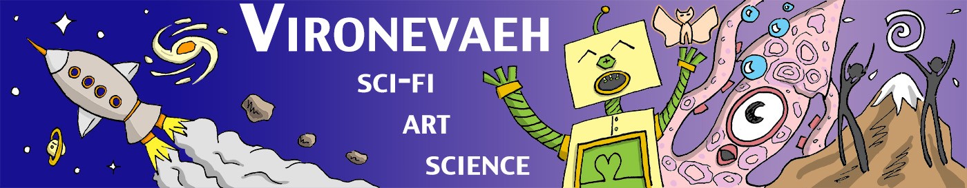
In 5th grade, we had the city project; we had to invent a city, describe its economy, design a model of it, and write a small essay. It was my catalyst. I created a city called Vironevaeh, set on a distant planet, colonized by humans from Earth in the distant future. My languages, my maps, my characters, my aliens now had a focal point.

That was 19 years ago. Once a year, I like to look back and celebrate all the fun I’ve had since. Dreaming about world building made me look at our own world in odd ways.

For now, Vironevaeh is just my little place. Maybe someday it will be something different, but more than anything, I love the journey.

Trips down memory lane

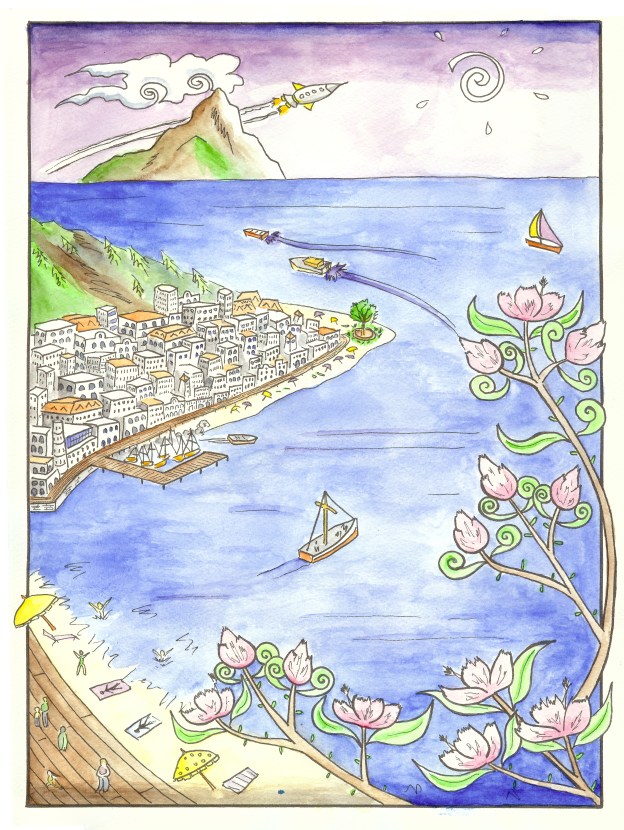
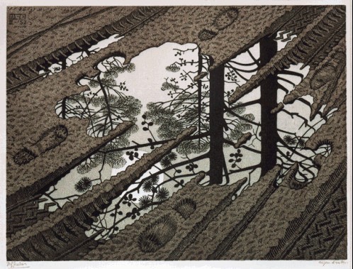
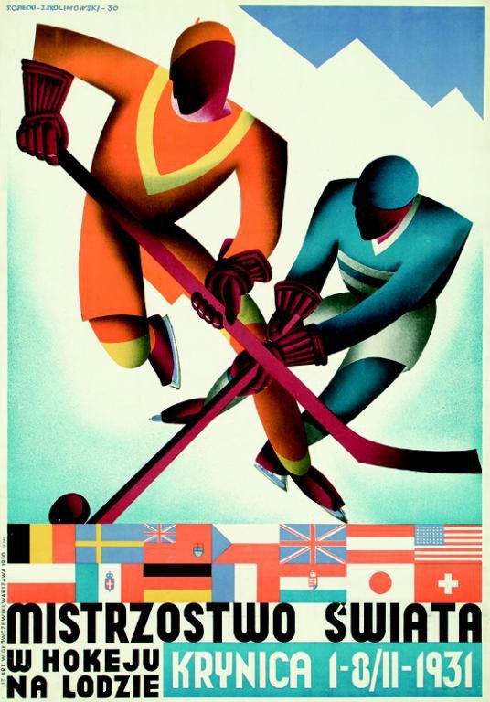
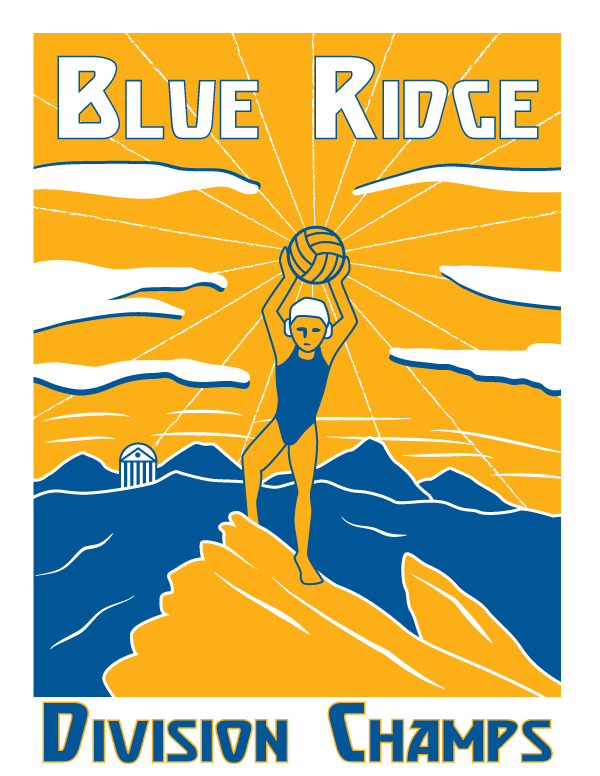
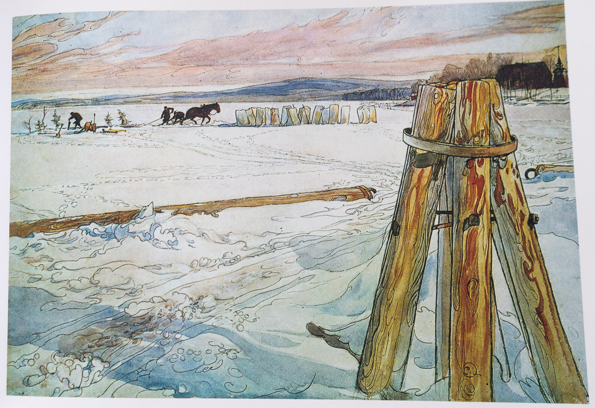
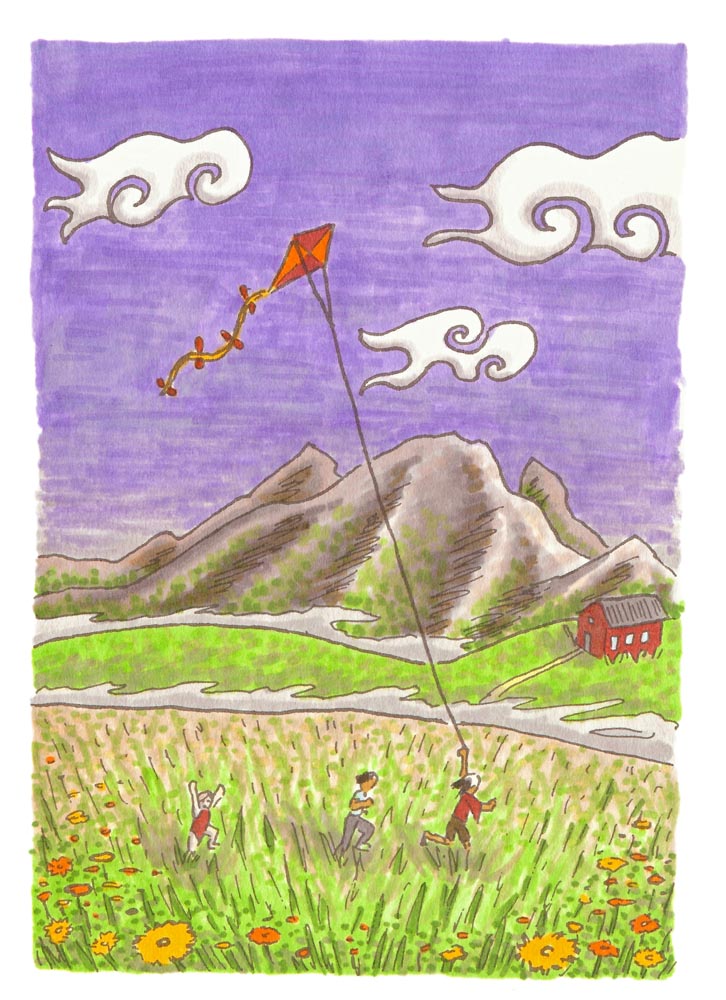
Below are a pair of landscapes, one from years ago and one from last year. My longing to depict Vironevaeh forced me to draw for a purpose. The pencil drawings was one of my first landscapes ever. The poster was an homage, and and another experiment in new territory: art nouveau and posters.

This slideshow requires JavaScript.

Maps

Maps are a simple staple of scifi and fantasy, but drawing maps made me ask a lot of questions. What kinds of geology could happen on a planet that could still sustain humanoid life? Or non-humanoid? Where should lakes, mountains, deserts, and oceans be in a realistic environment? What kinds of names would places have? What names would be linguistically compatible? What kind of linguistic range could I expect on a planet–how much would it vary in a place with a global culture versus one with regional cultures? What kind of stories would I tell about the people on such planets based on the map, and for the people whose stories I had already imagined, what kinds of maps would that require? Maps seem dry and factual on the surface, but I found myself asking a million such second-level questions. I love maps.

This slideshow requires JavaScript.

Storytelling

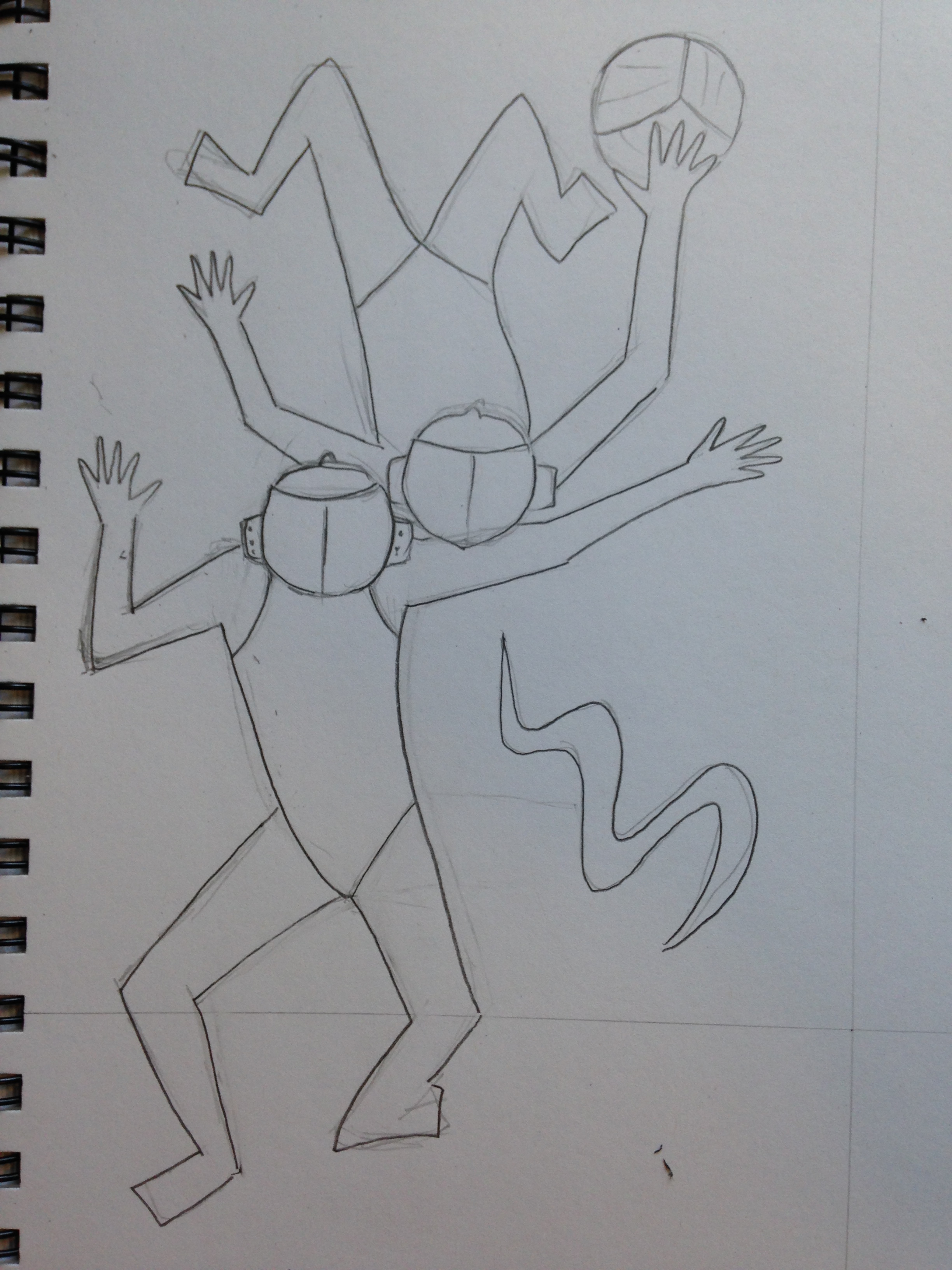
Vironevaeh filled me with stories, but I struggled to express them as I felt them. I have written my stories so many ways. Nowhere is that more rapidly evident than in my portraits. Below are four portraits of a character over six or so years. I had to learn to get the details right and be honest with myself where it wasn’t right. As ever, it’s a work in progress.

Places for the people

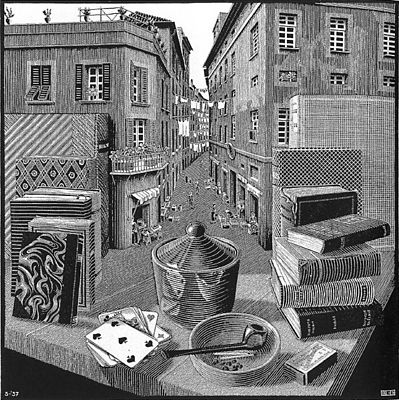
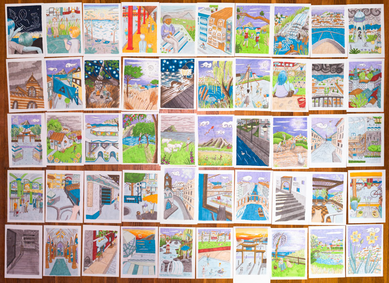
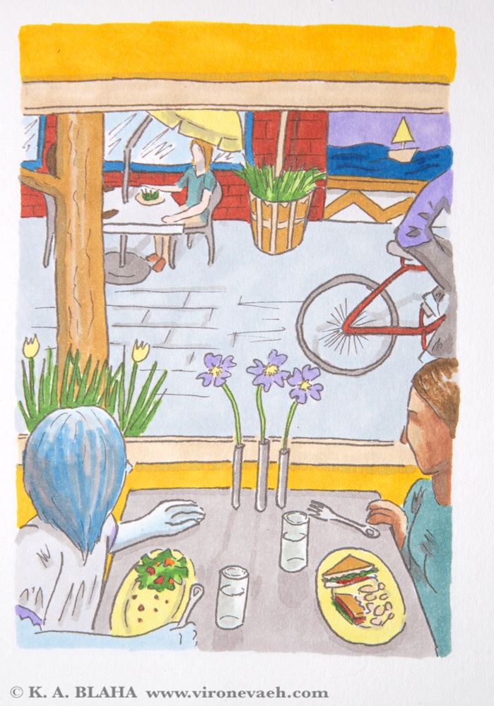
Maps and people weren’t the end, I wanted to know how the streets looked. That’s really hard! There’s architecture and materials, and then there’s imagining the landscape and how such things would fit in. I studied pictures of streets from around the world. I find this aspect the most challenging, but maybe also the most rewarding.

This slideshow requires JavaScript.

Stories of a new world

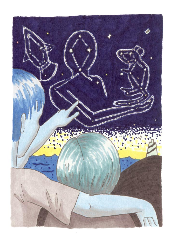
As I told stories about a new world, I wondered about their stories. And when I told them, I found that they fit everywhere. How many references to the garden of Gethsemane exist in western literature? A new place would have new Gethsemanes. Below are two images from mythology about a mouse, and new people finding that mouse in new constellations.

It’s never the end. Next year I’ll have new thoughts to share. Every year I am a new person, and Vironevaeh is a new place.

M.C. Escher: revisiting a familiar name

M.C. Escher and Salvador Dalí are two of the greatest reality-bending artists. So, fittingly, the Salvador Dalí Museum in St. Petersburg, Florida recently hosted a special Escher exhibit. I’ve visited the Dalí collection many times, but I’d never seen Escher in person.

I had many Escher calendars as a kid. When I took crystallography, we studied the symmetries in Escher’s tessellations. I’ve always been interested in design and mathematics, and Escher is the purest intersection of the two. I was ecstatic to see the exhibit.

Before the exhibit, I was most familiar with Escher’s lithographs. Without too much elaboration, lithography is a high-fidelity technique which allows the artist to produce an image that is not directed by the mechanics of printing (I’m sure the method does direct some artistic choices, but as a non-expert, that’s my rough take on it).

The exhibit contained many of Escher’s woodcuts, which were new to me. Woodcuts are make by carving a plate of wood, coating the plate with ink, and pressing the plate to a page. The page will be white where the wood has been cut away and the page will be colored where the wood remained. Woodcuts have a distinctive style–they cannot render colors in between white and ink color. Multiple colors can be achieved with additional pressings, but the technique is inherently color-limited.Additionally, the resolution of the print is limited to the fidelity of the wood. These two aspects give woodcuts a distinctive artistic feeling. If you can’t tell, I’m currently a little in love with woodcuts.

Escher died in 1972, but thanks to Disney, his works remain out of the Creative Commons. However, I am allowed to use low-resolution works for discussion purposes. You’ll have to buy books if you want anything with much detail, though. Below are a few of my favorite Escher images that are available through Wikipedia, as I have linked them under the image.

Some of Escher’s early works were illustrations. There was a beautiful cathedral, half underwater. There were evil-looking creatures in forests. It was such a romantic side to an artist most think of as a master of geometry. Below is an example of one of his illustrations. Even though it’s of a conventional subject, the Tower of Babel, the perspective is beautiful. I love the lines; this work just wouldn’t be whole using a method besides woodcut.

Below was Escher’s first impossible reality. And look, it’s a woodcut! Hooray!

escher2c_still_life_and_street

Still Life and Street: Escher’s first impossible reality

Below is one of Escher’s more famous images. It is a lithograph printing. See how various tones of gray are possible with this technique, as well as high-fidelity. It lends this images a very different tone than the one above. The lizard design is called a tessellation. Tessellations are plane-filling patterns. They occur in nature and area subject of mathematical study. Escher was inspired by the tiling work at the Alhambra in Spain, another example of tessellation.

Below is another Escher woodcut, done with several plates to achieve multiple colors. Even when Escher wasn’t exploring impossible realities of geometry puzzles, he chose interesting perspectives.

Water Polo Designs & T-shirts

Is there any greater joy in art than seeing a project through and sharing it with others? I designed some water polo t-shirts, and finally they have arrived. They look phenomenal!

Plus, it’s a great joy to design for water polo. It’s a small sport. Maybe you’ll see a neat poster for the Olympics, but that’s about it. The women’s game is especially short on designs. This year, I took my design inspiration from art deco sports posters and the National Parks vintage poster series.

Art Deco poster style

I wanted to convey the sense of motion I like in the art deco posters. The curve of the water surface suggests energetic water. It could also suggest the curve of the ocean.

Vector artwork for t-shirt

Vector artwork for t-shirt

tshirts-04810

Final t-shirt result

design1

Source pencil drawing

Below: An art deco poster I particularly found inspiring. Early versions of my design incorporated gradients to suggest form, as in this poster. In the interests of simplifying printing, I chose to go with two colors.

Mistrzostwo Swiata: Krynica by Stefan Osiecki and Jerzy Skolimowski, 1930.  For the 1931 Ice Hockey World Championships in  Krynica, Poland.

Mistrzostwo Swiata: Krynica by Stefan Osiecki and Jerzy Skolimowski, 1930. For the 1931 Ice Hockey World Championships in Krynica, Poland.

Below: an alternate idea. Like basketball, a lot of action in water polo happens at the center position. Unlike basketball, the offender and defender stay relatively fixed, facing away from the goal. The offensive center wants to turn forwards or backwards to take the shot. The defender waits to react. I hoped that the slightly disjointed postures suggested depth or motion.design2 text-01

Design made into a poster. Perusing Wikipedia, I discovered that water polo has a surprising variety of names for a sport invented only about a century ago.design2-poster-01

Original pencil sketch. Eventually dropped the water ripple and turned it more geometric.design2

National Parks poster style

All the teams in our water polo conference, the Atlantic Conference, are in North Carolina and Virginia. Three out of the five are close to the Blue Ridge Parkway, and none are coastal. This gave me the idea that the conference could be thought of as the Blue Ridge Conference.

The championships this year were held in Charlottesville. Humpback Rocks are a popular hiking destination along the Blue Ridge near Charlottesville. People often hike Humpback rocks at sunrise to get the view of the Rockfish Valley. This fell quite naturally into a vintage style poster look.

This design was a super rush job. I drew the sketch at 10PM before the deadline the next day. The next morning I vectorized it. The shirts arrived a week later. I probably now would choose to make the figure white, for better clarity at a distance, but I still like the design.

Blue-ridge-tee

They didn’t go for my conference renaming. =Ptshirts-1774

Original sketch.IMG_0769

One of the national parks posters that inspired this design.

Three beautiful books that inspire

I’m always looking for design inspirations. Whenever I find myself in an art museum or an interesting shop, I always look to see what kinds of design books they have. Today I included three very different commercially available favorites in my little collection.

Waterlife by Rambharos Jha

A stunningly beautiful book by Indian folk painter Rambharos Jha. The critters come alive with the wiggling and colorful lines. Each page is silk-screened by hand onto hand-made paper. You can see the difference from ordinary printing methods immediately. Striking. This is also one of the best smelling books. Every time I open the book, the smell of ink and paper hits me, I’m looking at this book. My only criticism is that the binding method prevents the book from opening as flat as I would like. I love to look at this book when I’m trying to feel energy in my work.


beauty-books-02737beauty-books-02739

Carl Larsson’s A Farm: Paintings from a Bygone Era

A collection of 19th century Swedish painter Carl Larsson‘s farm paintings. His calendars are a staple with the Scandinavian branch of my family. His work makes me think a bit of Norman Rockwell– beautiful and flowing, but with crisp lines that give a feel of illustration. I love to look at his work for inspirations in depictions of the ordinary, the pastoral, the family.

beauty-books-02733beauty-books-02743

Radioactive: Marie & Pierre Curie, A Tale of Love and Fallout by Lauren Redniss

I previously reviewed this book here. I’m not in love with the writing in this book (see the review), but I am in love with the art. I love the way it connects to the science and is elevated by it. The typography for this book is also divine. Redniss even created a special typeface called Eusapia LR for this book, and it works beautifully. This book is an inspiration in marrying art and science.

beauty-books-02736beauty-books-02741

November means NaNoWriMo, but with a Twist for me

It’s November and thus it’s NaNoWriMo. Generally this means you write 50,000 words of a novel. I did that last year. This year I’m doing things a little differently. I’m going to do two 15,000 word stories and 24 illustrations. After all, a picture is worth a thousand words?

As of today, I’m at 7,265 words and 7 illustrations. That’s behind pace, but mostly due to a water polo tournament, which has a way of reducing one’s concentration to jelly for a few days (which is not unrelated to the shortness of this post).

I’m glad I did the traditional NaNoWriMo last year, to prove to myself that I could. But this year is about making the wonderful NaNo collective spirit work for me. I feel really inspired, and really excited about my eventual final product. I have two novel drafts that need reworking, and the prospect of another hulking chunk of words sitting around wasn’t very exciting. With the lower word count, I spend more time editing and creating a tighter first draft. I will come out of this month with something new to be proud of, which to me is the goal at the heart of NaNoWriMo.

Print jainus-pjs toys

The slow and steady

Over six months ago, I challenged myself to do 100 illustrations of my city of Vironevaeh, the fictitious city that is the unspellable namesake of this website. I would build my world in myriad ways, practice art, and create some beautiful scenes. On Thursday, I finished the fiftieth color image. I have images of city streets, markets, pets, agriculture, constellations, architecture, pastimes, clothing, family, and weather.

50-74


Eventually, I will have descriptions for each of them, and a place on the map. Eventually there will be at least 50 more. It’s a lot of work to do for something that probably won’t mean much to anyone besides me. But Vironevaeh is a city at my side for over 17 years, and it will mean a lot to me. I am so pleased with my progress. Here are a couple of my favorites:

006-small

A man showing a child constellations in the sky. These constellations are of Abenn the hermit and Peep the mouse, who hid away on Neva the spaceship. These legendary figures are the subject of my recent and free fairy tale The Lonely Man on the Ship. Sharp eyes may note that the people here are blue and green.

008-small


Children running with a kite in the countryside. A pretty typical scene even here on Earth, except for the lovely purple Vironevaehn sky. Also the fact the fog in the valleys behind them could be brain-eating. All in normal day!

Soon I’ll bind up a little fun book of my favorite ten illustrations, but for now, I’m basking. Onto the next milestone!

Another Fairy Tale at last


When I released my collection of science fiction fairy tales, it was the start of a push to creatively engage with the world. I finally finished a project and put it out there, doubtless non-perfect like everything. Since then, I’ve submitted my short works nearly 90 times (with 3 acceptances). I’ve joined a writing group and participated in critiquing groups to work on my writing. I’ve studied Adobe’s Photoshop and illustrator, and recently painting, to improve my artistic skills. I’ve studied Indesign and book layout. I started posting regularly on this site, as I have for nearly two years now. The first set of fairy tales started all of this self-improvement.

I always intended to do another collection of fairy tales. I recently finished the first story, “The Lonely Man on the Ship”, about a man trapped alone for years on a spaceship during  terrible storms. I did the art with Prismacolor color pencils (which I intend to use for the rest of the eventual collection).

Now I’m coding the fairy tale for the kindle. Once I do, “The Lonely Man on the Ship” will be available free on the kindle and on the iPad. Much of the last two years’ studies has gone into this work. I used Indesign and illustrator for layout work. I used Photoshop to make sure my scanned art work was as attractive as possible. I think the writing is stronger than in the first fairy tales. As the first fairy tales inspired new studies, to release this work properly I’m learning CSS and HTML coding.

So until I finish this last step, enjoy a couple of illustrations!

abenn_ghost-small letterhead-small

Writing prompt: using an illustration as inspiration

Time: 7 minutes. Click here to go to my list of prompts.

I wrote this prompt while looking at the image below, which I made for my worldbuilding exercises, discussed here.

SONY DSC

Enh and Della sat at the table, staring out the window rather than at each other. Enh hadn’t seen Della in fifteen years, not since that terrible night. And now they sat in a beautiful café, staring out at the sea rather than talking. Out of the blue, Della had contacted her two days before. She still hadn’t explained why, and Enh was growing uncomfortable. In the distance, a sailboat skating gracefully by. Enh wished she were there. Anywhere but here.

“It’s good to see you again, Enh,” Della mumbled again. Enh just nodded this time. Della’s voice, so distinctive, was unchanged, and she mumbled just like she had so many years ago. She paused for a long time. “Don’t you have anything to say to me?”

Enh sighed. “You contacted me. And you still haven’t told me why yet. I didn’t come here to reminisce. I came here because to asked me to, and I’d prefer you get to the point.”

Della’s eye’s narrowed. When she was young, she might have cried, but evidently she was past that. “You always make everything hard. Fine, I’ll just say it. I found out that Intira might be alive.”

Enh dropped her fork. Visions of that night came unbidden. The night they found the bike on the beach, but not Intira. Intira’s angry note, condemning all their undermining, how they had never really been friends. A man who’d seen her running into the ocean. Her clothes, found a month later on the coast.

(As it happens, the end of this prompt became inspired by another illustration, see below.)

SONY DSC