Tag Archives: art

Fun and inspiring: The Library of Congress online archives

My trip to the Library of Congress building later led me online to explore their equally amazing catalog of images. They have thousands of high-resolution images, from baseball cards to Japanese prints to Spanish civil war posters. And that’s just the prints and photographs section.

I preferred the collection of WPA posters. They combine beautiful design with period topics that can seem wacky today. Ride the El! Get tested for syphilis! Beat the Germans! Children’s piano competition! Over 900 governmental exhortations paint a vivid picture of 1930s life. I was amazed by the number of posters for illness: tuberculosis, syphilis (31 posters alone!), diphtheria, scarlet fever.

The posters are also great sources of design inspiration. Most have playful typography and engaging graphics. Many of them are available as high-resolution TIFFs, so you can print them out and have instant decor. My bathroom now has posters about syphilis and pneumonia. I’m sure my guests will feel safer.

And without further ado, some favorites:

As old as creation, Syphilis is now curable.

pneumonia strikes like a man eating shark led by its pilot fish the common cold.

The Art Institute of Chicago international exhibition of water colors

An orderly line is a safe line!

Stop and get your free fag bag– careless matches aid the Axis.

14th Illinois Cattle feeders meeting.

Art and Math: Poemotion (Takahiro Kurashima)

Poemotion and Poemotion 2 books of astonishingly beautiful patterns. They are beautiful because they are so simple and yet I struggle to describe them here. The book comes with a lined overlay, and when the images of the book combine with the overlay, they dance and amaze.

These dancing patterns arise from something called a Moiré pattern, a creature of math and physics. These kinds of patterns naturally arise when two patterns are overlaid.

Moire pattern (wikipedia)


You’ve probably seen Moiré patterns when people wear busy patterns on tv:

We usually associate Moiré patterns with annoying visual artifacts, but science has found several ways to exploit them. Moiré patterns can be used to measure strain in materials. They can also be exploited to take microscope images at high magnification. The little lines on US dollars are designed to create Moiré lines when scanned, as a mechanism for defeating counterfeiters.

Kurashima’s Poemotion (just in black) and Poemotion 2 (in color), contain dozens of Moiré patterns. Every time I look at them, I feel such simple joy. The patterns are so deeply familiar and yet I had never consciously noticed them before. These books made me look at the world differently.

DSC00928 DSC00933 DSC00935

Fun science: An easy fractal to make at home

DSC00224

Viscous fingering is a fractal pattern that occurs when a less viscous (or thick) fluid spreads through a more viscous (or thick) fluid. Such systems are present in oil extraction, when we pump one fluid underground to push another one out. Fractals are common in nature even though they’re new to our mathematics, and they are beautiful.

The pictures in this post were created with basic watercolor paints using one simple principle: water containing paint is more viscous than regular water. It’s easy to try at home!

For the top picture, I laid down red paint. Before the paint dried, I added salt, then let the square dry. Water from the still-damp paper rushed to the salt (because of entropy, systems tend towards uniform distributions of things if they can help it– in this case, the lowest energy state is to have a uniform distribution of salt). But because paint molecules are larger than water molecules, they don’t move as well. The water that accumulates around the salt has less paint than the water in the rest of the paper, and thus we have a less viscous fluid spreading into a more viscous one. Try it at home! If the paint is too wet or too dry when you add the salt, the results won’t be as dramatic, so play around a bit. Larger salt crystals can be especially fun.

For the three pictures below, I simply placed a drop of water into a damp square of paint. The patterns vary depending upon the size of my drop, the wetness of the paint, and the paint color (the chemistry of which influences the viscosity of the paint).

DSC00225-2 DSC00225-3 DSC00225


Below are a couple of examples from the University of Alberta of viscous fingering with pentane into oil and water into oil. This particular research aims to improve the flow rate of oil during extraction. And it looks pretty similar to some humble watercolors.

Left: pentane displacing mineral oil. Right: Water displacing mineral oil (University of Alberta).

Another Fairy Tale at last


When I released my collection of science fiction fairy tales, it was the start of a push to creatively engage with the world. I finally finished a project and put it out there, doubtless non-perfect like everything. Since then, I’ve submitted my short works nearly 90 times (with 3 acceptances). I’ve joined a writing group and participated in critiquing groups to work on my writing. I’ve studied Adobe’s Photoshop and illustrator, and recently painting, to improve my artistic skills. I’ve studied Indesign and book layout. I started posting regularly on this site, as I have for nearly two years now. The first set of fairy tales started all of this self-improvement.

I always intended to do another collection of fairy tales. I recently finished the first story, “The Lonely Man on the Ship”, about a man trapped alone for years on a spaceship during  terrible storms. I did the art with Prismacolor color pencils (which I intend to use for the rest of the eventual collection).

Now I’m coding the fairy tale for the kindle. Once I do, “The Lonely Man on the Ship” will be available free on the kindle and on the iPad. Much of the last two years’ studies has gone into this work. I used Indesign and illustrator for layout work. I used Photoshop to make sure my scanned art work was as attractive as possible. I think the writing is stronger than in the first fairy tales. As the first fairy tales inspired new studies, to release this work properly I’m learning CSS and HTML coding.

So until I finish this last step, enjoy a couple of illustrations!

abenn_ghost-small letterhead-small

Books and pictures and programs

These last few weeks have been a whirlwind, so in departure from something more organized, I think I’ll just list off a few of my projects. Hopefully some of them will inspire you to something; at the very least, I know I can come back here when my own motivation wanes (it always does, it always will, we just have to learn to re-energize it).

  • In the last few months, I’ve assembled a science fiction and fantasy anthology for my writing group. I did all the formatting and editing and layout. Last night we had a binding party in which we put together several handmade copies. Soon it will be available for the kindle (after a little more work), but here are pictures of the first bound copy of Bizarre Tales from the Three Notch’d RoadSONY DSC SONY DSC
  • I’m taking a watercolor painting class through a local art community. Everything I know now I taught myself, and I’m sure there are new things I ought to learn. The next Zish and Argo will be even more beautiful.
  • I’m taking the plunge and going pro with my photography. Check out my new website karenblahaphotography.com.
  • I’m learning database design, something I knew zero about before June. You can just pick up a new skill, if you give it time and realize that it will be a slog at times. I’m using this book by Michael Blaha, which as the name suggests, my dad wrote. Nearly 30 years of osmosis didn’t teach me anything, but two months with this book has been inspiringly instructive.
  • I’ve been learning the Adobe creative suite, using videos from Lynda.com. I learned InDesign for the anthology pictured above. I learned a ton about Illustrator after being unable to make even the simplest graphics in it. Although I’ve been using Photoshop for years, I’ve learned more about it in the last month than I have in the last ten years. Immensely eye-opening.
  • I made the switch from Aperture (the mac photo-managing software) to LightRoom (the Adobe photo-managing software). LightRoom ties into creative suite better, and Mac is not supporting Aperture sufficiently anymore. And I’m using Lynda.com videos to speed my adaptation to LightRoom too.
  • I discovered a wikipedia for classical music whose copyright has lapsed. Imslp.org has sheet music for hundreds of composers for dozens of instruments. It even has some free recordings. I am working on learning Gilbert and Sullivan’s H.M.S. Pinafore for piano, Grieg’s  Peer Gynt for piano, and Saint Saen’s Swan for viola. The only trouble is knowing which music you want!
  • I continue to work on short stories for my Clarion Write-a-thon goal. I’m on the second one, and I need to pick up the pace. Check out my profile page here.
  • And finally, I continue to work on my 100 scenes of Vironevaehn life. I’m up to 42 color illustrations.SONY DSC

Whew, that was a lot, and time to get back to it!

Technology and art in the rail photography of O. Winston Link

If you are interested in rail photography, or if you’re like me and really never gave it a thought, the O Winston Link photography museum in Roanoke, Virginia is a fascinating visit. O (short for Ogle– I think I’d go by the initial too) Winston Link photographed steam locomotives in the 1950s, at the very end of their widespread use. The Norfolk and Western rail lines he snapped ran through Virginia, West Virginia, Kentucky, and other parts of the coal belt of Appalachia.

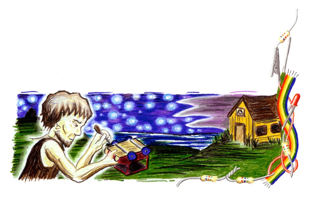
In his photographs, Link captures the end of a powerful technology, but he also captures life in 1950s Appalachian rail towns. People play in a pool twenty feet from a roaring locomotive. People read in their living room with a cat sleeping on their lap as a train passes the window. Folks chat on a porch as the N&W rolls past. In the image below, the train passes a drive-in movie.

Hotshot Eastbound, by O. Winston Link.

Link captured images with such technical precision that they would still be difficult shots today, barely possible without rare equipment until very recently. Link was a civil engineer, hired out of college as a photographer; during World War 2, he used his scientific and photographic backgrounds at the Airborne Instruments Laboratory.

Link’s railway shots rely heavily on both science and photographic techniques– in order to better control the lighting and thus the composition of his photos, he often shot at night. Because, he said, “I can’t move the sun — and it’s always in the wrong place — and I can’t even move the tracks, so I had to create my own environment through lighting.” This required the use of flash bulbs, one-use bulbs that burned metal to produce brief, intense illumination. According to the museum, one of his shots alone used illumination equivalent to 10,000- 100 watt light bulbs, although that light only lasted for a moment. Reading that, I wondered what the experience was like for the train conductor, driving through nearly black rural Virginia, when light so bright it might as well be lightning flashes. His first power source was too unreliable, and so he designed his own power source. Link invested $25,000 into the unpaid project, closer to $125,000 in today’s currency.

As someone who dabbles in photography, the difficulty of Link’s task and the quality of his work (60 years ago!) deeply impressed me. Bear with me as I explain some technical details of modern cameras to convey the awesomeness of Link’s work. Today, we might just be able to reproduce such shots without flashbulbs due to advances in digital photography. Flash bulbs (using combustion) are still brighter than any modern flash (using capacitors). A single flashbulb produced about 1 million lumens (the unit that measures the brightness of light) while a modern camera-mounted flash produces about 100,000. Many flashbulbs may be used at once, so the flashbulb is great for extreme illumination. Only one manufacturer of flash bulbs still exists. Their photo gallery is pretty neat.

Today, we have cameras that are more sensitive to low light, called high-ISO cameras. Camera speed, whether digital or film, is measured in a system called ISO-sensitivity. In this system, a film with double the ISO requires half the exposure time; a two-second exposure with 200 ISO film would take 1 second with 400 ISO film for the same level of exposure. In the 1950s, the fastest film was ISO 400-640. The Sony Alpha 7S, releasing in July, has up to ISO 409,600, 1024 times  faster than ISO 400. A shot requiring 30 seconds of exposure on ISO 400 would require roughly 1/30 of a second on ISO 409,600. This is really new technology; as of 2013, no ISOs above 10,000 existed.

So, in short, Link’s work is a beautiful hybrid of science and art, a testament to their combined power. Link’s scenes of rural 1950’s Appalachian life are beautiful, and remind us of the era of the man behind the lens. New advances behind the lens are happening today. What new wonders will they capture?

Nationality Rooms at the Cathedral of Learning

This weekend, I went to the Cathedral of Learning in Pittsburgh. Among other things, this gothic skyscraper contains 29 nationality rooms–each of these rooms is decorated intricately in the design of a nation. The first 19 were built between 1938 and 1957, with ten built since 1987. The Turkish and the Swiss classrooms were dedicated in 2012, and several more are planned. If you are in Pittsburgh and have any interest in craft or design, I can’t recommend visiting enough.

To visit the classrooms, you can check out a key at the desk, or take a tour with a guide. We rented a key. Visiting each room felt like a treasure hunt; each room was so different, and full of intense detail. Each room had special walls, windows, ceilings, chairs, lecterns, and chalkboards. Even the light switches and doors were in style. Many contain intricate wood or stone carvings, or genuine artifacts. Most were designed by architects of the country.

You can learn more on the University of Pittsburgh website about the nationality rooms. This page allows you to virtually tour each room.

The Chinese nationality room.

The Chinese nationality room, dedicated in 1939.

The Czechoslovak room, dedicated in 1939. This room contains a letter from the first President of Czechoslovakia, Tomáš Masaryk, to the students of the University of Pittsburgh.

The Czechoslovak room, dedicated in 1939, 8 days before the Germans invaded in World War 2. This room contains a letter from the first President of Czechoslovakia, Tomáš Masaryk, to the students of the University of Pittsburgh. His son, Jan, spoke at the dedication of the room, foreseeing trouble in the future. Page 4 of this document details the interesting connection between Czechoslovakia and Pittsburgh.

The Hungarian room was dedicated in 1939.

The Hungarian room was dedicated in 1939.

The Lithuanian room, dedicated in 1940. The walls are woven from linen in the "The Path of the Birds" design. Between the angular, abstract carvings and the painting and the walls, this was one of my favorite rooms.

The Lithuanian room, dedicated in 1940. The walls are woven from linen in the “The Path of the Birds” design. Between the angular, abstract carvings and the painting and the walls, this was one of my favorite rooms.

A detail from the Romanian room, dedicated in 1943. The style of this mural on the back wall reminded me of the opening of Beauty and the Beast.

A detail from the Romanian room, dedicated in 1943. The style of this mural on the back wall reminded me of the opening of Beauty and the Beast.

The Swedish room, dedicated in 1938.

The Swedish room, dedicated in 1938.

The Yugoslav room, dedicated in 1939. The carving in this room, called "notch carving" was simply amazing.

The Yugoslav room, dedicated in 1939. The carving in this room, called “notch carving”, was simply amazing.

The cathedral of learning, exterior.

The cathedral of learning, exterior.

The main hall of the cathedral of learning.

The main hall of the cathedral of learning.

The main hall of the cathedral of learning.

The main hall of the cathedral of learning.

Science Fiction Worldbuilding

One thing I love about science fiction is worldbuilding. When you go to a new place, you take in the architecture, the language, the food, the weather, how someone enters a house, how someone insults another person… These things exist in any culture, but they vary, sometimes radically. In science fiction, the creator tries to imagine these things in a logical and consistent manner for a time that hasn’t happened yet, for planets unknown, with the very constants of life such as gravity and oxygen subject to change. And yet the end product, when successful, is similar to travel–we visit a place that is deeply familiar in the fundamental ways and yet different in ways that provoke thought.

(Some people think that there is too much worldbuilding–I don’t agree. I think the author can tell too much of their own personal worldbuilding process and not consider the reader enough. However, I speak from a place of no authority, so take my opinion for what it is worth.)

In the last few weeks, I’ve been working on illustrations of street life in my city inspired by Hiroshige’s 100 views of Edo. Even after 17 years working on this world, I see many new things this way.

SONY DSC

On the hill in the background is the outline of an old storm tower, shaped a bit like a lighthouse. The old fortifications stood high on the hills with thick walls to withstand the storms.SONY DSC

The view west from a storm tower, to give early warning of storms. In the early days of the city, storms caused flash flooding and devastation.SONY DSCGleaming cities often have unsavory hidden parts, sometimes literally lurking around the corner.

So far I’ve done about 20 illustrations. I’d like to do at least 100. In each one I feel more comfortable with previous details. I’ve looked up references of European and Moroccan and Japanese architecture (mostly the European showing in these three samples). Now I’ve started incorporating old sketches over a decade old. The city feels all the more real to me (it’s great inspiration for story ideas and details), and the work is great fun.


Science is Creative!

In the US, science is regarded as valuable, but dry and a bit stiff. As a student, it’s easy to get this impression, studying rigid facts first explored centuries ago. The math, chemistry, physics, and biology we learn in high school and college are about recreating long-known answers by well-established methods. But the process of making new science and math is inherently creative, and new ideas require letting the mind run wild a little. In this post, I’ll talk about how I develop my ideas.

I work with populations of oscillators. The idea of this research is that the complexity of the whole (the population) exceeds the complexity of each element (the oscillator). The human brain is a good example of such a system–each neuron is fairly simple and well-understood, but overall brain behavior arising from the interactions of many neurons is not understood. My research tends to work by observation–I notice something I find interesting and I explore that further. Other researchers work on what they suspect they will find, based upon other work. All research works within the context of its field. There are many interesting behaviors I have noted in my experiments, but I explore the ones I might explain. Really random observations are cool, but hard to frame in a way which is meaningful to the community.

The above may not sound particularly creative. But the key to experiments like I do is imagining what might happen when one explores slightly beyond what is known. It requires extrapolating from the areas we know, in the context of the rules we know, to the areas we don’t know. Some of the rules we know are pretty absolute, like thermodynamics, but others may be flexible. (As a note on this point, the stable chemical oscillations I study were once considered thermodynamically impossible. Someone had to bend the established understanding of thermodynamics to explain these oscillations. Einstein had to bend Newton’s Laws for relativity, and he arrived at that conclusion by logic rather than by observation.) In an experimental apparatus like mine, thousands of experiments are possible. It is up to the experimentalist to pick from the possibilities, in the context of what might work in his imagination, to demonstrate something hitherto unknown.

In some ways, the process is similar to writing. There are rules that must be obeyed, and the process of finding something new or interesting is very indirect. With science and writing, I develop some of my best ideas drinking a beer or taking a walk. Sitting at a desk focusing is required at times, but so too is active contemplation. The rules of science are broader and more rigid and take longer to learn, but there are similarities.

A lot of historical scientists were fascinating people, akin to historical artists. Van Gogh got his ear cut off in a fight. Astronomer Tycho Brahe lost his nose in a duel. Salvador Dali shellacked his hair. Electrical engineer Nikola Tesla fell in love with a pigeon. Mathematician Paul Erdos lived itinerantly for decades. In one visit to a colleague, he couldn’t figure out how to open a carton of juice, so he instead stabbed it open (among many, many other oddities). Physicist Richard Feynman used to work on his physics at strip clubs. Artists may share their eccentricities more in their works, but I would argue that scientists have every bit as much oddness.

I hope this post illustrates a little what it is like to be a research scientist, and how science at the cutting edge works. For more science posts, check out my fun science list.

Style: University of Virginia Lawn

There are three manmade UNESCO world heritage sites in the United States: The Liberty Bell, The Statue of Liberty, and The University of Virginia Lawn with Monticello. The UNESCO designation basically means there is something noteworthy of distinctive about the site. I happen to live near to the University of Virginia, so I get to take a lot of photos. (As of this post, I just discovered that all the modern photos on the lawn Wikipedia page are mine. I love to see where the creative commons take my works. Side note: check out my very large Flickr collection of mostly creative commons images.)

Many years ago, Benoit Mandelbrot, the creator of fractal geometry, visited the university to give a talk. He said it was like walking into the lion’s den of Euclidean geometry. I always liked this description; everything about the university is columns and arches and perspective points. Monticello and the University were laid out by Thomas Jefferson, who one gets the feeling never actually died living around here. He was the ambassador to France for a while, and greatly admired the architecture. He came back to the states with those architectural inspirations.

The UVA lawn, shown below, has the rotunda at one end (the second one… the first one burned down and blew up when a professor tried to save it with TNT) and is lined by ten pavilions. Between the pavilions are dorm rooms that distinguished fourth year students still live in. Each of the ten pavilions is architecturally different, and behind each is a garden in a different style which no doubt will be the topic of a future post. Pavilion 2 is pictured below. Professors still live in the pavilions. The pavilions were built in a strange order, to ensure that diminished funds would not diminish the scope of the project.

It’s very easy to find plenty of reading material on Jefferson and the University if you are interested, so I won’t try to write a tome here. However I’ll include a few of my pictures that may hopefully spark your interest.

SONY DSC DSC03036 SONY DSC SONY DSC SONY DSC SONY DSC SONY DSCpavilion 2

Monticello, i.e. the back of a nickel